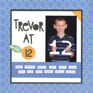
Trevor at 12 (affiliate link)
This was the third of three layouts I recently finished away from home. I somewhat like it, but I would have chosen a different font for the title and a different way of highlighting the 12 if I'd had my entire stash at hand. Still, I am very happy to have finished it and pleased that I was able to do something I'd never done before.


I love these layouts...it's a great way to show their age progression! One thing I always wondered... do you ever find yourself re-using the same adjectives? I mean, I would think you would and it would make sense for the most part, but does doing so bother you at all?
ReplyDeleteI make a point not to look at previous years' layouts until I've made my list of words. Then I go back and look. Most of the words are repeats from year to year, as you'd expect. It doesn't bother me at all. It means that I've captured their personality. :)
DeleteYes, I would do the same... and I agree w/ your assessment! I'm sure they will love looking back, not only on the layouts but, on what part(s) of their personality stood out to you the most!
DeleteLove this! LOVE how you use the words to describe him!!!!
ReplyDeleteIt looks great for a layout created quickly and with limited supplies. Good job!
ReplyDelete