10/31/22

"I Am Not Candy Corn"

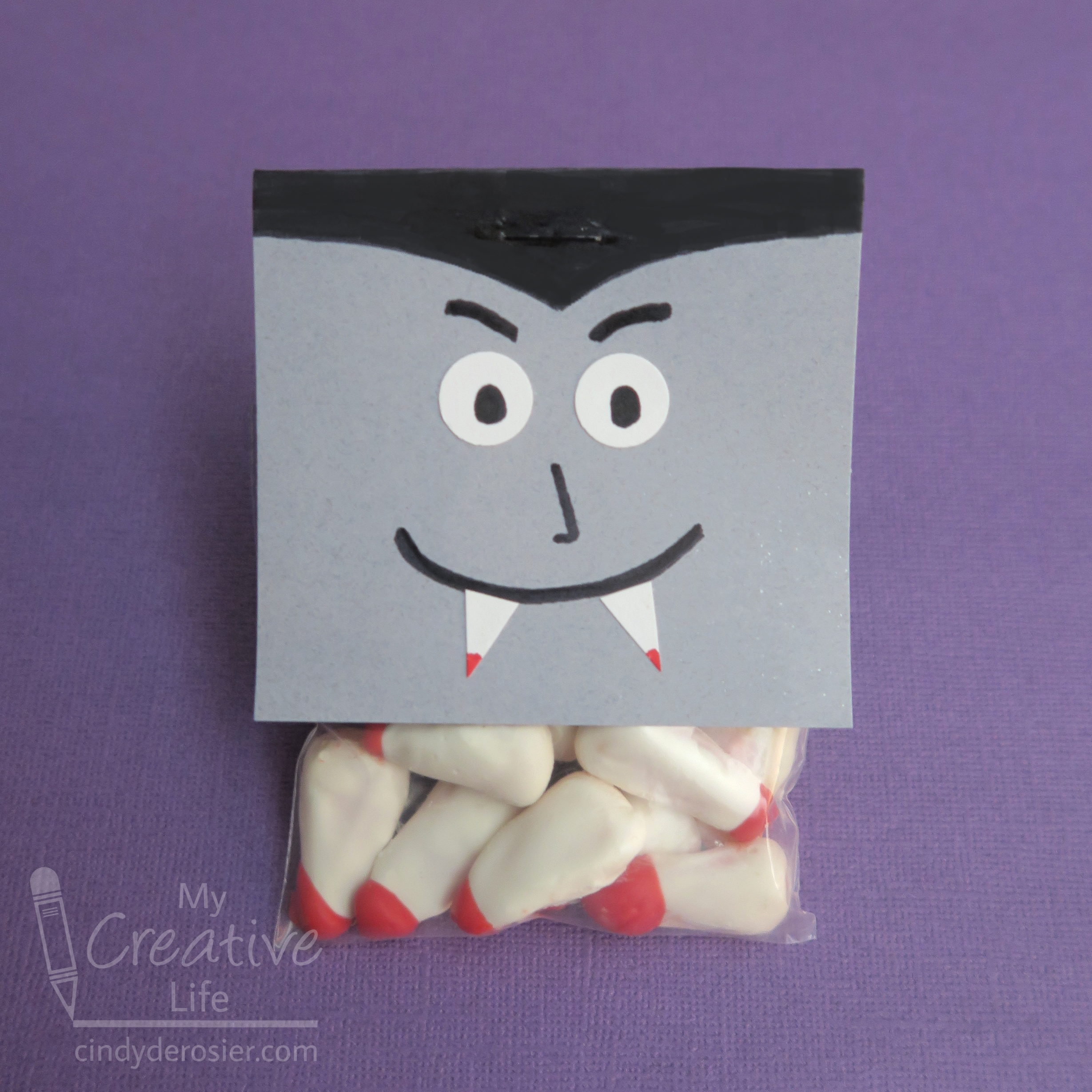
To understand today's craft, take a look at this homework assignment that Trevor completed 10 years ago as a first grader. It's adorable, and so is my version (if I do say so myself. And I do.) Then look at this Candy Corn Character I made last Halloween. When I dug him out of the Halloween decoration box, it got me thinking that October is to my candy corn guy as November is to that turkey. So I gave my candy corn character a disguise. He can wear it until Halloween has safely passed and then return it to the turkey.  


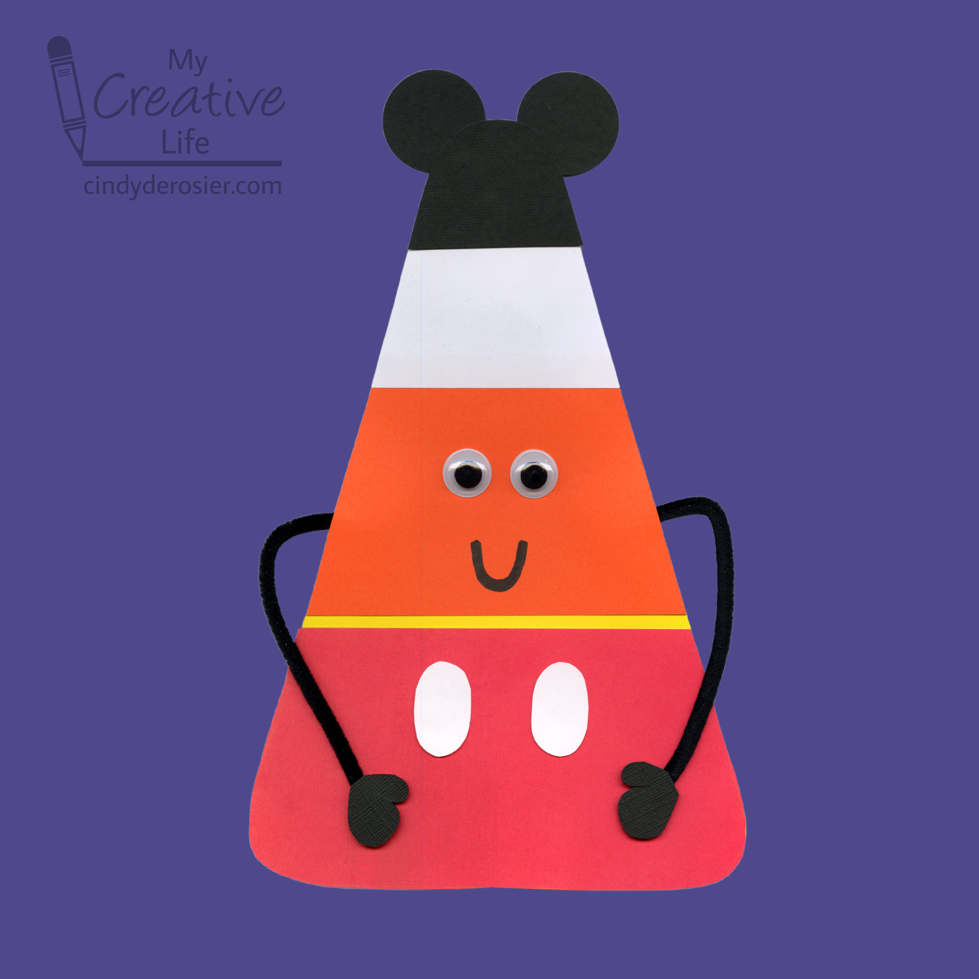
I don't know what all this talk about candy corn is... all I see is Mickey Mouse! 

I would love to have seen how 6-year old Trevor would have disguised his candy corn. Unfortunately, 16-year old Trevor has too much homework and too little interest in crafting with me anymore. Sigh. 

If any of you have 6-year olds with lots of creativity, I'd love to see their versions! Follow the directions to make the Candy Corn Character, then you can add whatever you need for the costume. All I used was black, white, and red cardstock, scissors, and glue. 

By the way, it would be completely inappropriate to snack on candy corn while making this project, but all other candies are on the table. Here's an affiliate link to one of my all-time favorites, which inexplicably is not universally popular. Happy Halloween!

10/28/22

Travel Blogger Business Card

I have a new business card! 


Well, technically I don't HAVE it yet. But I designed it and should have the cards in my hands soon. I'm excited. I've been needing a travel-themed business card for a long time. The all-purpose business card that I’ve been using since 2017 is fine and I will continue to give it out to promote my crafts, recipes, other creative endeavors. But this one will take people directly to the travel portion of my blog rather than the home page.

In designing the card, I wanted it to fit with the My Creative Life brand and feel like an extension of my blog rather than a departure from it. I started with a globe, pulling the colors from my brand kit. Then I played with ways to combine the globe with my MCL logo. I tinkered around with the design, moving the pencil down (but still on the left). It was missing something, so I added the tiny heart to mark where we live in California. While I enjoy traveling, there's no place like home. 


I like this new logo a lot. I put it on a business card template, extended the "table" under the pencil and globe, and added my name, title, and a QR code that leads to my travel page. I colored the corners of the QR code to match the green on the globe. I shrunk my blog address and added my email address.  


What do you think? 

10/27/22

Roy Lichtenstein Name Art

Roy Lichtenstein is most famous for using Ben-Day dots, speech bubbles, and images from comic strips in his artwork. I was inspired by his portrayal of sound effects to make name art. 


I used this 1966 Newsweek cover as my reference. 


To start, write your name in block letters. Add a heavy drop shadow. As you can see, I made pencil lines first, then inked. After this step, I erased the pencil lines. 


Draw triangular 'burst' shapes behind your name. I didn't use pencil first, resulting in a few weird placements, but oh well. 


Learn from my mistake. It would have been MUCH easier to color my artwork as I worked than to go back later and try to figure out what color each shape should be. 

The next step is to add a spiderweb shape behind the burst. Lichtenstein drew his going diagonally from the top right to the bottom left, but I flipped mine. It feels more logical to me that way. Maybe it's because I'm left-handed. 


Behind the spiderweb, draw a cloud. Are you seeing now why coloring as you go would be a lot easier? At this point, I hadn't realized that yet. 


The final step is adding a reverse burst behind the cloud. While the first burst has the ends pointing out, these shapes have their (non-visible) ends pointing in toward the name. 


To color my artwork, I started with red for my name, just like in the example. I left the foreground burst white, then colored a secondary burst behind it yellow. Then it was time to do the Ben-Day dots. I used a piece of perforated drywall tape, which worked really well. I did make two mistakes. Can you spot the single dot outside the cloud that shouldn't be there? How about the missing dot inside the cloud that should be there?


About that drywall tape... a friend gave me a chunk from a large roll she bought at the hardware store. I just wasted 15 minutes trying to find it on Amazon in order to create an affiliate link, but it is simply not there. I'm surprised. I thought pretty much everything was on Amazon, particularly something as commonly used as drywall tape. 

As you can see, I went back and colored the burst in the foreground blue. I'd intended to leave it white, but thought it needed to be bolder. 


I'm happy with how it turned out and enjoyed working with Ben-Day dots. Thanks for the inspiration, Mr. Lichtenstein!

10/26/22

The Worst Craft Supplies to Clean Up

I think almost everyone would agree that the worst part of crafting is the cleanup, particularly when crafting with kids. An enthusiastic crafter can end a session with glue, paint, and all sorts of other supplies in places they definitely don't belong. Glitter is the worst, right? You can never get it completely cleaned up; it appears for weeks in unexpected places, no matter how much you clean. 

Glitter (affiliate link here and below)

Actually, no. Glitter is not the worst, by far. It is obnoxious to clean up, no doubt, but once you've spilled paint on carpet, you'll be begging for a glitter mess instead. It is a nightmare to get paint out of carpet, and you have to work really quickly because once it dries, that's it. So is acrylic paint the worst?


Nope. Gesso is much worse than acrylic paint. They're equally awful to get out of carpet, but since gesso is used as a primer for things that acrylic paint won't stick to, that means a whole other bunch of surfaces are vulnerable to gesso. For example, it's easy to get paint off a plastic ruler or a drinking glass or even the handle of the paintbrush you're using, but gesso stubbornly sticks to them all. 


So gesso has to be the worst, right? Nope, I'm awarding the top title to spray adhesive. In theory, you protect your work surface, spray what needs to be covered, and move on with your life. In reality, it's really hard to prevent overspray, no matter how much area you cover. Spray adhesive sticks to absolutely everything. It's no easier to clean wet than dry. I used to use it for convenience (it's so fast to spray a large item that needs stuff stuck all over it and it really does hold strong!) but I've realized that the prep and the cleanup add so much time that it's not worth it.  


There are plenty of other craft materials that are a nightmare to clean up, particularly on specific surfaces. So what do you think? Did I get it right, or is anything worse overall to clean up than spray adhesive? Let me know in the comments!

10/25/22

BYSS World Series: Steve

As I mentioned yesterday, after getting my first grand slam I was eager to try for another. This is the page I made: 

Steve (affiliate link)

The photo, taken in October 2021, is a headshot from his most recent job; they let him go less than three months later. The journaling talks about his resilience and what a good provider he is for Trevor and me. Despite many layoffs over the years (not uncommon in his industry, but still unexpected each time it happens), every time he bounces back and finds an even better job. It's one of the many things I love about him. 

I *thought* I had another home run, but it wasn't until I was submitting it to the Scrappin' Banshees team page that I realized I forgot to use a Project Life card. Everything else is there. The title letters are actually metal, which I colored with a black Sharpie. I'd forgotten I had them, but discovered them during my (unsuccessful) search for something else. I used two punches (heart and stitch border) and stenciled the background, first with gel medium on the whole page, then with silver ink at the corners of the cluster. Because I didn't use the PL card and earn the home run, I can't get the grand slam even though I included the elements. Darn. Hopefully my points don't mean the difference for the Banshees. 

10/24/22

BYSS World Series 2022: COVID Sucks

We're on a roll! My team for the BYSS World Series 2022, the Scrappin' Banshees, won Game 2


For Game 3, we earn a base hit (1 point) for each of the four following elements: metal, stenciling, punches, and Project Life cards. If you get the home run, you can add the grand slam element, which is creating a 2-element mixed media background. 


This was not an easy challenge for me. Well, parts were easy. I use punches all the time and, while I don't have many, it's not hard to work a Project Life card into a layout. Stenciling is not my favorite, but metal was the hardest element for me. Unfortunately, we were not allowed to substitute metallic paint, or embossing powder, or anything like that. It had to be a chunk of metal. Fortunately, staples were on the approved list. Mixed media is totally not my thing, but I gave it a go. This is the page I made:

COVID Sucks (affiliate link)

I wanted to tell the story of our COVID experience. After avoiding it for nearly 2.5 years, we finally got COVID this summer. Trevor (vaccinated with one booster) came home from summer camp with it in mid-July. He had almost no symptoms and we wouldn't have even known to test him if other Scouts hadn't tested positive. Steve (vaccinated with one booster) and I (vaccinated with two boosters, because I'm over 50 and Steve isn't) stayed healthy for another month, but tested positive within a day of each other in August. I had three miserable days and then felt fine. Steve had five miserable days and continued to test positive for another 5 days. 

I started the page by stenciling the background paper using modeling paste. When it was dry, I added ink. Then I added the patterned paper, photos, title block, and embellishments. The metal staples are at the top left and bottom right. The circles are my punches. I actually used three Project Life cards (2 for the title block and ribbon behind it, then another for the blue in the bottom right). I'm really happy with how this page turned out. And it's my first grand slam!

I had time, so I went for a second grand slam... and failed. I'll tell you about that tomorrow. 

10/21/22

"Visit a Museum and Call Me in the Morning"

I read a fascinating article about doctors in Belgium prescribing a museum visit as one component to treating mental illness. Studies indicate that art can lower anxiety and depression, as well as improve critical thinking skills. So in this pilot program, patients are prescribed a free pass to a museum or gallery, which is used in tandem with traditional treatments, including therapy and medication. This was the first I'd heard of museums as medical treatment, but it turns out that Canada is the pioneer. The city of Montreal was the first in the world to offer museum visits as a prescription for treatment. Recipients include not only those with mental health issues, but people with a wide variety of physical concerns, such as epilepsy, Alzheimer's, and cancer. (More props to Canada - their doctors can also prescribe free passes to national parks.) 

I love this idea. 

I'm a big fan of museums and we visit them often. I went back to see how many museums I have visited so far in 2022. Any guesses? Here are photos from four of my favorite museums of the year to look at while you guess. You can click on each photo to read about the museum.   


This is just a small sampling of the great museums we've seen in 2022. There are so many other good ones. So what's the grand total? I've been to 35 different museums in the last 10 months. That includes two in South Carolina, five in North Carolinafour in California that I blogged about here and heresix in Washingtonthree in Alaskaeight in Minnesota, and six in Wisconsin

While few of these are strictly art museums, every museum has art on display. In fact, the well-designed displays are in themselves art. Some of my favorite museums are immersive, taking you temporarily out of your everyday life (and your problems) and transporting you somewhere else. For me, museums feed my desire to learn and provide me with inspiration for my own art. They open my world to something new. There is no doubt in my mind that the doctors in Belgium have it right.

10/20/22

Paper Plate Lattice Pie

I had the paper plates out to make my Football Fan, so I went ahead and turned a pair of plates into a cherry lattice pie. As one does. If you prefer a blueberry pie, switch out the red paint and red pom-poms for blue. By the way, you can add scent to this project if you really want to go all in. Use the same technique as I did for my scented pumpkin pie craft, but swap out the cinnamon oil for cherry. Affiliate link here and below. 


Paper Plate Lattice Cherry Pie


Materials: 


Steps: 


Paint the center portion of the front (eating side) of one paper plate red. Paint the edges of that same plate with Yellow Ochre (or the crust color of your choosing). Paint the back (non-eating side) of the other plate completely with Yellow Ochre. 

When the paint is dry, cut the solid plate into about twelve 1/2" strips. Keep the strips in order. 


Glue a bunch of pom-poms to the red portion of the plate. Now is the time to add cherry oil if you want the scented version. 

Now you'll make the lattice top. It's basically the same procedure as with real pie dough, but less fragile (and less tasty). Skip the first (shortest) strip. Starting with the second strip, apply glue to ONE end, then glue it to the plate so that its length fits. Skip the third strip, then glue ONE end of the fourth strip in place. Continue until you have five or six somewhat evenly spaced strips, glued just on one side. Let the glue dry completely. 


Rotate the pie 90°. Once again, skip the smallest strip. Take the next strip and weave it over and under the half-glued strips. Add a drop of glue under each end to secure it. Repeat the process with more strips. I ended up using only four strips for this step, because I wanted more of the cherry pom-poms to show through. 


When the lattice is complete, glue down the loose ends from the first set of strips. Now go bake a cherry pie to go along with this craft!

10/19/22

Fall Leaf Luminarias

Luminarias looks so pretty lining a path at night. Use fall leaves to make make your own luminaries to display during autumn. They're particularly nice to set out for Halloween to welcome the trick-or-treaters. Affiliate links below. 


Fall Leaf Luminarias


Materials: 


Steps: 


Spread out the paper bags and arrange the leaves on top of them. I made my luminarias two at a time and used a box to contain the spray. 


Spritz the spray ink over the leaves until the visible white area is mostly covered. If you leave visible white, there won't be contrast when you remove the leaves.  


You can remove the leaves immediately and set the bags aside to dry while you spray the next batch. Continue until you've decorated enough bags to line your walkway. 

Fill the bags with an inch or so of dried beans (or rice or pebbles). You want enough to keep the bags upright and in place. Nestle the tea lights into the beans and arrange the luminarias. Beautiful!


I made these for fall, but luminarias are even more common for the Christmas season in places like New Mexico. I found this fascinating article about the difference between luminarias and farolitos that you might enjoy. You can make a winter version by following the same steps. Try using different elements from nature (holly leaves and berries, for example). You can also use different colors. 
 

10/18/22

BYSS World Series 2022: Ellia at 13

Since I shared Andrei at 16 yesterday, it can't be too much of a surprise that today's post is Andrei's little sister, my goddaughter Ellia. I can't believe she is a teenager. I was there when she was born. Somehow, it feels like yesterday and a million years ago at the same time. 

Just like with Andrei's layout, I incorporated the four single-point elements from Game 2 of the BYSS World Series. 

Ellia at 13 (affiliate link)

I used stickers for the title, as well as the smallest hearts on the top- and bottom-right. The larger hearts in the corners are stamped. Each cluster has a sprinkling of white sequins and the ric-rac dividing the layout in half counts as a "texture textile." Another four points for the Scrappin' Banshees!

10/17/22

BYSS World Series 2022: Andrei at 16

 I'm happy to report that my team, the Scrappin' Banshees, won the first game of the BYSS World Series 2022!


For Game 2, we earn a base hit (1 point) for each of the four following elements: stamping, sequins, "texture textiles", and stickers. If you get the home run, you can add the grand slam element, which is filling a shape at least 1/4 of your page. 


I use stickers on layouts all the time (particularly letter stickers) and stamping isn't a major stretch for me, but I rarely use textiles and sequins are definitely outside my comfort zone. Doing all that AND adding a large shape was too much for me. But I was determined to use all four single-point elements and still maintain my clean and simple style. I'm really happy with how 'Andrei at 16' turned out!

Andrei at 16 (affiliate link)

I used stickers for the title, as well as the tiny heart in the upper-right corner. I stamped the leafy border just below the photo. The sequins are highlighting each descriptor of Andrei, and the mulberry paper under the patterned paper counts as a "texture textile." That's a home run for me and four points for the Banshees!  

10/14/22

Vampire Fang Treat Bags

If you're one of those weirdos who hates candy corn, or if you can't get behind the idea of candy-coated candy, today's craft isn't for you. Feel free to check out my other Halloween craft ideas

Still with me? Good! Because if you think adding a candy coating to candy is fine, you're probably also fine with giving out edible bloody vampire teeth on Halloween. You're my kind of people. Affiliate links below. 


Vampire Fang Treat Bags


Materials:


Steps: 


Melt the white candy according to the package instructions. Coat the candy corn with the melted candy and let the excess drip off, then set it on a piece of parchment paper. 


When the candy is completely set, melt a small amount of red candy and dip just the tips. Allow the candy to set completely. Put about 12 fangs into each treat bag, then set them aside. 

Cut one 3" x 6" rectangle for each vampire you're making. Fold the paper in half so that the face is a 3" x 3" square. Punch two eyes from the white cardstock, then cut out two tiny triangular fangs. Use the black pen to draw the vampire's widow's peak, using the fold line as a guide. Draw pupils on the eyes. Add a tiny bit of red to the ends of the fangs.


Glue the eyes to the face, then draw eyebrows, a nose, and a smile with the black pen. Glue the fangs in place. Staple the treat toppers to the bags of candy fangs and you're ready to dispense your candy-covered candy.

If you need another idea for an edible vampire craft, be sure to check out my Dracula Smores!

10/13/22

Pineapple Sunflowers

One of my all-time favorite treats is a wedge of fresh pineapple dipped in dark chocolate. It's a must-have at the Dole Plantation in Hawaii. My latest edible craft takes that amazing flavor combination and adds a salty component and an unexpected crunch from sunflower seeds. Because the pineapple rings are dried, this delicious dessert is easy to make year-round but is especially beautiful on a fall table. Affiliate links below.    


Pineapple Sunflowers


Materials:


Steps: 


Put a piece of parchment on your work surface, then arrange the pineapple rings on the parchment. Put a lollipop stick behind each pineapple ring. Follow the directions on the package to melt the chocolate wafers, then spoon a small amount of chocolate into the holes in the pineapple rings. Add a generous amount of sunflower seeds on top of the chocolate (as shown in the bottom right), then cover the seeds with more chocolate. Allow the chocolate to set completely. 


I experimented with different methods of making these and recommend the directions above. You can make the sunflowers without sticks if you prefer and/or make wedges to accompany the sunflower treats. Enjoy! 

10/12/22

Paper Plate Football Fan

Have you seen the football field cookies that are so popular? They're the inspiration for my project,  a football fan for a football fan! Affiliate links below. 


Paper Plate Football Fan


Materials: 


Steps: 


Apply a piece of painter's tape across the middle of the paper plate to establish the horizon. Add five pieces of 1/4" painter's tape radiating down from the center of the plate to form the yard lines.  


Paint the smooth section below the horizon line with green paint. Remove the tape. Paint the bumpy perimeter of the paper plate with light blue paint. 

When the paint is completely dry, rub a thin, even coat of tacky glue to the smooth section above the horizon line. Sprinkle on glitter in your team colors, covering the gluey area. Allow the glue to dry. 


Use a white pen to mark the 50-yard line. 


Add letters to spell out a message on your fan. You can put, "Go team!" like I did, or use the specific name of the school, city, or mascot. 

Glue a 10" craft stick to the back. Now you have a football fan that will help any football fan stay cool while supporting their team!

10/11/22

Wonky Faces, Inspired by Deb Weiers

Today I'm sharing another "Inspired By" project, where I choose an artist with a style radically different than my own and make artwork inspired by them. My first artist was Julie Fei-Fan Balzer. This time, I'm inspired by Deb Weiers. Deb is best known for her "Wonky Faces." I first learned about her on the ArtStacks blog, where my friend Sharon Fritchman is a designer. 

These are the three pieces I made. 


Just like I did with Julie's artwork, I studied a bunch of Deb's paintings to help me define her style.  These qualities stood out to me: 
  • asymmetric, oversized, elongated facial features
  • heavy eyelids and under-eye lines
  • unexpected colors used for skin tones
  • details emphasized imprecisely (thin, controlled scribbles) with black and white
  • a hand-lettered short phrase or word 
  • tiny circle embellishments 
  • strips of black and white horizontal stripes
  • solid, usually dark, backgrounds

Then I tried to figure out her process and what media Deb used. It's not always easy to tell how artwork was made or even what materials the artist used. I enjoy the detective process, looking for hints in the pieces that reveal what came first, or what one material has to be based on how it interacts with another. 

With my research complete, I decided to make three pieces. I started with light pencil sketches, focusing on the facial features. Then I covered those with paint, adding and mixing colors until I felt like I had a good base that mimicked Deb's work. When the paint was dry, I used Scribe-All pencils (affiliate link) to add details and then do the lettering. Here is a side-by-side of each my pieces, before and after using the pencils. They make a huge difference. 


I'm really happy with how my pieces turned out. They look NOTHING like something I would have made, yet I do see myself in them when I compare them to Deb's. I go back and forth on which is my favorite - either 'Peace' or 'help yourself first.' I made 'Patience is a Virtue' first and it's my least favorite of the three by far. 

If you have a recommendation for an artist whose style I should try, I'd love to hear suggestions!