5/5/22

Colored Pencil Magazine's White to Bright Challenge - Winners!

I updated my post about entering my first-ever colored pencil contest with the (shocking) news that I got Honorable Mention in the Beginner category, but seeing it in print in the May issue of Colored Pencil Magazine (affiliate link) was thrilling. Check it out: 


I love seeing all the winners together like this. I'm so impressed with the skill of the winners, particularly Mario Gonzalez, who placed first in the Advanced category. It's stunning. I have a lot to learn. 

In case you haven't guessed, I now have a subscription to Colored Pencil Magazine. I also bought some very inexpensive back issues and have been savoring them; even though they're old, it's all new to me! The May issue has a new contest in it, the Wild Cat Art Challenge. I intend to enter, but I'm super intimidated. I have drawn a wild cat only once in my life and frankly, it's pretty bad. But no matter. Attempting it will teach me a lot, even if my end result is not all that great. And I might surprise myself and do better than I expect. I certainly did with the White to Bright Challenge!

5/4/22

Comparing Paper for Colored Pencil Drawing

For someone who knows a lot about the types of papers used for scrapbooking and other paper crafts, I know very little about the paper used in fine art. I've dabbled in watercolors, so I know a little bit about cold-press watercolor paper (affiliate link here and throughout the post), but learning more about colored pencils has opened my eyes to many other types of paper. Early in my colored pencil journey, I watched a video about the best paper for colored pencils and bought Neenah Vellum Bristol specifically because it would work well in the printer. Overall, I've been very happy with it. 

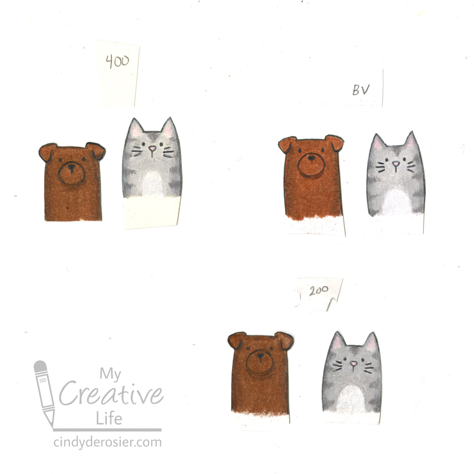
While the Bristol is my go-to for printing, I wanted to see if it was the best option for coloring stamped images with colored pencils. I went through my stash of art paper and pulled out Strathmore 200 Series Drawing Paper (their "Good" paper) and Strathmore 400 Series Drawing Paper (their "Best" paper).


Obviously, I was expecting the 400 to perform better than the 200, but I wasn't sure how either would match up with my printer-friendly paper

I decided to rank the three papers based on five criteria. I labeled each paper, mixed them up, then felt them with my eyes closed. Based solely on touch, I preferred the weight and feel of the Bristol. Next was the 400, and the 200 was a distant third. 

Next, I compared their color. The Bristol packaging indicates that it has a Brightness of 94. I thought Brightness = Whiteness, but it turns out I'm wrong. Neither Strathmore pad mention Brightness (or Whiteness). I like a white paper that is truly white and the Bristol looked the whitest to me. Interestingly, the 200 was more white than the 400. 

Next, I tried stamping on each paper. I used the darling Peek-a-Boo Pets stamp set for the first time. As a side note, I love these stamps but I have to question why several of these animals are in a pet set when a rabbit is not. Fun fact: Rabbits are the third most common pet, after dogs and cats. Anyway, the images I chose (the dog, the cat, and some sentiments) stamped well on each paper. The Bristol and 400 were ever so slightly crisper than the 200. 

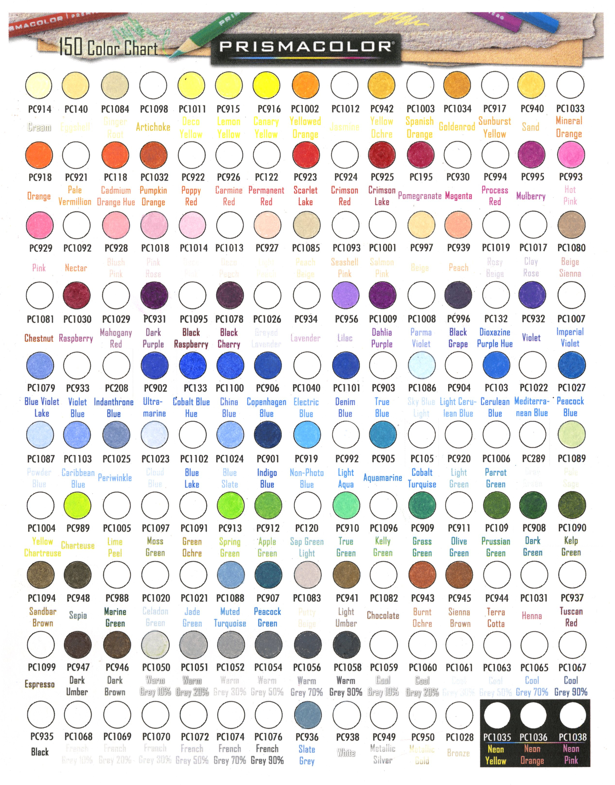
I pulled out my Prismacolor Premiers and started coloring. The first thing I learned is that I need more brown Prismas. Yes, "need." Look how many empty spaces there are on my chart.


The next thing I learned is that the 400 has a tiny bit of texture to it that the others do not. I had to work a little harder burnishing the images on the 400, but it accepted lots of layers much better than the 200 did.


Overall, the Bristol Vellum is my favorite of the three for coloring stamped images. I'm interested in trying out other papers to see how they perform with colored pencils. I'd definitely like to give Strathmore's Bristol a try. 

Do you have a favorite paper for colored pencils? Tell me about it in the comments!

5/3/22

"Dear Entrants,...." - Part Four: Photo Tips for Digital Entries

The pandemic interrupted just about every facet of life to one degree or another. County fairs were no exception. Some canceled outright in 2020 and 2021, while others switched to a virtual fair, with exhibits displayed online. Most, if not all, fairs will be in person for Summer 2022. But that doesn't mean that fairs are operating the same way they did pre-pandemic. Many fairs are asking entrants to submit photos of their projects, rather than the item itself. The entries are judged virtually, then the prize-winning entries are collected and displayed for people to see in person. 

There are some major advantages to this system for entrants, fair staff, and judges, most of which involve saving time and money. But there are some major drawbacks, too. As a judge, it is really difficult to properly assess something via a snapshot. I recently judged paper crafts for a county fair and the overall quality of the photos people submitted to be judged was pretty bad.

I wish I could show you some of the photos that were submitted, just so you understand how terrible they were. To be fair, some of the photos were fine and a few were even good. But there were a few that make me question how its even possible to take such a poor-quality picture. I'm not a good photographer, but there are some basics that literally anyone can do to make a picture less terrible. 

To illustrate just how bad the worst of the photos was, I took this snapshot of the trendiest project I've ever made:


Honestly, as bad as this photo is, it's not as bad as the worst I had to judge because nothing is too blurry to see, there's no glare obstructing the project, and most of the project is visible. When a photo has all those sins and more, it's tempting to disqualify the whole thing. Really tempting.

I've written a series of posts in the past giving advice to fair entrants from their judge (things like, "Don't give your judge fleas.") My recent judging experience has led me to write another letter.

---------

Dear Entrants,

Thank you for submitting your project to the fair. As a crafter myself, I know the time and effort that goes into your creations. As a judge, it is my responsibility to do my best to honor that time and effort. Back in pre-pandemic days when I judged items in person, I would carefully inspect your project from all angles and assess the tiniest details to ensure the best project wins. This is much more difficult to do now that I am judging your project based on a single photograph. 

Since you took the time to enter, I assume you would like to win? If that is the case, I strongly recommend that the photo you submit actually shows your project in its best light. Or, for that matter, in any light. One of you entered a photo that was so dark I could hardly make out the project. Likewise, if there is a light casting a major glare on your project, perhaps you could move the project somewhere else before you take the photo? Photos taken in indirect, natural light are usually best. 

It seems obvious to me, but apparently it needs to be mentioned: if you want me to judge your whole project, your whole project should be in the photo. If you're entering a scrapbook layout, but I can only see 60% of the page because you've zoomed in too far, I'm going to struggle judging it. And while your whole project should be in the photo, your whole room should not. Don't set your layout on the couch and then move to the other side of the room to photograph it. The picture is supposed to be of the layout, not of the couch. (You've done a lovely job decorating the living room, by the way!) 

A plain background does wonders to highlight your project. An empty tabletop or even the floor make acceptable backgrounds. I like to set a sheet of plain posterboard down and photograph my projects on that. Contrast is helpful. If your project is black or another dark color, photograph it on a light countertop or tablecloth, or on white posterboard. Do the reverse if your project is a light color. 

If your photograph is blurry, try taking another one. Isn't it nice to be in the digital era when we can take as many photos as we want and we know instantly if they are any good? Take advantage of that and don't just submit the first photo you take. I frequently take ten or more photos of my projects in order to get one I like. 

I want to say how much I appreciate those of you who took the time to make my job easier. One of you photographed your entry next to a coin to give me a sense of scale. That was very helpful!   

Pictures can be worth a thousand words, so when you submit a digital entry to the fair, think what words you want your picture to convey. Take the time to ask yourself what a judge will see in your photo. You've spent a lot of time creating a beautiful project and we want to see it and judge it fairly. 

I can't wait to see what you enter next year!

Sincerely,
Your Judge

5/2/22

Plastic Wrap Rainbow Painting

I painted this rainbow trivet using plastic wrap. It was really fun to do and only took a few minutes.  


Rarely is a craft truly appropriate for ALL ages, but this one is! Toddlers and preschoolers will enjoy the interesting feel of the paint under the plastic wrap (and their parents will appreciate that there's no mess). School-age kids can explore color blending as they paint the trivet. Even teens and adults will find this project fun to do! 

I did my plastic wrap painting on a 6" square of wood to use as a trivet, but you could use a different size to make coasters or a wall hanging, or switch up the materials and paint a canvas or any other substrate. Affiliate links below. 


Plastic Wrap Rainbow Painting


Materials: 


Steps: 

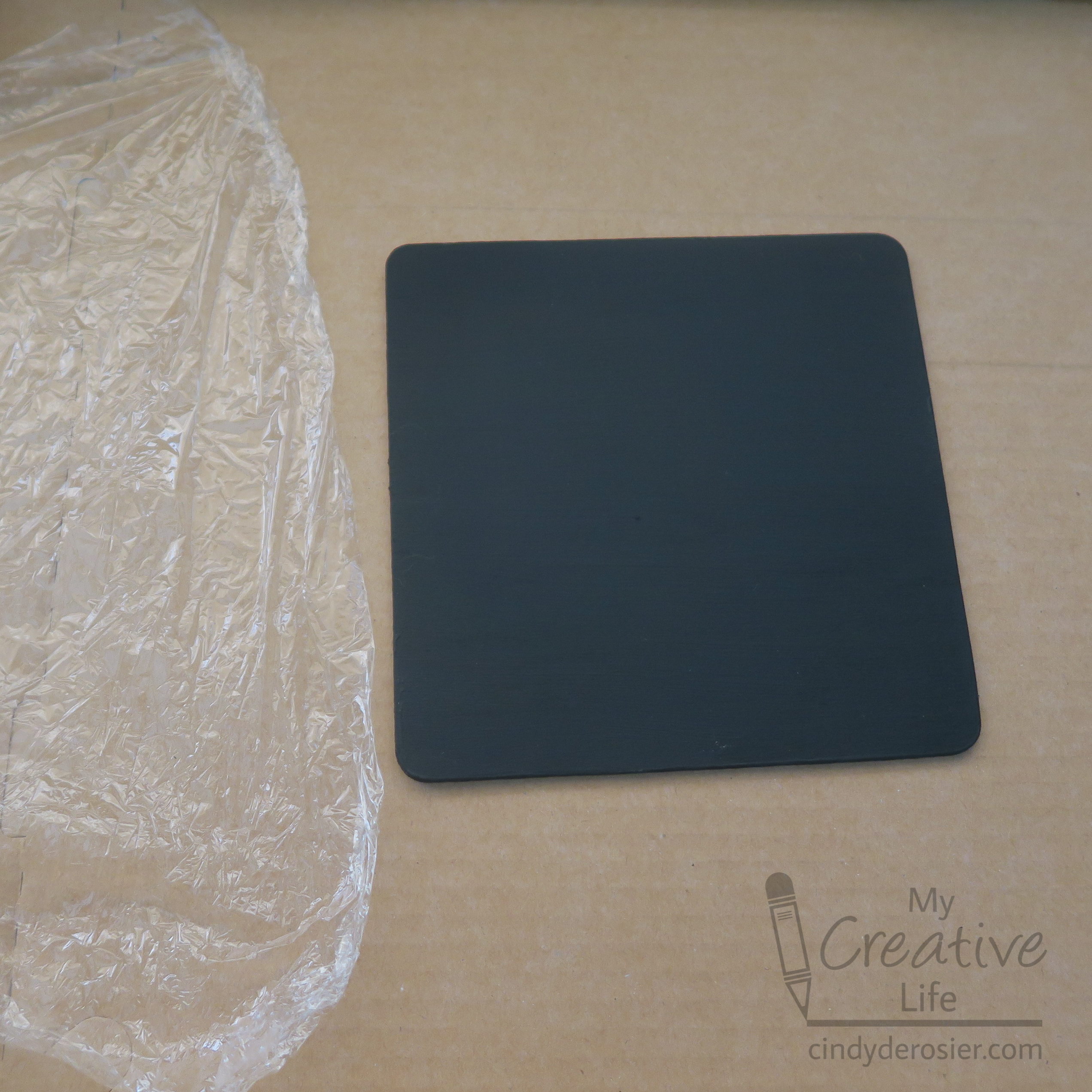
Protect your work surface with cardboard or newspapers, then prepare your substrate as desired. I put a black base coat on mine. Cut a square of plastic wrap that is a few inches larger than what you're painting. 


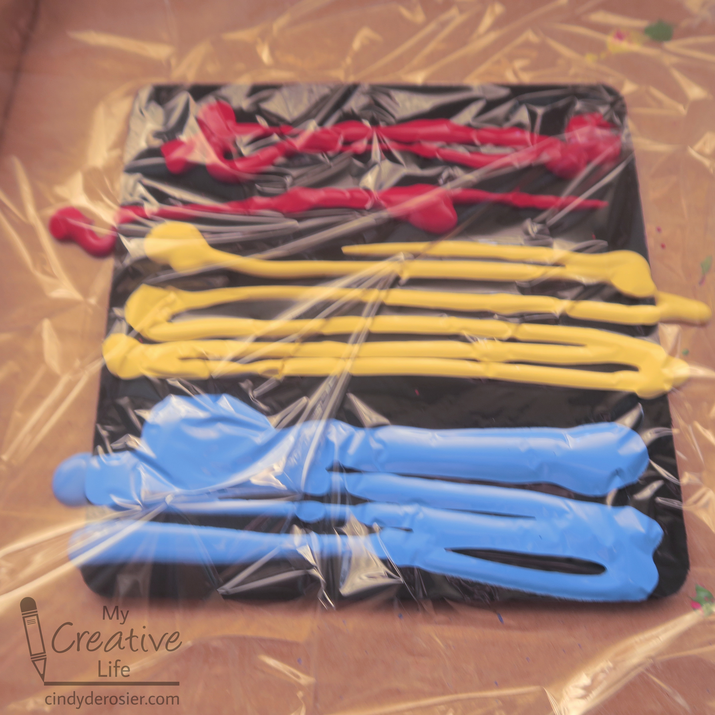
Squirt red, yellow, and blue acrylic paint onto the surface, then cover it with plastic wrap. Apply a generous amount of paint, but leave gaps between the colors as shown. 


Press and squish the paint around through the plastic wrap. It's a neat feeling. As you move the paint, the primaries should mix to make orange and green. Mine don't show up well in this photo because of the weird lighting, but they're there. 


Peel away the plastic wrap to reveal the design. Let the paint dry completely. 


In better light, my orange is iffy, but you can definitely see green. 


If you'll be using your project as a trivet or a coaster, you'll want to seal it with Mod Podge and add felt to the back. If it's hanging on the wall, that won't be necessary. 

In retrospect, I should have used truer primary colors in order to get good secondary colors, but I'm happy with how it turned out. Part of the fun is that no two are ever quite the same.

4/29/22

Back Where it All Started

I have been blogging for 11 years (!), but my entry into the professional crafting world started three years before that. Shortly before Trevor's second birthday, I was hired by a local scrapbook store called Remember When. In spring 2008, the owner (Brenda) was looking for both designers to create projects for classes and the teachers to teach those classes. Oddly, employees could only be one or the other. If you designed projects, someone else taught the classes to make those projects. If you taught classes, you were teaching someone else's design, using yet another person's lesson plan. (One employee wrote lesson plans and put together all the class kits and could neither design nor teach.) I'm not sure what the logic was of dividing the work this way, other than some sort of checks-and-balances idea. Anyway, I applied for both open positions and when I was hired, Brenda gave me the choice of designer or teacher. I'd been a classroom teacher for 11 years and had absolutely no design experience, but I selected the design option. It sounded more fun and would definitely be more of a challenge. But most importantly, the hours were flexible, which they wouldn't be if I were teaching classes. I loved the job. 

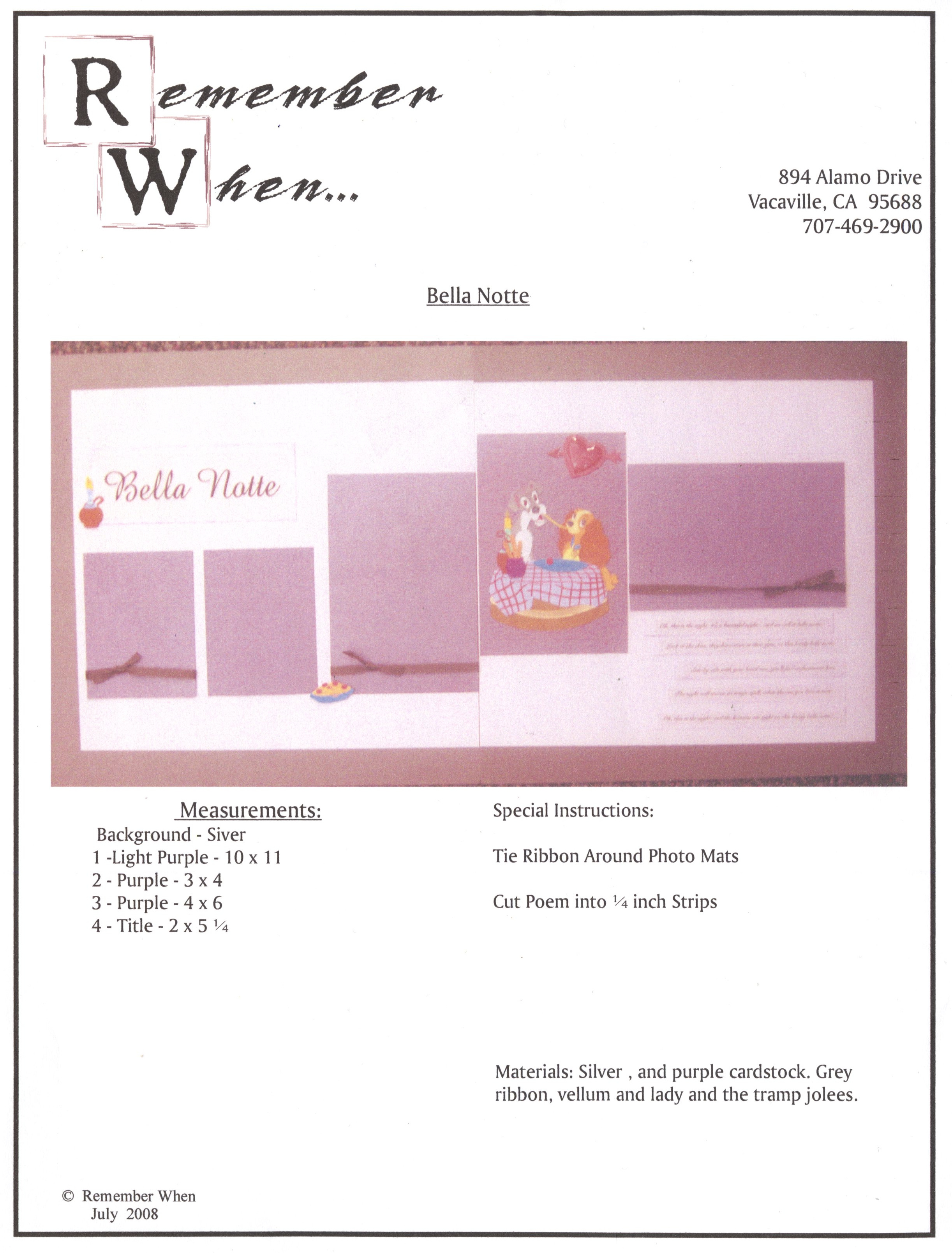
Each month, I was assigned a few layouts and/or cards to design to fit a particular theme, material, or skill. One of the first layouts I ever made was this Lady and the Tramp themed project called 'Bella Notte.' My job was to create a simple, beginner-level, multi-photo, two-page spread featuring Jolee's stickers (which were all the rage in 2008). 


As you can see, the page used silver, light purple, and dark purple cardstock, grey ribbon, vellum, and the Jolee's. The class consisted of cutting things to size, tying ribbon, using adhesive, and adding stickers. 

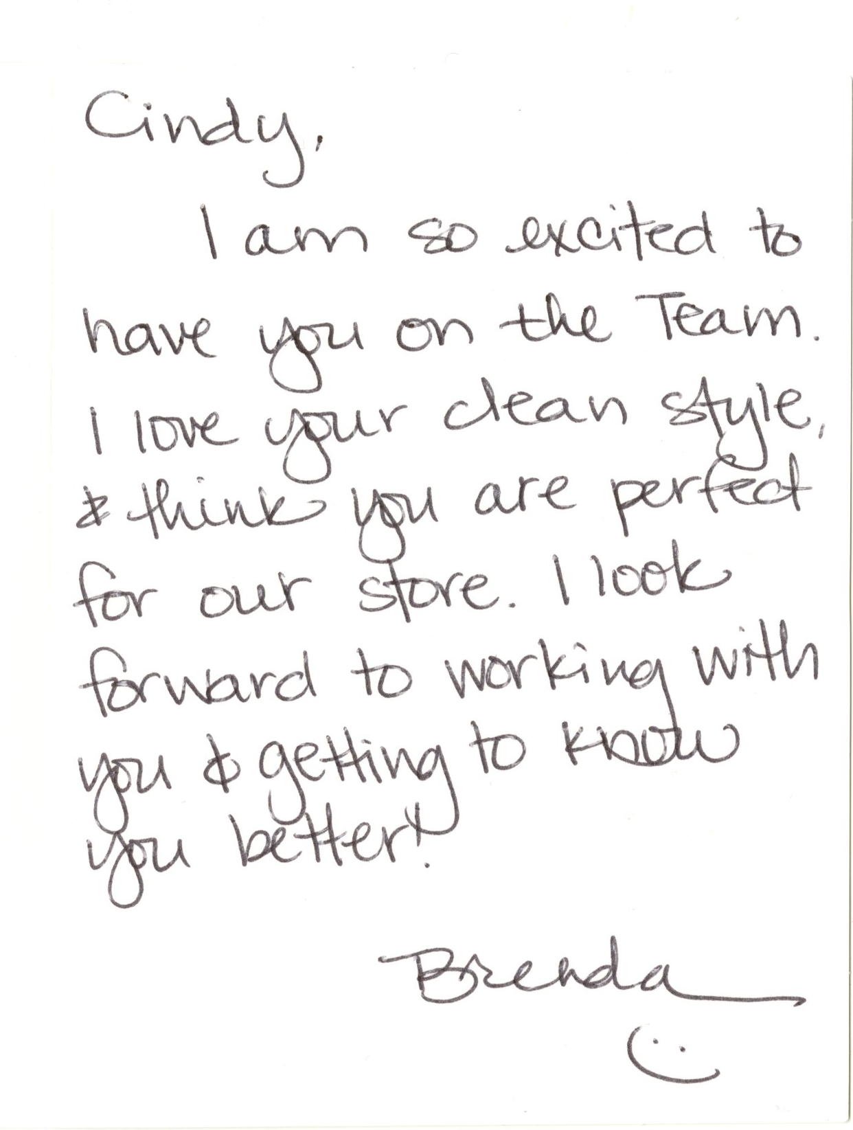
This is the only lesson plan I ever received (since I never wrote nor taught my designs). I found it recently when I was cleaning out files, along with this: 


It's very interesting to me to read back over the guidelines, particularly the Page Expectations. My biggest challenges were #1 (I had to remind myself to measure and write everything down); #3 (I hated incorporating 3-D items then as much as I do now), #7 (I struggled mightily to use all the embellishments in a pack or all the stickers on a page), and #8 (when making the pages at home, it was hard to know what there was a lot of in stock or what was leftover from past classes, so I had to take a lot of notes when I was in the store). 

None of my projects were ever rejected (#7 on Creative Team Expectations) and it was amazing being paid to make layouts and cards, even if I didn't get to keep the finished items. It allowed me to stretch myself creatively and explore product and themes I wouldn't have used in my own scrapbooking. Most importantly, it started me along the path to where I am now.   


Sadly, my time at Remember When was very short. Brenda decided to relocate (and thus close the store) about six months after I started. It's crazy to think how that small job led to the next and the next and the next. It's a good reminder to jump through a door when it opens, because you never know what's on the other side.