2/10/23

Family Fun at Napoli Culinary Academy

If you're like me, buying gifts for older relatives is challenging. They are trying to downsize and don't want to collect more things, and/or they just buy themselves the things they want when they want them. There's only so many times you can give them the same consumable items before it doesn't feel like a thoughtful gift anymore. 

Experiential gifts are the perfect solution. This year for Christmas, we gave Steve's parents, aunt, and sister a certificate for a cooking class and dinner at Napoli Culinary Academy in Sacramento. I designed and printed cards using the academy's logo, then backed them with cardstock. Then I went through all the available classes in January and February with room for 7 people, on dates that didn't conflict with previous obligations, and with menus that worked with various family members' food restrictions. I put those onto a separate sheet, along with a flag showing that particular day's cuisine.  


When we got together to celebrate Christmas (ahead of time because we thought - incorrectly, it turns out - that we'd be flying on Christmas), they picked their desired date and cuisine. Here's a closer look at the options: 


They all look good to me. The group picked "A Taste of Italy" on February 7, so I made the reservations.

During the day, Napoli Culinary Academy is a non-profit cooking school offering diplomas in Culinary Arts. In the evening, those students act as staff for the 3-hour cooking classes like the one we did. They also operate a cafe and do catering. 

When you arrive, you take a seat along the outside of a U-shaped table. You can order drinks from the full bar. 


Next is the cooking demo. The chef demonstrates (with help from the audience) on a small center table with overhead cameras that project to screens behind him. For our class, he demonstrated cream of broccoli soup and pasta puttanesca. We got to taste each - delicious!


The 17 attendees were divided into 2 teams, then we headed into the kitchen. During the demos, the culinary students had done all of the prep work for the meals we would be assembling. Here you can see Teri on the left working on the puttanesca and Trevor on the right making cream of broccoli soup. The rest of the family tried to squeeze in behind them, but there wasn't room. 


There was space for 4 people on each team to work comfortably. For our team of 9, that means 5 of us weren't participating. That was fine with me, as it gave a chance to take pictures, but it's a consideration if you're expecting every person to get to have a hand in making the meals. 


When the food was ready, we returned to our seats and the culinary students plated the food we'd made. We all LOVED the broccoli soup. 


Look at these happy faces!


The puttanesca was a hit, too. (Does anyone else immediately think of these books when see 'puttanesca'?)


The portion size was enormous. They recommend you bring containers to take home your leftovers and all of us did. 


There was no demonstration, nor explanation, of our dessert. It just showed up. Since affogoto is just vanilla ice cream with espresso poured over the top, it didn't require explanation or demonstration. I didn't think to take a photo, so you'll have to imagine a dish of ice cream with an inch of coffee at the bottom and a ladyfinger resting at a jaunty angle. 

Overall, we enjoyed the experience. It was fun to do together as a family and definitely something I'd consider again. I'm especially interested in Napoli's 'Cooking with the Movies' nights. In addition to the Sound of Music theme that was one of the choices I gave my inlaws, they also have classes built around The Little Mermaid, Lady and the Tramp, Ratatouille, the Godfather, and more on their calendar. I definitely recommend Napoli Culinary Academy. The class was a great gift for difficult-to-buy-for family members and a unique way to spend an evening. 

2/9/23

Library Roulette, Class 700: How to Draw Kawaii Vegetables

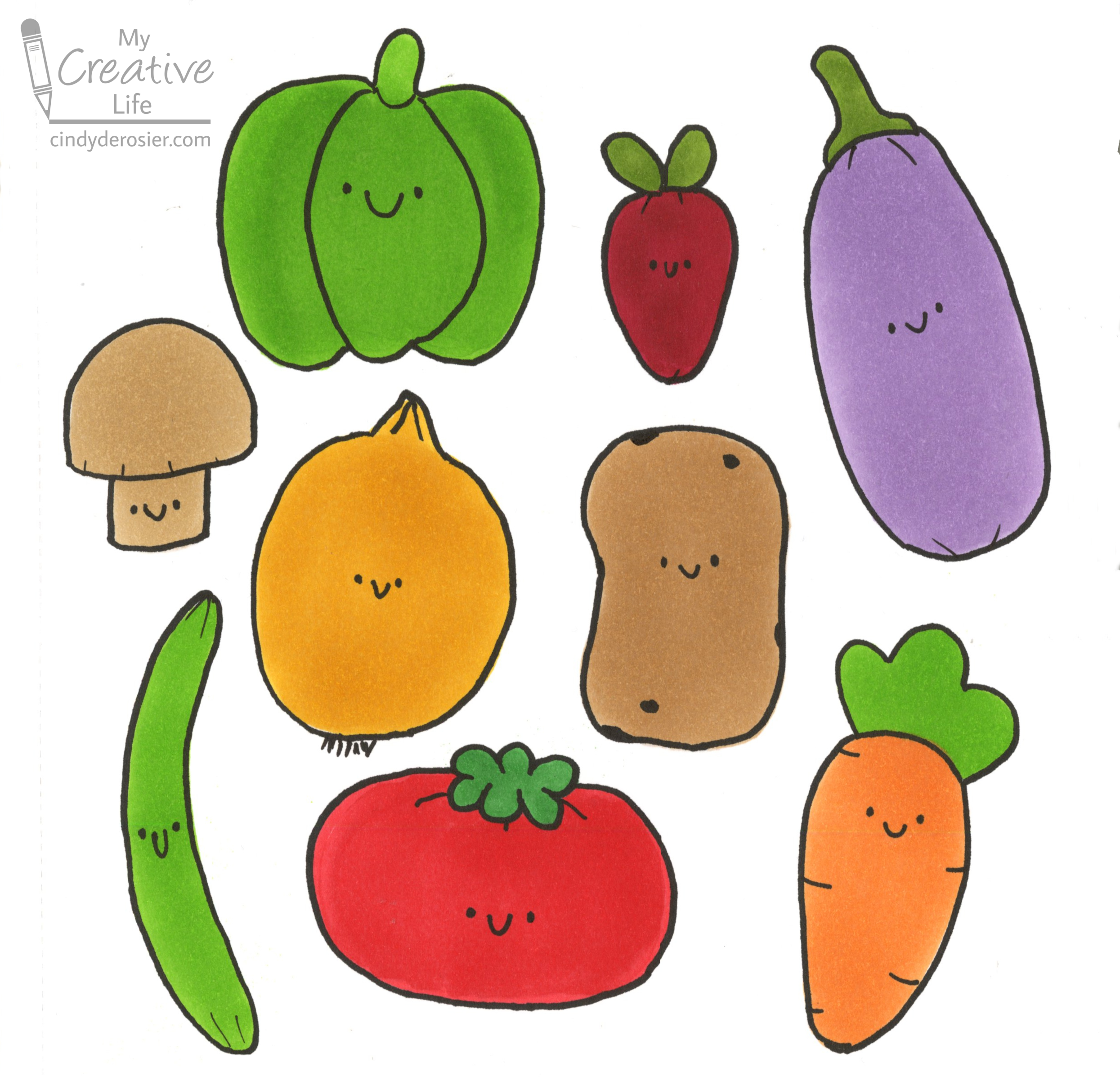
For the fifth (and final) craft in my Library Roulette Class 700 project, I drew vegetables. Cute vegetables, that is. 


This time, my random number was 745, the category for Decorative Arts. I chose the book Crafting Cute: Polymer Clay the Kawaii Way by Dani Banani. (Affiliate link here and throughout the post.) The book begins with an introduction and an explanation of kawaii ("cute" in Japanese) and chibi (an exaggerated, minimalist drawing style). Next is an excellent explanation about working with polymer clay. The rest of the book has detailed instructions to make 50 adorable anthropomorphized projects using polymer clay. The writing is excellent and the many step-out photos make this a great book for beginners. 

Rather than work with polymer clay, I opted to take inspiration from the Pickle Charm project to draw kawaii vegetables. 


Looking at this project and the others in the book (the finished clay pieces, not the illustrations), I identified characteristics of Banani's work that I wanted to include. 
  • projects are done in a solid color, in a lighter shade than the real item would be
  • the proportions are shorter and squatter than in reality
  • all edges are rounded
  • details are minimal or non-existent
  • the faces consist of a tiny smile and two dots, done in black, and lined up with each other

This project gave me the perfect opportunity to test out the Marker Sketchbook I received from Ohuhu. The smooth, heavyweight paper is designed specifically to use with Ohuhu markers and they colored like a dream in this sketchbook. 

I started by putting vegetable-shaped blobs of color onto my paper, trying to keep them short, squat, and rounded. I started with the carrot and eggplant (since I'm left-handed). I didn't plan ahead with overall placement; the next vegetable I drew was whatever fit nicely into the remaining space I had, both in terms of space and not repeating a color. The mushroom and the bean were last, since I hadn't left myself much room in the left-hand side!


Then I used a Black Honolulu to add faces. I outlined each vegetable, then added tiny lines to imply dimension to the carrot, eggplant, radish, tomato, mushroom, and bean. I made full lines on the bell pepper - in retrospect, I wish I hadn't. I added small lines to both the top of the onion and the root end. Finally, I added a few small spots on the potato. 


I've really enjoyed trying to mimic different artists' styles in the past and this was no exception. I've never drawn anything with a kawaii and/or chibi style, so it was fun to try something new. The happy vegetables make a great first page in my new marker sketchbook. Every time I work in it, I'll have these smiling faces greeting me!

2/8/23

Library Roulette, Class 700: Northern Lights Painting

For the fourth craft in my Library Roulette Class 700 project, I painted the Northern Lights. 


This time, my random number was 751, which is the category for Painting Techniques, procedures, apparatus, equipment, materials, forms. The book I selected is Color Harmony for Artists: How to Transform Inspiration into Beautiful Watercolor Palettes and Paintings by Ana Victoria Calderón. 


It begins with an introduction to color theory, then the bulk of the book consists of two-page "Inspired Palettes" spreads. These are divided into categories: Notable Art Movements; Expressive Skies; Colorful Cultures; Animal Wonders; Cities, Towns, and Destinations; Influential Eras; Remarkable Landscapes; Florals and Still Life; Mineral Riches; and Human Hues. For each spread, the left page has an introduction and a photograph. The right page has a large palette inspired by that photograph and a smaller painting below. 
 

This book is absolutely beautiful. I love flipping through it and seeing all the inspirational palettes. It was very difficult to select just one palette for my Library Roulette project, but something about the Northern Lights stood out to me. Probably because I had just discussed tentative plans with my sister for a family trip to Iceland. Honestly though - I could have picked a page at random and happily painted whatever was there. 

While this book is positively packed with inspiration, it is not an instructional book. You won't find any step-by-steps or helpful hints. For that, you're on your own. I don't really know what I'm doing with watercolors, so my attempts to paint the Northern Lights ended up a bit muddy as I tried to layer colors and blend them. 

Here's a look at my process. I started by taping off a page in my sketchbook, then swatched colors from my favorite watercolor set


Then I did a basic undercoat. Rather than rinsing away the excess paint, I just put it on the right-hand page. No plan or goal. 


When that was dry, I sprayed some white mist for stars, then added a simple foreground. I don't really like the results, but that's ok. I really enjoyed the book and might try the Northern Lights project with acrylics, which are easier for me than watercolors. Maybe I won't. Either way, it was fun, I discovered a great new book, and I learned something, so mission accomplished. 

2/7/23

Celebrating 250 Years of 'Amazing Grace' with a Coloring Page Inspired by Stained Glass

This year marks 250 years since the hymn Amazing Grace was written. It's one of my favorites (although for some reason I didn't include it in this list of my faves) and I think a lot of Christians would include it on their list of favorites. A quick search of "most popular hymns" confirmed this for me. Open the Bible lists 'Amazing Grace' as #1 of the 25 most popular Christian hymns. GodTube also places it at #1, as does Music Grotto and a bunch of other sites. In fact, every link I opened had it within the top 3 of all time. 

Our church is starting a multi-week study of Amazing Grace for our Adult Forum. That inspired me to make a simple coloring page to go along with the lessons. I made and printed the page last week, but I didn't color it until Saturday, when my grief about losing Trouble made it impossible to do anything else.


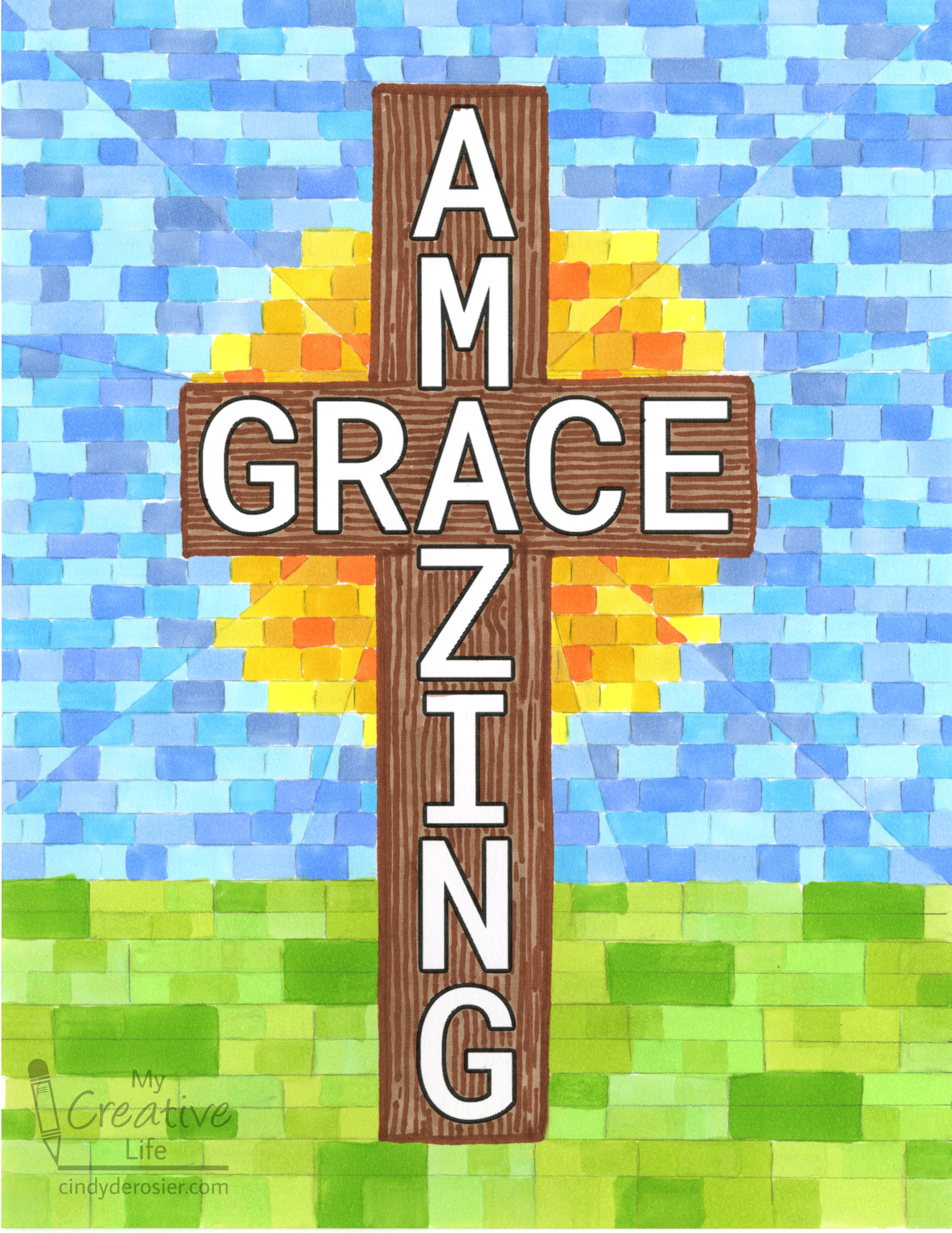
I hadn't imagined anything nearly so detailed when I designed the coloring page.


But it felt right. Coloring soothed me as I grieved. What would have ordinarily felt ridiculously tedious was instead comforting. 

I colored the cross first, using two Ohuhu Honolulu markers to make the wood grain. 


I wanted to make the background look like stained glass, so I drew some light guidelines below the horizon and colored in that section with six shades of green. I liked it, but decided to do the top section with smaller blocks of color. I added a bunch of guidelines that were much closer together than the others, then added diagonal lines to mimic the panels of stained glass. I didn't measure any of this (which you can tell in the finished product); I just went with what I felt at the time. 

I imagined a warm, comforting glow behind the cross, so that's what I colored next. I used six shades of yellow and orange Honolulus. 


After finishing the sky (6 more shades of Honolulus), I didn't like how blocky the grass area looked, so I went back in and tried to create smaller blocks out of what was already there. It didn't work with the darkest green, but I was able to break up the other blocks.  


The final step was mimicking the lead lines in the stained glass. I used a medium grey marker for that.  


I learned a lot from coloring this page. First, and most important, is that coloring can be incredibly beneficial during difficult times, especially coloring an inspirational image that feels comforting. My other lessons were less profound. Among them, when I don't feel like measuring something that really should be measured, I can use the computer to do it for me. It would have taken less time to add the guidelines digitally and reprint my coloring page than it did for me to draw them by hand, and the results would have been significantly better. With that in mind, I'll be creating a new version of my coloring page with the guidelines in place. 

2/6/23

Forever in our Hearts

We had to say goodbye and my heart is broken.


Trouble deRosier
Born 10/15/10
Adopted 6/25/11
Gone 2/3/23

----

Forever in our hearts.