I've been doing more design work for my church, St. Mark's. We wanted to have more eye-catching, modern, and cohesive graphics to use in the newsletter. The first is for our Bible Study and the second is for our community-building and education activities, which we call Growing Together.
I like the way they look separately, but I especially like them together. This is what we had before. They were done by different people, years apart.
We have a 3-part mission statement at St. Mark's. Our mission is to:
Nurture Discipleship
Communicate the Gospel
Serve the Community
Each year, we focus on one of the three. In 2026, or focus is on Serve the Community. Pastor Karen asked me to make a graphic for that back in late December. I didn't blog about it at the time, so I'll share it now.
I love doing design projects like these. I am especially glad to be able to use my time and talents to benefit my church.
The St. Mark's Quilters have come a long way in a year. Our group has grown to include community members and friends who are not part of the congregation but feel strongly about the mission of providing quilts to people in need.
Not only have we grown in numbers, but we now have a large dedicated space! It has made all the difference. Our weekly meetings used to be 30% setup, 40% quilting, and 30% cleanup. Now we are able to spend 100% of our time quilting. It's such a blessing. We have two large tables for arranging quilt squares and then doing the actual quilting. We are talking about adding a third. We have sewing and ironing stations.
We also have lots of storage. These rolling shelves hold donated fabric that needs to be ironed and cut, squares that are ready to be pieced together, and quilts that are ready to be bound. All of the quilts you see at the top left are completed and ready for Ingathering.
I love our little group and look forward to quilting each week. Keep up the excellent work, St. Mark's Quilters! We are making a difference.
I'm on a committee to improve the digital presence of our church, St. Mark's Lutheran in Fairfield, California. That includes the website, newsletters, and social media channels. Our first step was developing a brand kit, one component of which is a logo that represents who we are as St. Mark's. On Sunday, after a lot of hard work, we debuted our new logo.
The first step in creating a logo was deciding what we wanted it to say about us. During our two most recent congregational retreats, we have focused on how we see ourselves as a congregation and how others see us. I used the detailed notes from these retreats to identify the five key words that were mentioned the most often to describe us: Welcoming; Friendly; Generous; Faithful; and Family. Put together into a sentence, they became: "At St. Mark's, we are a welcoming, friendly, generous, and faithful church family." This sentence guided the rest of the process.
Next, I researched the colors associated with each of the five key words.
Generous = green (nature, balance, kindness, growth, renewal)
Faithful = white (reverence, purity)
Family = green (growth, stability, belonging)
Based on this, we set a color palette of green, white, yellow, and orange, to show that we are welcoming, friendly, generous, faithful, and a family.
There are countless shades of each of those colors, so as a next step, I went to the sanctuary and took photos of our stained glass and other architectural features. Then I used an eyedropper tool to pull the colors directly from the digital files to create a handful of potential color palettes.
While the rest of the team picked just the right shades, I started designing logo options in greyscale, incorporating images and shapes that fit with our guiding sentence. The team selected their favorites and we looked at those logos in the colors that represent our St. Mark's family. From there, we selected our new logo.
If you are interested in seeing my actual presentation to the congregation, you can watch it below:
Thanks to my fellow committee members: Ann, Diane, June, and Pastor Karen. We're a great team. I love our new logo!
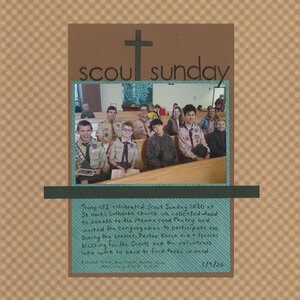
Trevor's Scout troop celebrated 2020 Scout Sunday at our church, back in February when going places in person and sitting next to other people was actually a thing. I put together this very simple layout to document the event.
I'm looking forward to the time when we can safely return to church. I really miss my church family. We have been participating in the weekly service via Facebook Live, and I am very grateful to everyone who makes that possible.
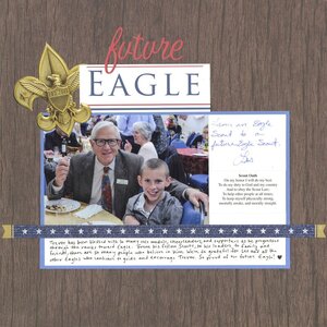
Trevor has been in Scouts since he was six and loves it. He earned the Arrow of Light (the highest Cub Scout rank) in March 2017 and has been working on Boy Scout ranks ever since. He has completed all the requirements for First Class and is scheduled for a Board of Review on Wednesday. We're so proud of the hard work Trevor has put in to reach this milestone.
When Boy Scouts started, First Class was the final and highest rank, signifying that a boy was a complete outdoorsman. Now, in addition to the original four ranks, there are three additional ranks: Star, Life, and Eagle. With the completion of First Class, Trevor is officially on his way to Eagle. He has a lot to do along the path, but I'm confident that he will get there.
Why I am so confident Trevor will get there? Steve and I support and believe in him, of course, but it's much more than that. Trevor has the support of many others: his fellow Scouts, his leaders, other family members, and friends. Most important of all, he has mentors, those who have gone before him and reached Eagle. Cousin Ian. Peers Mateo and Charlie. Church friends Garrett and Les. And so many others.
This photo was taken at a church event. Les and Trevor were seated next to each other and spent time chatting about Scouts. Les gave the print to Trevor and signed it "From an Eagle Scout to a Future Eagle Scout." I knew I had to scrap it. The wood grain background is from the Great Outdoors collection from Paper House Productions and the star border sticker is from their Let Freedom Ring collection. I cut the Eagle emblem, Eagle title, and Scout Oath from an extra copy of the program from a fellow Scout's Eagle Court of Honor. The script letters are from Websters Pages. I'm so happy with how this page turned out and can't wait to see all the great things Trevor accomplishes with so many people behind him.
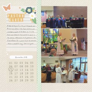
I briefly mentioned the installation for our church's long-awaited new pastor in this post about the S'mores Casserole I brought to the potluck that followed the service. It was a wonderful day. Our congregation celebrated with at least a dozen local pastors from various congregations as well as and Pastor Karen’s family. She gave Trevor a role in the service as book bearer. He did a great job, though I don’t think the officiant had expected the person holding the Bible for her to be so short!
I used the same collection from Chickaniddy Crafts that I did to scrap about saying farewell to our Interim Pastor Tim. I thought that was a fun parallel. The two layouts look quite different and I love them both. Just like Pastor Karen and Pastor Tim - quite different and I love them both.
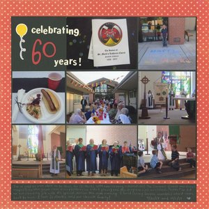
It's a little crazy that I made so many layouts on National Scrapbook Day that I'm STILL sharing them 4 weeks later, but the end is near. This is the second-to-last of the pages I made on NSD. It documents the 60th anniversary celebration for our church. I joined St. Mark's Lutheran Church 20 years ago when I was single, teaching, and a new resident of Fairfield. A lot has changed in that time, both for me and for the church. Some good, some not good, but I'm thriving and so is the church. It was great fun to be a part of celebrating 60 years.
Our church is in the process of finding a new pastor. For two years, Pastor Tim was our interim pastor, helping us and guiding us as we grieved the loss of our previous pastor, and helping us prepare to call the next pastor. We had to say goodbye to him in April, as he was reassigned to another church. We'd known all along that he was temporary and we tried not to get attached. But it was no use. Saying goodbye was really, really hard.
I chose the mint, peach, and grey colors to go with the banner and stained glass in the photos. What's funny is that the collection I used is called Date Night... the same one I used to scrap about my 13th anniversary. In other words, pretty much the last papers most people would reach for when scrapping about their pastor! But that's the beauty of B-sides. The pastel stripes that coordinate so well with the Easter banner give no hint of the date-themed papers hiding on the back.
I entered this layout in the National Scrapbook Day Crafter's Choice Challenge.