Showing posts with label Inspired By. Show all posts

9/4/25

Self-Portrait, Inspired by Tim Burton

I really enjoy creating projects inspired by other artists, particularly those whose style is nothing like my own. It's fascinating to see that, no matter how much I try to stay true to the artist's aesthetic, my own style is evident. That's definitely the case with today's self-portrait, which is inspired by Tim Burton. This is a great project to do with kids any time of the year, but it's especially fun during the Nightmare Before Christmas season. Affiliate links below. 


Self-Portrait, Inspired by Tim Burton


Materials: 


Steps: 

Start by deciding if you will be drawing just yourself or if others (like a pet) will be with you. Lightly sketch an oval head for each character on the toned paper. Add very large circles in the middle of the oval for eyes. Then fill in the rest of the features. The mouth, nose, and human ears should be undersized. The bunny ears should be large. Draw the rest of the torso for each character. It should be very skinny - much skinnier than I made mine! 

When you are happy with your pencil lines, trace them with the Flair pen. Add hair. Then fill in the details: pupils in the centers of the eyes, short lines for eyelashes, small eyebrows, and bunny whiskers. 


Color in the eyes and the bunny's tummy with the white colored pencil. You may need to redraw the pupils after coloring. 

Use the pencil to add shading: around the outside of the eyes, on the side of the nose, along the insides of the face, under the chin, on the shoulders, under the arms, and in the bunny's ears. Add depth to the hair by filling it in with more pencil lines and shading. 


I stopped here, but feel free to add gothic-style clothing, a whimsical border, or an interesting background. You could also make a cool paper frame. Let your creativity go wild!

8/11/25

Summer Creative Workshop: "Be You" Cut Paper Collage

The fifth project I completed during Summer Creative Retreat was another paper collage. It was so much fun to make and I love how it turned out! Appropriately, it's totally me. :)


This class was taught by Lynn Giunta, who is now one of my favorite artists. I adore her collage work and the positive messages they convey. She has been a master artist with Hallmark for over 40 years. 

This is the project that Lynn made during her workshop: 


I love Lynn's teaching style and will be looking to see if she offers any more classes. I would definitely like to explore her artwork further and see what else I can learn from her. 

6/5/23

Painted Fruit Bowl, Inspired by Romero Britto

It's time for the next project in my "Inspired By" series, where I make a piece of art in the style of another artist. This time, I was inspired by Romero Britto. Britto is a Brazilian artist who has spent his adult life painting, sculpting, and printing in Miami. He is the founder of the Happy Art Movement and aims to spread happiness, fun, love, and optimism through his colorful artwork. He is one of the most famous living artists and is thought to be the most licensed artist in history. 

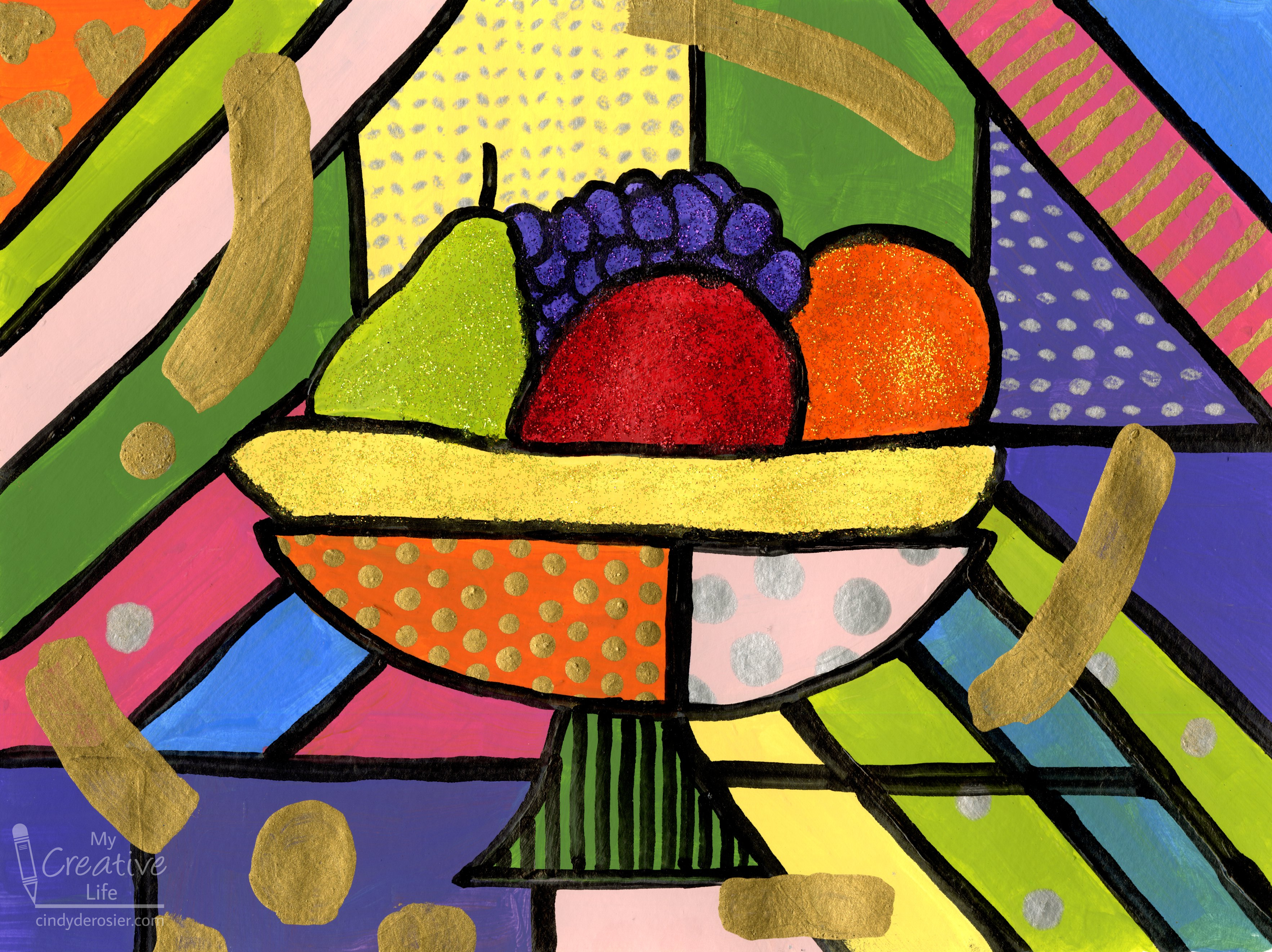
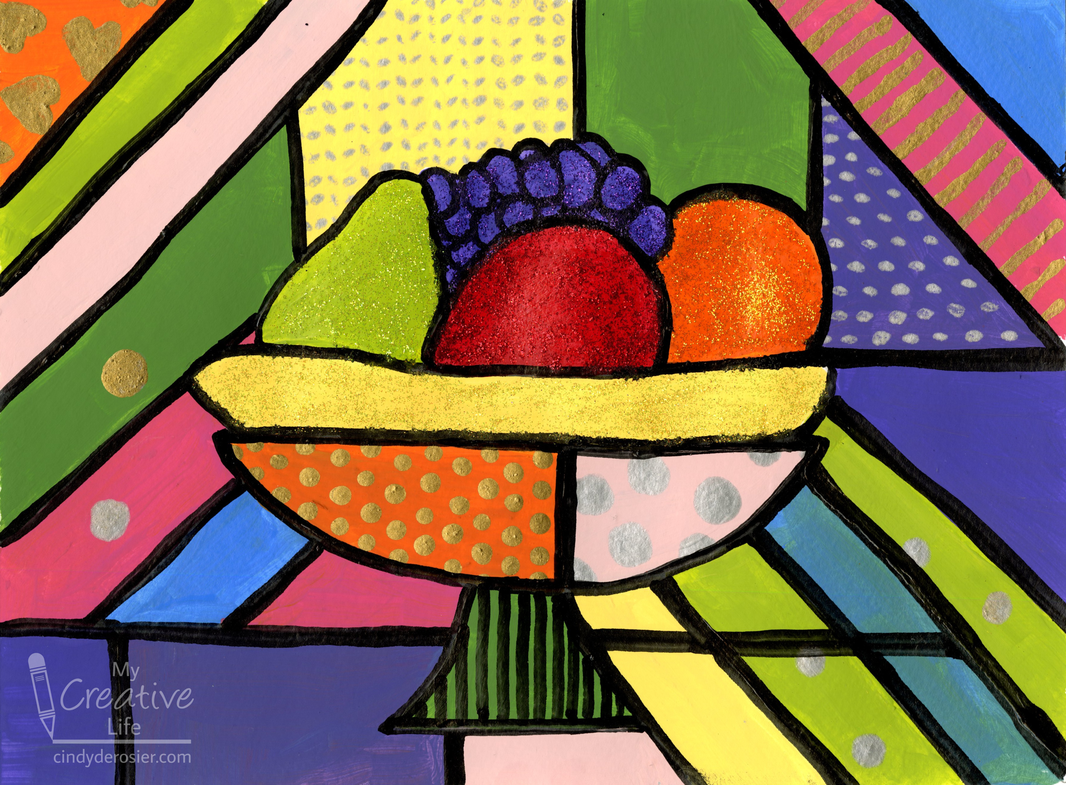
My painting is called Fruit Bowl


Before I started painting, I made a list of the characteristics of Britto's paintings that, to me, best define his style.
  • bold, bright colors separated by heavy black lines
  • happy subject matter 
  • pops of glitter and gold
  • doodles, especially circles and hearts
  • swoops of color over the black lines

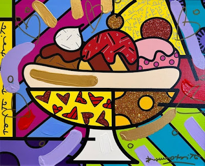
Britto's subject matter is broad, so I selected one piece, called Banana Split, as my inspiration: 
 

Rather than make my version of his Banana Split, I used the banana as inspiration for a fruit bowl. If I were teaching this lesson to a group of kids, I'd challenge them to think of other items that could be sitting in a dish like that besides a banana split or fruit. It could be other foods, but there are countless other options. It's always so much fun to see what creative things kids dream up!

I did a light pencil sketch of the bowl and the fruit, then painted blocks of color. 


When that was dry, I painted some gold and silver dots and hearts in a few of the color blocks (affiliate link here and below). 
 

Then I rubbed Stickles onto just the fruit and let that dry. Then I used Testors' Black Gloss Marker to draw my lines. 


In retrospect, I should have done the black lines first and the glitter afterward. The paint marker went over the glitter just fine, but it bled a little. It's particularly evident on the banana. I totally should have known better. 


Finally, I added some big swaths of gold to the painting. I wish I'd given their placement a bit more thought. I'm particularly unhappy with the one in the upper left, as it leads the eye out of the painting instead of into it. 


The whole painting could have benefitted from more thought, to be frank. I made some choices I would definitely change if I made a second attempt. But that's a good thing because it means I learned a lot in the process.


3/16/23

Painted Dragonflies, Inspired by 6th Grader Jack M. from Arkansas

I've been painting dragonflies in my sketchbook. Whimsical, colorful dragonflies. 


Immediately before I started painting dragonflies, I was doing prep work for an upcoming trip to Arkansas. I'm very excited to get to see some of the things we were supposed to have seen over winter break. I thought rescheduling the trip would be a lot easier than it's turning out to be. I'd already done all the research before, so it's just a matter of booking exactly the same things, right? Nope. We're traveling for a different number of days. Attraction hours have changed, due to the season and holidays. Hotels I'd booked for winter are full or prohibitively expensive for when we'll be traveling. All this to say, I'm basically having to redo everything.

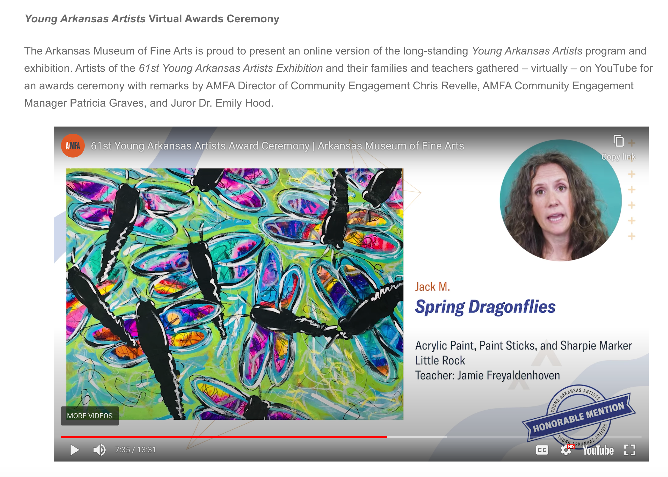
But plenty of good has come of this. We'll be visiting a few places that were closed over the winter holidays and now will be open. The extended daylight hours and non-freezing temperatures make parks, botanical gardens, pedestrian bridges, and other outdoor attractions much more, well, attractive. And speaking of attractive, I stumbled across the awards ceremony for the 61st Young Arkansas Artists Award Ceremony

One piece stood out to me: Spring Dragonflies, by Jack M. Jack is a 6th grade student of teacher Jamie Freyaldenhoven, somewhere in Arkansas. Or at least, he was. The video was posted 10 months ago, so presumably Jack M. is in 7th grade now. 


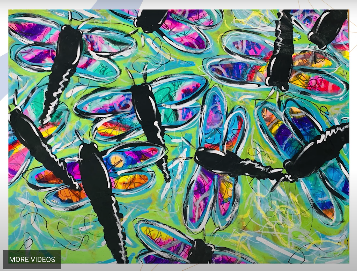
Jack got Honorable Mention, but I am awarding him Judge's Favorite. I love Jack's artwork. The colors, the textures, and the sense of motion really draw me in. I dropped everything so that I could make my own version. This is officially the latest project in my "Inspired By" series. As before, my style is nothing like this artist's. I was curious to see how my personal aesthetic would come through using Jack's piece as inspiration. 

I know absolutely nothing about his process, although I do know he used acrylic paint, paint sticks, and a Sharpie. I don't own paint sticks (something to add to my Amazon wishlist?), but I own plenty of acrylic paint and Sharpies. (Well, not plenty. I'm always on the lookout for new colors of both.) Affiliate links here and below. 

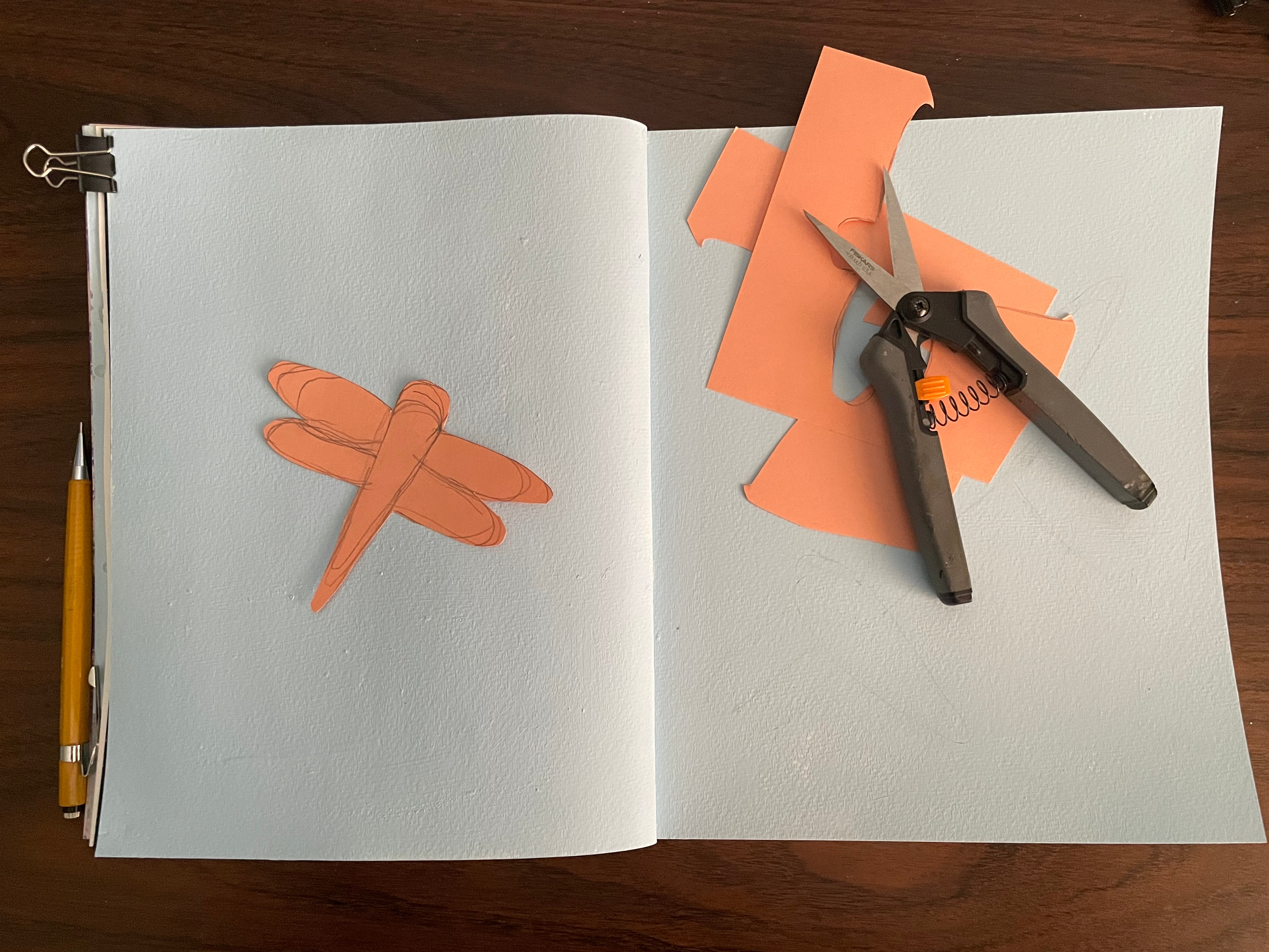
I started by painting two pages of my sketchbook sky blue. While that was drying, I cut out a dragonfly template from some scratch cardstock. I could have drawn them freehand, but having the template made it easier to play with orientation and to keep the sizes consistent. 


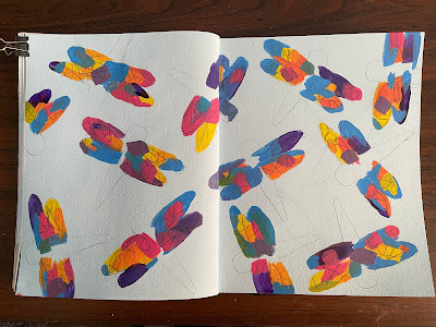
I traced dragonflies, then painted the wings with random spots of color. I used the same basic colors Jack did (yellow, orange, pink, blue, and purple), but I made no effort to mimic his placement of color. When that was dry, I used a navy colored pencil to scribble onto the wings. This added some of the movement and texture I see in Jack's work. 


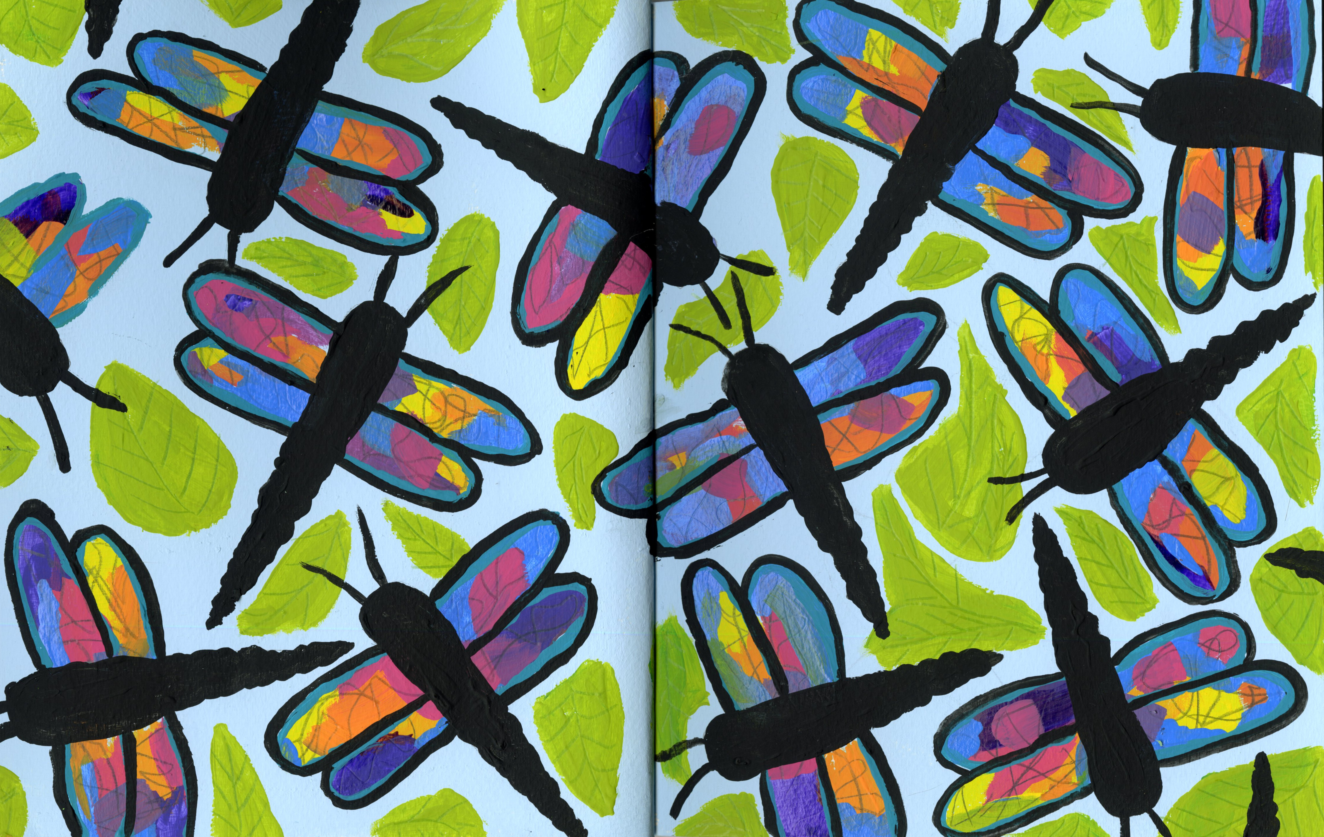
Next, I painted the black bodies of the dragonflies and outlined their wings with black paint. In between the dragonflies, I put patches of green. While Jack used a a bright, almost-neon green to do a loose outline, I used a leaf green to paint leaves between the dragonflies. 


My next step was using a green colored pencil to draw veins on the leaves. Then I painted on the dragonflies' antennae. I switched to scanning because it was getting too dark in the craft room to do quick phone photos. 


The last thing I did was to use my new Posca pen to add eyes, highlights, and outlines to the dragonflies, similar to what Jack did. I opted not to add any white to my background like he did. Here's my finished artwork:


And here's Jack's: 


No surprise, mine feels very controlled next to his more whimsical, freer piece. I like control - what can I say. But the inspiration is definitely there and I did use techniques that I wouldn't otherwise have tried. Jack M. from Arkansas, keep making art. I'm a fan. 

One final note: both Washington and Alaska have a dragonfly as their state insect. It's easy to adapt this painting to make either of them. For the Green Darner Dragonfly, leave the wings the color of the background, then scribble in them with a brown pencil. Paint the bodies green, blue, yellow, and garnet, as shown in the photo. For the Four-Spot Skimmer Dragonfly, leave the wings the color of the background, then use a silver pencil to scribble in them. Paint the bodies gold, brown, and black, using the photo as a reference. 

12/5/22

How to Draw Santa, Inspired by Picasso

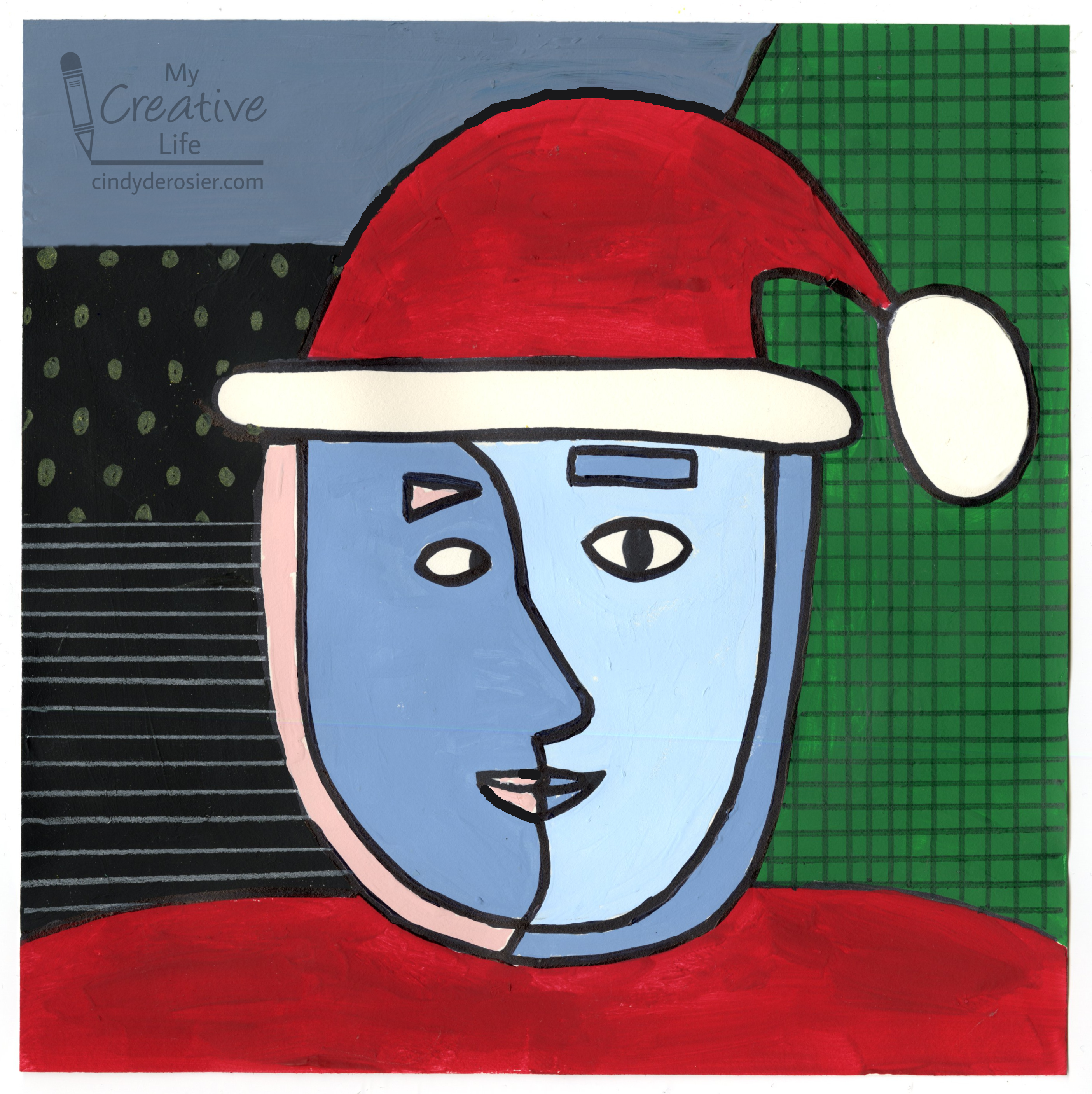
Today's project is the fourth in my series based on crowd-sourced responses to ten questions. For this one, I asked my friends to name a famous artist. The top answers were Van Gogh, Monet, and Picasso. We already have 10 kid-friendly crafts inspired by Van Gogh at Fun Family Crafts, but only one each that is Picasso-inspired and Monet-inspired. I chose Picasso and put a fun holiday twist on it. 


Santa Painting, Inspired by Picasso


Materials: 

  • paper
  • colored pencils
  • Sharpie
  • acrylic paint

Steps: 


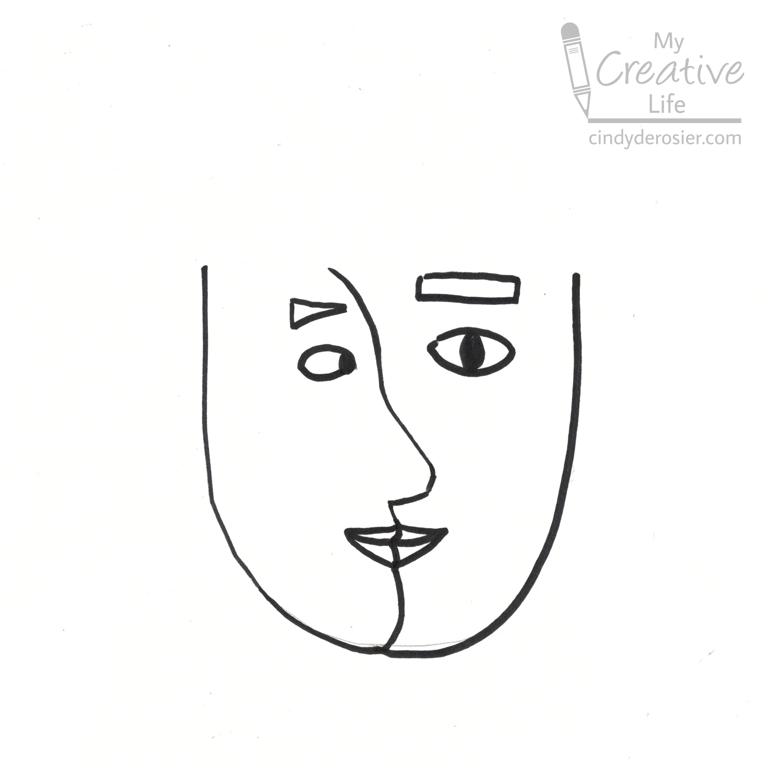
Lightly draw a U with a pencil in the center of the paper. On the left side of the U, draw a side view of a person looking to the right. Trace over your drawing with a Sharpie. 


On the right side of the U, draw a face that is looking forward. Trace it with Sharpie. 
 

Draw a second U just outside the border of the first U. This is Santa's beard. Then add the trim of his hat on top of his head. Draw the hat and the pom pom. Finally, give Santa some shoulders. I forgot to scan my paper at this point, but I think you'll be able to get the gist from the completed picture.


Now, paint. I started with the face, choosing two cool blues and a pale pink. Then I painted the red hat and suit. Then I painted three swaths of color in the background: green on the right, a blue-grey on the top, and black on the left. 

When all the paint was dry, I traced over the black lines with a Sharpie, then used colored pencil to add the grid on the green and the lines and dots on the black. 

It's a very simplified interpretation of Picasso's style. It's also a simplified version of Santa! I thought about including his mustache and making his beard shaggier, but after looking at a lot of Picasso's work, neither fit the style. Since the prompt was Picasso and not Santa, I went with the less hairy version of St. Nick. I like it. 

10/11/22

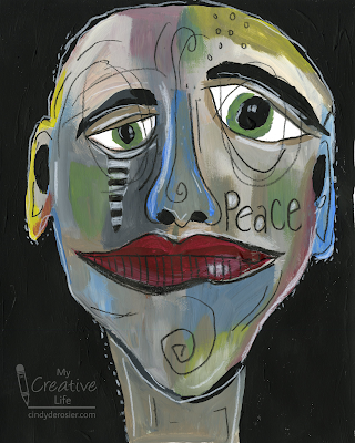
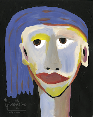
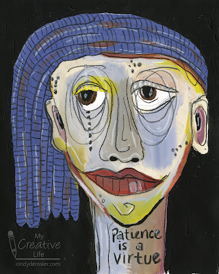
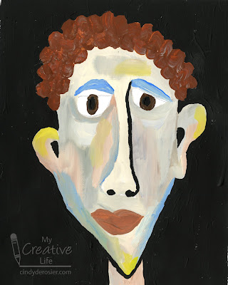
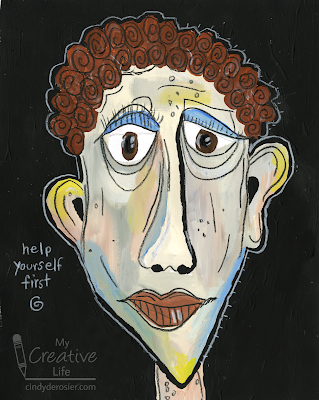
Wonky Faces, Inspired by Deb Weiers

Today I'm sharing another "Inspired By" project, where I choose an artist with a style radically different than my own and make artwork inspired by them. My first artist was Julie Fei-Fan Balzer. This time, I'm inspired by Deb Weiers. Deb is best known for her "Wonky Faces." I first learned about her on the ArtStacks blog, where my friend Sharon Fritchman is a designer. 

These are the three pieces I made. 


Just like I did with Julie's artwork, I studied a bunch of Deb's paintings to help me define her style.  These qualities stood out to me: 
  • asymmetric, oversized, elongated facial features
  • heavy eyelids and under-eye lines
  • unexpected colors used for skin tones
  • details emphasized imprecisely (thin, controlled scribbles) with black and white
  • a hand-lettered short phrase or word 
  • tiny circle embellishments 
  • strips of black and white horizontal stripes
  • solid, usually dark, backgrounds

Then I tried to figure out her process and what media Deb used. It's not always easy to tell how artwork was made or even what materials the artist used. I enjoy the detective process, looking for hints in the pieces that reveal what came first, or what one material has to be based on how it interacts with another. 

With my research complete, I decided to make three pieces. I started with light pencil sketches, focusing on the facial features. Then I covered those with paint, adding and mixing colors until I felt like I had a good base that mimicked Deb's work. When the paint was dry, I used Scribe-All pencils (affiliate link) to add details and then do the lettering. Here is a side-by-side of each my pieces, before and after using the pencils. They make a huge difference. 


I'm really happy with how my pieces turned out. They look NOTHING like something I would have made, yet I do see myself in them when I compare them to Deb's. I go back and forth on which is my favorite - either 'Peace' or 'help yourself first.' I made 'Patience is a Virtue' first and it's my least favorite of the three by far. 

If you have a recommendation for an artist whose style I should try, I'd love to hear suggestions!


9/26/22

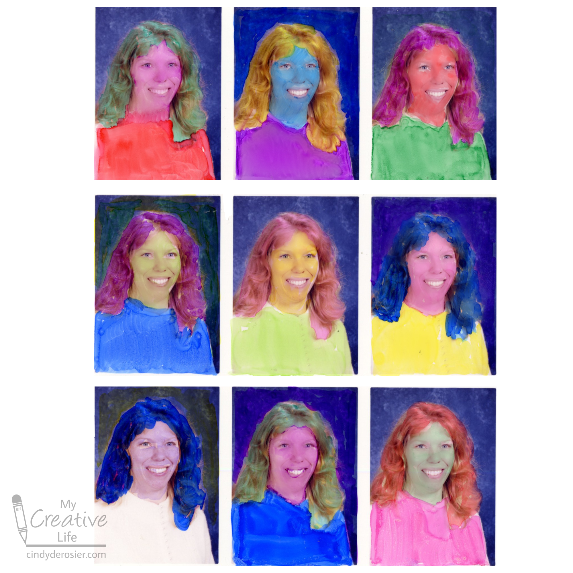
Colorful Me, Inspired by Andy Warhol

I have another idea to use up one of my MANY extra sheets of school photos. Presenting, Colorful Me (Inspired by Andy Warhol)! This project is obviously inspired by Warhol's famous paintings of Marilyn and Mao


Don't have extra photos to use up? Not a problem! Use a single digital photo to make a collage, then print it out on whatever paper you'd like. 

When choosing your photos, you want light colors that you can color over. This set of photos was perfect because the overexposure makes my skin even paler than it normally is and completely blew out my cream-colored sweater. My blonde hair is easy to color over. The background was the only part I couldn't change much by coloring. 
 

If you don't have a suitable photo, edit the one you have. You can overexpose the picture, desaturate the colors, or otherwise play around until you have a good base for coloring. 

Because I was coloring directly onto glossy photos, I opted to use alcohol-based markers. Choose the coloring tool that works best for the paper you're using. I worked from right to left (so that my left hand wouldn't smear the colors before they dried), coloring my face, hair, sweater, and the background different bold colors. 


The results crack me up. Some combinations are hideous, but I kind of like the yellow skin, pink hair, and green sweater. Not as much as I like my actual skin and hair color, mind you. I'd definitely wear a mint green sweater. 


It was a lot of fun coloring on photos. It's such a different surface than I usually use, so it was neat seeing how the pens behaved. I'm definitely going to have to revisit coloring on photos, maybe see how some of my other supplies perform. 

7/5/22

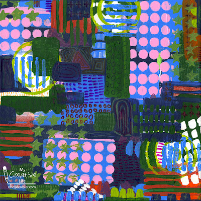
Abstract Art, Inspired by Julie Fei-Fan Balzer

This project is completely different than anything I've ever made. Nothing about this abstract painting is my style, and that's intentional. 


One of my creative goals for 2022 is to choose three artists with radically different styles than my own and make artwork inspired by them. My first artist is Julie Fei-Fan Balzer. She is a contemporary mixed-media artist and printmaker. I first became aware of her about 15 years ago when she did a lot of scrapbooking and I have continued to follow her ever since. She's transitioned completely away from scrapbooking (at least publicly), but I find her work to be very interesting, even if it's not my style. Maybe it's so interesting to me BECAUSE it's not my style.

Julie does a lot of work with quilting, gelli printing, and collage, but I chose to focus on her painting. Specifically, her abstract painting. As my first step, I went through Julie's blog and videos to find some examples to analyze.


And here are six projects from a workshop Julie led


I made a list of the qualities that, to me, define her style. 
  • messy but intentional
  • layers, with occasional transparency
  • swaths of paint in bold colors
  • patterns - hash marks, circles, plus signs, dots, stripes
  • high contrast
  • repetition
  • use of many stencils
  • crayon and colored pencil patterns or scribbles

In the video above, Julie takes an existing painting and reworks it with an abstract design. She ends up covering 90% or more of the original work. I've never done that. I always start with a plain white surface. But in an effort to mimic Julie's style, I started with this painting and covered it up with blocks of color in two shades of blue. 

When that dried, I used a stencil to make the pink circles. In the past, I've always been very careful when using stencils to make sure everything is completely covered and nothing slops over the side to ensure a perfect design. I completely threw that aside for this project. I added some forest green. At this point, I'd covered 98% of the original painting.


But it was a little too Cindy and not enough Julie. I used another stencil with a burnt orange paint and that helped. Then I went in with a lime green colored pencil and added some pattern. 


I stamped some green stars and purple triangles, then tried to add some details with a white paint pen. That didn't work, so I grabbed white spray mist. I hated the results. 


But the best thing about this style of painting is that you cover anything you don't like. I painted over the white mist with white blocks, then stenciled the lime green swirls. I used a Q-tip for the lime green dots and splotches, always focusing on repetition, contrast, and pattern. Then I painted more areas with dark blue and forest green. 


Along the way, I kept asking myself how I'd know when it was done. I'm happy to report that (a few more layers of stencils and a whole lot of details later) I felt confident that I'd finished. 


As I said, there is nothing about this painting that is remotely my style, but I actually like it. It's interesting to me and the process of creating it was a lot of fun. I learned a lot along the way and am definitely opening to trying another abstract painting in Julie's style someday. 

One final note: I really enjoy Julie's blog and wanted to recommend one specific post that stuck with me. It is called What is Helpful Feedback. After sharing her thoughts, she offers up a piece of her work and requests feedback in the comments. It's very interesting to read all the feedback she received and to see how people see things so differently. 

2/3/21

"You Are Priceless, Valentine" Heart Art, Inspired by Famous Painters

I had an idea to make a valentine inspired by Piet Mondrian's famous Composition in Red, Blue, and Yellow. I had so much fun that I ended up making three more, featuring works by Vincent Van Gogh, Jackson Pollock, and Wassily Kandinsky. Each is made with different media. I love how they looked grouped together, so I mounted them on black cardstock to display. 

I call this grouping You Are Priceless, Valentine. Affiliate links below. 


"You Are Priceless, Valentine" Heart Art


Materials:


---------


Mondrian's Composition in Red, Blue, and Yellow 


Use pencil to trace the heart template onto a square of paper. With the ruler, LIGHTLY draw horizontal lines on the heart, varying the distance between them. Draw vertical lines (and erase horizontal lines as necessary) to divide the spaces into squares and rectangles. Leave 2/3 of the shapes white and color the rest with red, yellow, blue, and black. Trace the pencil lines in black. 


---------

Van Gogh's The Starry Night


Use a pencil to trace the heart template onto a square of paper. With short bold strokes, use the light yellow pastel to rough in the location of the stars, the wind, and the horizon line. Fill in around these features with blues, always using short bold strokes. Add white to the outer edges of the stars and yellows and oranges to the centers and to make the moon. Add black to the shadowy areas, then add white to the wind. Continue layering colors to mimic the look of Van Gogh's work. You may wish to use a spray fixative after you finish to prevent smearing. 

(Put down newspaper before using pastels. I had to scrub my table pads afterward.)

---------

Kandinsky's Squares with Concentric Circles


Use a pencil to trace the heart template onto a square of paper. With the ruler, divide the heart into squares. I made a lot more than in Kandinsky's work, but you can be more authentic if you prefer. Use watercolor pencils to fill in each square with a different arrangement of concentric circles. When they are all filled in, use a small brush to blend the colors, working around each circle and rinsing the brush frequently. 


---------

Pollock's Composition with Pouring II


I did a bunch of research and discovered, among other things, this fascinating article on the fluid dynamics behind Pollock's paintings. Armed with that knowledge, I experimented with a variety of different techniques to achieve a similar look. Feel free to do your own exploration! I recommend placing a sheet of paper into a deep cardboard box, then drizzling thinned acrylic paint onto the paper. After letting the paint set for about 30 minutes, I pressed with with a piece of newspaper to remove the excess paint, then let the painting dry completely. I traced the heart template around my favorite part of the artwork and cut it out, then mounted it to a clean square of paper. 


---------

To complete your study, label each piece of art with the artist who inspired it. Then mount the hearts onto black paper. 


This was such a fun way to learn more about these four artists and try out new techniques. I encourage you to give it a try! If you have suggestions for other famous paintings that would be awesome as heart art, leave them in the comments.