Showing posts with label PicMonkey. Show all posts

8/12/25

Summer Creative Workshop: Neon Heart

The sixth (and final) project I completed during Summer Creative Retreat was this neon heart. 


The instructor, Mako of Makoccino, taught an excellent class about how to use watercolors to paint a neon flamingo. 


I decided to simplify the project and switched my design from a flamingo to a heart. I tried using watercolor for the project, but I got really frustrated with not being able to control the pigment. Rather than give up on the class entirely, I switched from painting with watercolor to painting digitally. That allowed me to erase my mistakes with a single click - if only you could do that with watercolors!


How to Paint a Neon Heart (Digital Version)


Add a white heart to a rosy pink background. 


Select a darker shade of the same pink. Use a spray paint tool to color outside and inside the heart, leaving a visible band of the original pink.   


Select an even darker shade of the same pink and darken the outer edges of the canvas. 


Set the spray paint tool so that it is three times as wide as the white heart. Trace over the heart with white. This gives it the glow.  


Duplicate the white heart and change the color to a medium gray. Drop it down and slightly to the right to make a shadow. 

Add very faint horizontal lines to the canvas to mimic the wall where the neon sign is hanging. Move the white heart to the front. 


Use the airbrush tool to soften the entire design. 


This was so much fun to make! It's far from perfect, but I loved trying something completely new. I'd like to get more into digital art. You really can't beat that undo button. 

6/25/25

Creating Your Own Coloring Page from a Photo

Technology makes it incredibly easy to make your own coloring page. Pick a photo you like (one you personally took or that you have the rights to use)...


... and then use a photo editing program to convert it to an Edge Sketch. I used PicMonkey, of course. PicMonkey is a Shutterstock property, so a subscription includes access to a library of millions of royalty-free photos. 


Print your coloring page on good quality paper, then start coloring! I used Prismacolor colored pencils on Neenah Bristol Vellum. You can use the original photo as a guide for the colors, or you can color it any way you want. 


You could use this technique to make a coloring book of images from a special vacation or event. It would make a wonderful gift for anyone who loves to color. 

1/6/25

Giving an Escape Room Experience as a Gift

I really enjoy escape rooms. If you've never been to one, the concept is that you are "locked" in a themed room with around a dozen puzzles you need to solve in order to "escape." The puzzle difficulty varies and require you to be a keen observer of what is around you in order to find the clues you need to tackle each problem. It's a great activity to do with friends, family, or coworkers. 

We recently treated Steve's family to their first escape room experience, a Prohibition-themed room rated Intermediate/Challenging. There were six of us and it was indeed a challenge. It took a little time to find our groove and work together, but we got better and better as time went on. We didn't make it out in time, but we had a lot of fun. 

For Christmas this year, we gifted them another escape room experience. I love experiential gifts, but the question is always how to present it in a way that the recipient can unwrap. I came up with scrolls. This is what they looked like under the tree. 


I started by designing this in PicMonkey. 


I printed the design on buff paper, tore and inked the edges, rolled them into scrolls, and tied them with twine. It was a hit. I'm looking forward to our next escape room adventure!


-------


If you don't have an escape room near you, there are plenty of options for having a similar experience at home. Some options include: Escape Room in a Box, Clue Escape, Escape Room the Game, and many more (affiliate links). Enjoy!

2/27/23

Spanish-English Fruits, Vegetables, and Meat/Dairy Vocabulary Cards

I've been relearning Spanish using Duolingo since January 2021 and I have an uninterrupted streak of 770 days. I really enjoy it and am so pleased to have regained so much of the vocabulary I'd lost. I get to apply the Spanish I'm relearning during my twice-monthly shifts doing food distribution at the Food Bank, as many of the recipients speak little or no English. 

I'd been telling my mom for some time that she would enjoy Duolingo. When my parents were in California for Trevor's Eagle Court of Honor, I set Mom up with an account. Sure enough, she loves it and has maintained an uninterrupted streak of 178 days. While I am relearning Spanish, Mom started from ground zero. She spends a lot of time each day practicing and has recently been able to use her rudimentary Spanish at her local Food Bank, where she volunteers several times a week. About a month ago, she mentioned that she wished Duolingo would skip all the vocabulary about travel, clothes, school, and chores for now and just teach her the words she needs to communicate with the Food Bank recipients. I tucked that away in my brain as a gift opportunity. Yesterday, for Mom's birthday, I gave her these:


I made these cards using PicMonkey. Some of the images were ready-made in their Graphics collections; others I had to make. Since vocabulary is not standard amongst the 20 countries whose official language is Spanish, I defaulted to the most common translation when there were differences. In some cases, I used the Mexican vocabulary word, as that's what most commonly used here. I had the cards printed on cardstock and laminated so that Mom can bring them with her to the Food Bank and use them as needed. I hope they're useful. Happy birthday, Mom!

11/28/22

Result = Skill + Tools

Owning every fancy cake decorating tool does not mean that someone who has never decorated a cake can make a masterpiece. Far from it. You can have all the best tools, but skill is crucial. Someone with skill can decorate a cake beautifully using nothing but a knife. Will that cake be as nice as if the expert had used high-quality, specialty equipment? Nope, but it will probably look better than the novice who uses the best supplies that exist.


Skill matters, and so do the tools. Without one or the other, the results are not going to be as good as if you had both. To continue the example of the cake decorator, not only do the tools matter, but the frosting does too. If it's too runny or too thick, grainy, or separated, the cake will suffer no matter what tools you have. 

So does this mean beginners should buy the all best tools and materials from the start? Yes and no. A cake decorating novice doesn't need 50 decorating tips, multiple shapes of cake combs, icing bag stands, an airbrushing kit, and special cutters for fondant and gum paste; you start with a few basics. But make sure that what you buy is a decent quality, or you'll be struggling unnecessarily and rebuying nicer ones later. (By the way, I've included affiliate links here, in case all this cake talk is motivating you to try decorating.)  

As you gain skill, you are better able to determine what supplies you need to get the results you want. That's the time to add more items to your collection. That said, there's nothing wrong with getting a particular tool or supply that interests you. If you can afford it and know that you'll use it (or can give it to someone who will), then go for it. 

I used cake decorating as an example for today's post, but it applies to all sorts of creative endeavors. Watercolor paint from a dollar store is not going to perform as well as artist-grade paint will, no matter who is using it. An expert painter can probably create a decent painting with it, but not nearly as nice as they could with the best watercolor paint. And a beginner using low-quality watercolors may be frustrated by their inability to do a certain technique that would be much easier to do with the pricier paint. 

Result = Skill + Tools. 

This Week's Coupon at Michaels.com

10/28/22

Travel Blogger Business Card

I have a new business card! 


Well, technically I don't HAVE it yet. But I designed it and should have the cards in my hands soon. I'm excited. I've been needing a travel-themed business card for a long time. The all-purpose business card that I’ve been using since 2017 is fine and I will continue to give it out to promote my crafts, recipes, other creative endeavors. But this one will take people directly to the travel portion of my blog rather than the home page.

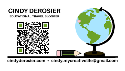
In designing the card, I wanted it to fit with the My Creative Life brand and feel like an extension of my blog rather than a departure from it. I started with a globe, pulling the colors from my brand kit. Then I played with ways to combine the globe with my MCL logo. I tinkered around with the design, moving the pencil down (but still on the left). It was missing something, so I added the tiny heart to mark where we live in California. While I enjoy traveling, there's no place like home. 


I like this new logo a lot. I put it on a business card template, extended the "table" under the pencil and globe, and added my name, title, and a QR code that leads to my travel page. I colored the corners of the QR code to match the green on the globe. I shrunk my blog address and added my email address.  


What do you think? 

9/14/22

Drawing Myself as a Duolingo Character

This week, I hit a 600-day streak learning Spanish on Duolingo. To mark the occasion, I decided to draw myself as a Duolingo character. I found an image of the Duolingo characters and identified their distinctive characteristics: rounded geometric shapes, unrealistic proportions, large eyes, teardrop noses, bright colors, minimal details, and disembodied feet on a white background. 

Then I used those traits to draw myself in the Duolingo style. This was my first draft. 


After making it, I found this interesting article about Duolingo's illustration guidelines. I went through each category to make any necessary changes to my drawing to bring it in line with Duolingo standards. First, all shapes are supposed to be rounded. Mine are, but the feet and eyebrows aren't rounded enough. Second, there should be a variation in shape, avoiding predictable shapes with similar visual weight. I think I'm ok there. 

Second draft: 


The next category is simplicity. They state that 6 shapes is too abstract, 30 shapes is too many, and 15 is just right. Mine has 16 shapes in the head alone: circle head, rectangle neck, rectangle hair, oval bangs, rectangle eyebrows (x2), circle eye (x2) with circle pupil (x2), circle ears (x2) with circle earrings (x2), teardrop nose, and semicircle mouth. However, the rest of the body only adds another 8 shapes, bringing me to 23. I took off the earrings to bring it to 21. 

Third draft: 


The next category says that all Duolingo characters must be designed with a flat perspective. I'm fine there. I didn't use shadows, so that's ok too. Then we get to color. There is a recommended color palette that I didn't follow, along with suggestions to be playful and vibrant while avoiding using too many colors. The final guideline is about floating accents. I only floated the feet, so I'm fine there. As I was looking closer at the characters, I realized my eyes were wrong. So I fixed those and made a bunch of changes to the colors, bringing me to.... 

Fourth (and final) draft: 


I really like my character! I think she needs a rabbit sidekick...

9/5/22

Eagle Scout Court of Honor: The Invitation

Yesterday was a big deal for our family. Around 90 friends and family members joined us for Trevor's Eagle Scout Court of Honor. As I've mentioned, Trevor earned the highest rank in Scouting on June 21, 2022. An Eagle doesn't receive their regalia until their Court of Honor, so this was the first time Trevor wore the Eagle Scout pin and neckerchief. We'll be sewing the Eagle patch on his uniform today. 

A lot goes into planning an Eagle Court of Honor. Over the next week or so, I'll be sharing all the things I did to prepare. Today, the invitation.

Obviously, the first step was to choose a date and location. We've attended Eagle Courts of Honor at churches, community centers, fellowship halls, schools, and public parks. We opted to hold ours at our church. After clearing a date with Trevor's grandparents and key Scout leaders, we set it in stone and it was time for me to make the invitations.  


There are official printable invitations you can buy (affiliate link), but I wanted Trevor's invitation to be unique. (OK, mostly I just wanted an excuse to play with PicMonkey.) I started with the photo from his Board of Review (note that he is not wearing an Eagle neckerchief or pin), then pulled the blue from the flag for the background. I used white for the printing and banner, then added the Eagle Scout patch. 

I love the way it turned out. In a lot of ways, it's similar to my scrapbooking style. The focus is on the photo, it's clean and simple, and there is plenty of journaling!

11/1/21

Presidential Trading Cards (with Hidden Money)

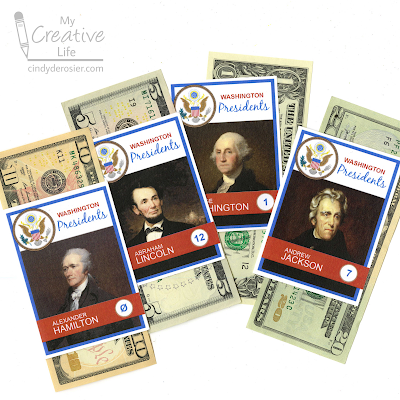
Time to share another money gift! My nephew, Timothy, turned 21(!) on Friday. I've been giving him a money gift for all gift-giving occasions since 2013 and coming up with something new each time definitely makes me stretch creatively. This time, I made him a set of baseball cards. Sort of. 

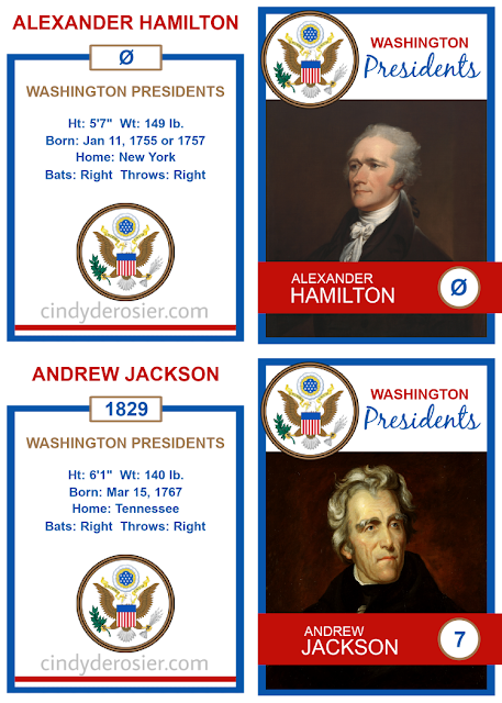
I've done a play on using the faces on money before, when I made Timothy this version of Air Force One. Now I'm imagining the 'Washington Presidents' as a major league baseball team. I used PicMonkey to design four rookie cards for the people on the $1, $5, $10, and $20 bills. (I included a $2 bill on Air Force One, but couldn't find one this year. So, $36 for Timothy this time instead of $38.)


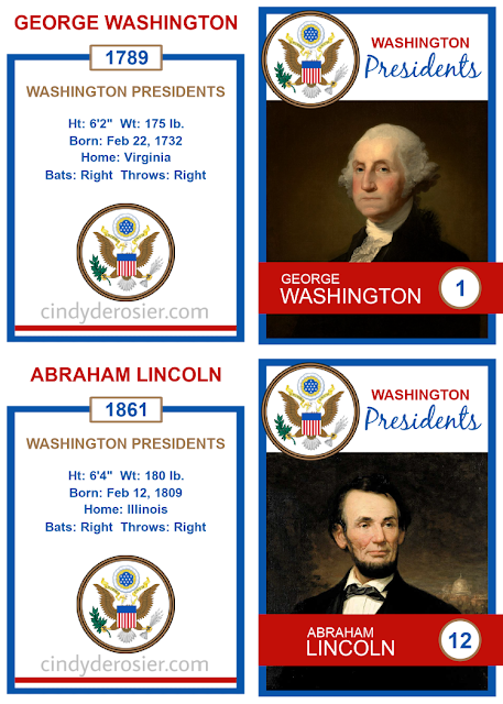
I started by opening up a 2.5" x 3.5" blank canvas. One by one, I added the features of a baseball card: the team name (Washington Presidents) at the top with their logo (the Great Seal) next to it, and a banner across the bottom for the player's name and number. I saved that template, then edited it to add each player's name, picture, and number. 

Then I created a template for the back of the cards. I put the player name at the top, then their rookie year, the team name, the player's stats, and the Great Seal. It was surprisingly easy to find each person's height, weight, and birthdate, but it was a lot harder to find their home. Is home the place where they were born, where they grew up, or where they lived when they were signed to the team (er, elected)? I decided home was wherever they were right before their rookie year. Even that proved a bit tricky, so I just listed a state and not a city. 

As for their batting and throwing preference... they're all right-handed. Maybe. Prior to the 1900's, being left-handed was considered a disability which was corrected in childhood. Some of these men may naturally have been left-handed, but they certainly would have batted and thrown right in adulthood. 

With the fronts and backs completed, the next step was moving them to an 8.5" x 11" blank canvas. I paired the backs and the fronts together and printed them. 


I printed on my new Bristol vellum. It worked perfectly, which is fortunate since I have a ream to use up. That's a lot of coloring pages, so I'm glad I can use it for other things. 

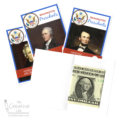
I used the paper trimmer to separate the cards, then I folded each and tucked the corresponding bill inside. Finally, I put a thin line of glue around the outside edge and pressed it together, trapping the money inside the card. In this picture, the three cards at the top are done and I just need to add the glue to the edges of Washington's card.


I'm fine with Timothy destroying my creations to get at the money he knows is inside, but if you want your recipient to be able to keep the baseball cards intact, use a repositionable tape runner (affiliate link) instead of glue. 

Happy birthday, Timothy! I wish I could have been there to celebrate with you. 

6/7/21

Donut Birthday Banner (Happy Birthday, Trevor!)

Today is Trevor's 15th birthday! 

We're keeping the celebration very low-key this year. Besides the fact that the things Trevor would most like to do to celebrate (ice skating and teppanyaki) aren't open because of COVID, it's a school day. Specifically, he has finals for three of his classes, with the other three finals tomorrow. Tonight he has a Scout meeting. And, while he had his second vaccination on Friday, he doesn't feel comfortable seeing friends or family in person until after the two weeks have passed. 

Since I wanted his day to be special, I surprised him with a theme I knew he'd love: donuts.


Here's how the banner looked strung across his bedroom door this morning. Such a fun surprise! I have other donut-themed surprises planned for him throughout the day.  


Donut Birthday Banner


Materials:

  • chipboard
  • scissors
  • Folk Art paint
  • cardstock scraps
  • tacky glue
  • yarn

Steps:


Cut out five circles from chipboard. Do not go to any effort to make them perfect, as donuts are often irregular. Then cut five circles that are slightly smaller than the first circles. These will be the icing and should be even more irregular than the donuts. 


Paint each of the icing circles. I chose to paint two white, one a chocolate brown, one pink, and one a mint green. 

When the paint is dry, decorate the donuts with toppings of your choice. I tore black cardstock to make Oreo chunks for one of the white donuts, cut brown cardstock to make chocolate chunks for the mint donut, cut brown cardstock fudge ribbons for the pink donut, and snipped a rainbow of cardstock scraps to make sprinkles for the chocolate and the remaining white donuts. 


Glue the toppings in place, then use the scissors to cut out an oval hole in the icing. 


Then cut matching holes in the donut bases. Glue the icing to the bases. When the glue is dry, cut a length of yarn to string the donuts. I taped them to the yarn for this photo... 


... then changed my mind and tied them on the yarn before putting the banner on Trevor's door. To me, they look more realistic this way, since that's the way you'd hang actually donuts along a string. 


In case you're wondering, I made the sign using PicMonkey. (Was there any doubt? I doubt it!) Anyway, happy birthday, Trevor!

5/31/21

Art Materials from A to Z

I've been working on a project for awhile. One letter at a time, bit by bit, until eventually I had all 26. Each letter from A to Z is made with an art material that starts with that letter. Once I had all my letters, I backed each one with a contrasting color. I put them together into a collage and I am in love with the results:


Take a close look and see if you can identify each letter. Some are easy. Some are almost impossible. (If anyone gets U, I am seriously impressed.) Some would be far easier to identify if you could see them in person instead of the scanned version. 

Have you made your list yet? 

Below are the answers, some info about how I made each letter, and affiliate links to the materials. Tell me in the comments how many you got right!

---------

A is for acrylic. I swirled globs of acrylic paint onto my Frisbee, let it dry, then peeled it off and used scissors to cut it into the letter A.

B is for beads. I covered a chipboard B with tacky glue, then dumped yellow seed beads on top. I used my craft pick to turn the ones that landed on their sides. 

C is for crayon. I colored on white cardstock, then cut out a C. 

D is for denim. That link goes to denim patches, but I actually cut up an old pair of jeans to make the letter D. 

E is for enamel. I cut out an E from cardstock, then covered it with Enamel Accents. I love that stuff. It dries to a hard, shiny, dimensional surface.

F is for felt. Not much to say here. I cut the letter from felt. 

G is for glitter. No more loose glitter for me. I'm all about Stickles for maximum sparkle. 

H is for hemp. Technically, I'm not sure that the rope stuff I used for this is actually hemp, but I think it is so I went for it. There aren't that many options for H.

I is for ink. I used a blending tool to put different shades of ink onto cardstock, then cut out the letter I. 

J is for jewels. Acrylic, but still jewels. In another application, I might call them rhinestones but then they wouldn't start with the letter J. 

K is for kraft. I recently learned that kraft paper is named for the German word Kraft, meaning strength. Fortunately, it's easy to cut with scissors. 

L is for lace. Two snips of lace ribbon glued together = Letter L. 


M is for marker. Really basic here - I colored on paper, then cut it out. 

N is for newspaper. Turns out you can buy all sorts of newspaper-printed stuff... deli paper, tissue paper, even wallpaper! I used the local paper.

O is for origami. I found a tutorial for turning a dollar bill into the letter O, but I used white paper instead. 

P is for pipe cleaner. Another very quick and easy letter. 

Q is for q-tip. This one was tricky. I ended up soaking two Q-tips and then gently easing them into a small medicine cup which held the curve while they dried over the course of a few days. Then I snipped them and glued the parts back together to make the Q. 

R is for ribbon. Three snips, two twists, some glue, and a heavy book while it dried.

S is for sequins. I put tacky glue on another chipboard letter and layered the sequins on top. 

T is for tissue paper. It took about 2 seconds to cut this out. 

U is for unryu. I know it by a different name (starts with M!) but you have no idea how happy I was to learn its U name. Doubly cool because I had some on hand to cut!
 
V is for vellum. I keep a decent-sized stash of vellum around. I don't use it often, but when I need it there's no real substitute.

W is for wire. Twisteez wire, in this case! Another material I always keep on hand. 

X is for xerox. OK, so xerox is not an art material itself, but it's the best I could do for X. I cut the letter from a handout I didn't need anymore. 

Y is for yarn. I could have done a few quick snips to make the letter Y, but I opted instead to crochet my letter. It's just a chain stitch, so it was still quick and easy. 

Z is for zipper. Remember the denim from letter D? Same pair of old jeans. 

4/12/21

Inspirational Words Mandala and Name Art Mandala

The possibilities are endless for making mandalas using PicMonkey. Here is a mandala made from 11 years' worth of my choices for One Little Word


The basic steps are the same as in the Easter Egg and Jelly Bean mandala, except instead of graphics, you're using text. After steps 1 and 2, instead of adding a Graphic, you'll click Add Text. Type in your word, choose a font, add some color, and drag it into position. 

Repeat until you have filled the upper right quadrant with words. All words should be fully within the quadrant.
 

Now pick up the egg mandala tutorial at Step 10. Group the words, then duplicate and flip. Group those two, then duplicate and flip. You should have a completed mandala.

 
You're not limited to inspirational words, of course. It's awesome for name art, too. (You know what a fan I am of name art!) To make this, I went back to my completed quadrant and changed each of the words to my name. I had to change a few fonts and resize a bit to make it fit, but it's mostly the same.


My brain is already whirring with more mandala possibilities!

3/31/21

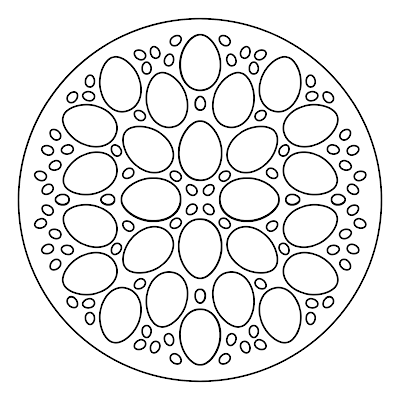
Easter Egg and Jelly Bean Mandala Coloring Page

I know that I never shut up about PicMonkey, but that is because I love it. In addition to using it for photo editing and creating graphics for social media and elsewhere, recently I've been using it to make my own coloring pages. My latest is a mandala of Easter eggs and jelly beans, which I colored by hand using Prismacolor art markers (affiliate link). 


You are more than welcome to print and color my mandala. 


Better yet, read on to learn how to make your own. I'll show you how I made my egg and jelly bean version, but you can use any shapes or objects you want. 


---------


How to Make a Mandala Coloring Page in PicMonkey


1. Open PicMonkey, then create a new blank canvas (square). 

2. Click on the wheel at the bottom to open Alignment. Check Show Grid on Canvas. Set it to 2 rows and 2 columns. 


3. Enter the shape you want (in this case, an egg) in Search All Graphics. There isn't a plain outlined egg, but that's no problem. I chose a polka dotted one, then used Effects to add an outline. 


4. Use Adjust to change both colors to white (if you'll be printing on colored paper, change them to Transparent). Now you have just the outline of an egg. 


5. Drag the egg into the upper right quadrant, then rotate it the way you want it. 

6. Right click and select Duplicate Layer. 


7. Place your duplicated egg where you want it and then duplicate again until you've filled the upper right quadrant with eggs. I fit eight in the space, with some sitting directly on the grid lines. This works because eggs have vertical symmetry. If you choose a shape that doesn't, keep the shapes within the quadrant.

8. Duplicate the egg one more time, then shrink that duplicated egg down to the size of a jelly bean by clicking and dragging on one of the corner dots. Drag the jelly bean into a space between the eggs. 

9. Continue to duplicate and place jelly beans until you're happy with the design. I have 22 jelly beans. 


10. Highlight all the eggs and jelly beans at once. Multiple Layers will pop up. Click Group. (Ungroup is showing in the screenshot because I've already grouped them.)


11. Now it's time for the magic! Duplicate the layer, then use the tool to flip it vertically. Move it into the upper left quadrant. 


12. Now group those two layers together, just like in Step 10. Duplicate the newly grouped layers, then flip it vertically, and slide it into place. 


Now you have a complete mandala, ready to print and color!