Showing posts with label Pantone. Show all posts

12/5/24

Pantone Color of the Year 2025

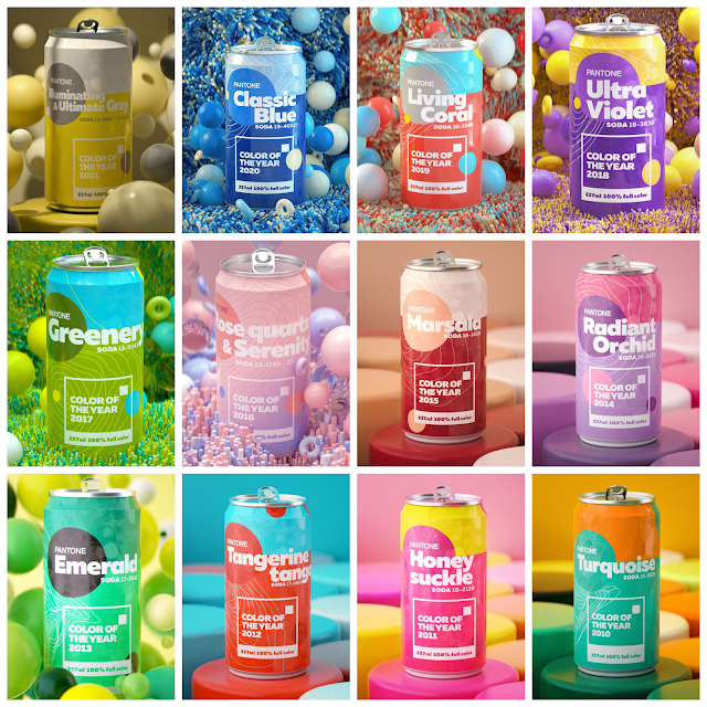
I've been eagerly awaiting the Pantone 2025 Color of the Year announcement. I attended their seminar this morning, excited to find out what it would be. But before I get into the 2025 color, let's take a look back at the COTY from the past 12 years. 


The Color of the Year is usually, but not always, taken from Pantone's Spring Trend Report. These are the colors in the Trend Report for Spring 2025


Based on everything I know about Pantone, I was predicting we'd see Cocoon as the 2025 COTY.  Between the shade and the name, it seemed like the obvious choice. Unless Pantone chose a color that wasn't in the Trend Report, that is. Which is exactly what happened. 

The Pantone Color of the Year for 2025 is Mocha Mousse. 


I'm going to go ahead and give myself credit for guessing correctly. The shade is similar and the descriptors are too. It just makes sense for where we are as a society right now. I'd love to hear your thoughts on Mocha Mousse! Let me know in the comments. 

12/7/23

Pantone 2024 Color of the Year

Today Pantone announced their 2024 Color of the Year. I attended their seminar this morning, eager for the reveal....


After reading Pantone's Trend Report for Spring 2024, my prediction for Color of the Year was Capri... 


... but I was totally wrong. 2024 is the year of Peach Fuzz!


Peach Fuzz "captures our desire to nuture ourselves and others. It's a velvety gentle peach tone whose all-embracing spirit enriches mind, body, and soul.... that echos our innate yearning for closeness and connection..."

My thoughts - I like it and think it makes sense as the 2024 Color of the Year. It will be interesting to see where it shows up. Fashion for sure, and home decor makes sense, but will we see it in the craft industry? Probably. 

I'd love to hear your thoughts on Peach Fuzz! Let me know in the comments. 

12/1/22

Pantone Color of the Year 2023

Last year, Pantone didn't reveal their 2022 Color of the Year until December 9, so I was caught off guard when the 2023 COTY was announced today, December 1. Say hello to Viva Magenta, "an unconventional shade for an unconventional time."


Among other things, it's described as "a pulsating color whose exuberance promotes a joyous and optimistic celebration... self-expression without restraint... audacious, full of wit and inclusive of all." 


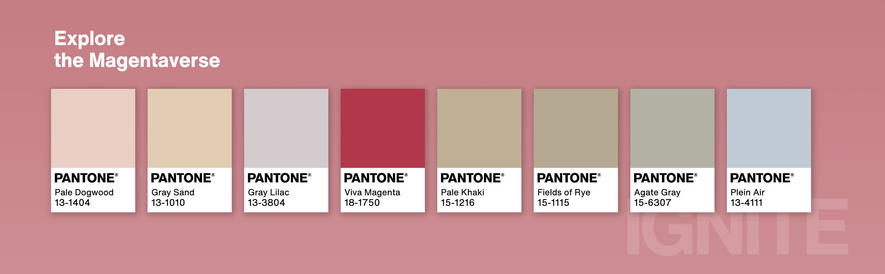
Pantone also announced a partnership with Motorola, who debuted the Edge 30 Fusion in Viva Magenta. They encourage everyone to "Explore the Magentaverse." 


My thoughts on Viva Magenta? Meh. Don't love it, don't hate it. We haven't had a red since 2007's Chili Pepper, so we're due. Frankly, as long as they don't repeat the 2016 and 2021 nonsense a third time, I won't complain no matter what the color is.   

What are your thoughts about Viva Magenta? Let me know in the comments.

12/9/21

Pantone Color of the Year 2022

Pantone has announced the Color of the Year for 2022, Very Peri! According to Pantone, "Very Peri displays a spritely, joyous attitude and dynamic presence that encourages courageous creativity and imaginative expression."


All week, Pantone has been doing a recap of previous COTY selections by imagining them as soda cans. I love how they look together. That's 2021 COTY(s) Illuminating and Ultimate Gray in the top left with the 2010 COTY Turquoise in the bottom right. 


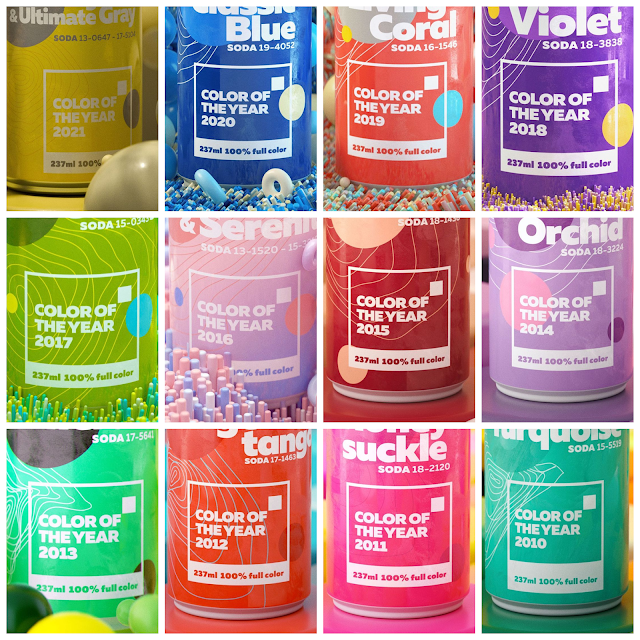
Here's the same graphic, but with a close-up of each color. Even though they are beautiful, I find it easier to focus on the colors without the backgrounds showing. 


What do you think of Very Peri? I'd love to hear your thoughts!

12/6/21

Pantone Color of the Year 2022

Each year around Thanksgiving, I begin impatiently awaiting the announcement of the Pantone Color of the Year. It's interesting to me to learn what colors are trending and which Pantone is predicting will represent the upcoming year. I enjoying making my own guesses from a craft perspective (rather than a fashion or home decor point of view) and then seeing if the COTY does indeed show up in craft materials, such as scrapbook papers, inks, and specialty paints. 

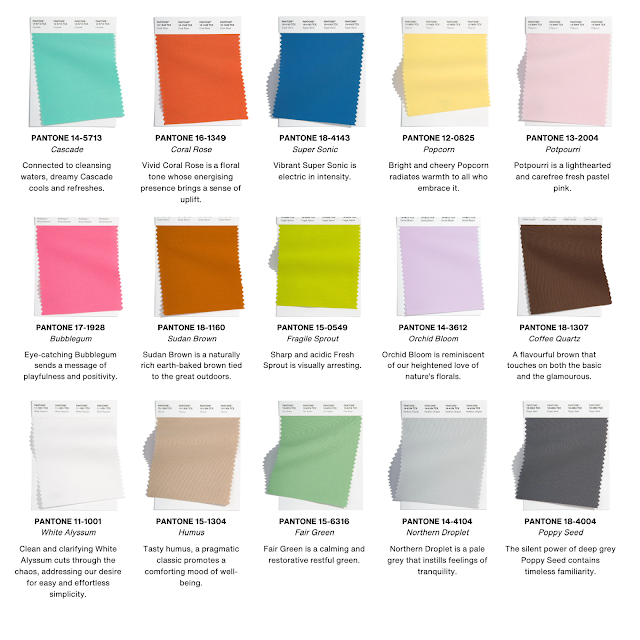
While I am very curious about which color Pantone will name as COTY 2022, I’m going to be really annoyed if they name another pair of colors like they did last year. (Or, god forbid, more than two colors.) Traditionally, the color comes from the Spring/Summer Palette, announced in the fall. This year, they presented two different palettes. Each has ten main colors, plus five 'core classics.' 

This is from New York Fashion Week:


There are a few surprises for me, the main one being Basil / Fair Green appearing as a neutral on their respective palettes. Conversely, the coffee-inspired Coca Mocha / Coffee Quartz are not part of the neutrals but rather a featured color. Interesting. I see a lot of pastels and wouldn't be too surprised for one of them, perhaps Orchid Bloom, to take COTY. Two colors, including Northern Droplet and Poppy Seed, are on both palettes, which makes me think they're contenders. I don't know - Pantone has surprised me many times with their selection.

What are your thoughts? What do you predict for COTY and/or what do you hope is named COTY?

12/10/20

Pantone's Color(s) of the Year 2021

Each year around Thanksgiving, I begin impatiently awaiting the announcement of the Pantone Color of the Year. Except this year. The COTY hasn't even been on my radar. For the first time in 8 years, I haven't been stalking Pantone's site waiting for the big reveal. Other things have kept me busy and drawn my attention elsewhere. My routines are off and my sense of time is all screwed up. In past years, December means prepping for an in-person trade show in January (where I scope out the Color of the Year). This year Creativation+ will be virtual and was moved to March, so I'm not in trend-spotting mode yet.

Traditionally, Pantone selects the Color of the Year from its Spring/Summer palette, announced in the fall. Here are the contenders:


I love Marigold, Cerulean, Illuminating, French Blue, and Amethyst Orchid. I kind of like Mint and Raspberry Sorbet. I do not like Rust, Green Ash, or Burnt Coral. Appropriately, I'm neutral on the neutrals. 

You might remember how annoyed I was when Pantone chose two colors for 2016. Well, guess what? I'm annoyed again. 


Personally, I think the color used in the background of the quote would make an outstanding 2021 COTY. As would either Illuminating or Ultimate Gray or literally any other single color. Emphasis on single. 

As always, I'll be on the lookout for the C(s)OTY. I don't expect them to have much of an impact in scrapbooking or in the general craft market, but perhaps I'll be proven wrong. It will be interesting to see if the color combination appears more often than either color on its own in 2021.

12/4/19

Pantone's 2020 Color of the Year - Just Announced!

Pantone just announced the 2020 Color of the Year, Classic Blue!


According to Pantone, Classic Blue is...

"a timeless and enduring blue hue elegant in its simplicity. Suggestive of the sky at dusk, the reassuring qualities of Classic Blue offer the promise of protection; highlighting our desire for a dependable and stable foundation from which to build."
But even more interesting...
"As we cross the threshold into a new era, Pantone has translated the hue into a multi-sensory experience to reach a greater diversity of people and provide an opportunity for everyone to engage with the color. We will be tapping into sight, sound, smell, taste, and texture to make the Pantone Color of the Year for 2020 a truly immersive color experience for all."
I love the color and can't wait to see where it appears in 2020! 

12/3/19

Pantone 2020 Color of the Year

As usual, I've been anxiously awaiting the announcement of the Pantone Color of the Year. They were teasing it all day yesterday, so I expect the news any time. Traditionally, Pantone selects the Color of the Year from its Spring/Summer palette, which is announced in the fall. According to Pantone,

"Combining our desire for stability, creativity, and more spontaneous design approaches, the color palette for Spring/Summer 2020 infuses heritage and tradition with a colorful youthful update that creates strong multi-colored combinations as well as energizing and optimistic pairings..."

Here is the Spring/Summer 2020 palette:


I really love the palette and would happy with most of these as Color of the Year. I particularly love Saffron, Orange Peel, and Mosaic Blue. My least favorites are Biscay Green, Coral Pink, and Cinnamon Stick. I'm not feeling super confident about COTY, but if forced to guess I'll go with Flame Scarlet. Or Classic Blue. 

What are you liking? Any predictions?

12/6/18

Pantone's Color(s) of the Year, 2000-2019

I wanted to do a quick follow-up to the announcement of Living Coral as the Pantone Color of the Year for 2019. First, check out this video that Pantone released to showcase Living Coral.


Stunning, right? Like I said yesterday, there is nothing inherently wrong with Living Coral, but I still think it's a hard color to wear and difficult to incorporate in both crafting and home decor. I am very interested to see how it shows up in fashion, crafting, etc. I have to say, I love how it pairs with the ocean water and the fish's eye.

Here's a look back at the Color(s) of the Year from 2000-2018. You can click on the colors from 2007 on to read more about each one. It's fascinating.

2006

Sand Dollar
13-1106
2005

Blue Turquoise
15-5217
2004

Tigerlily
17-1456
2003

Aqua Sky
14-4811
2002

True Red
19-1664
2001

Fuchsia Rose
17-2031
2000

Cerulean Blue
15-4020

12/5/18

2019 Pantone Color of the Year

I've been anxiously awaiting the announcement of the Pantone 2019 Color of the Year, and it's finally here! Rather than wait to post this in the morning, I wanted to jump in and publish this as soon as possible, which is why you're seeing this early.

Pantone selects the Color of the Year from among their Spring/Summer color palette, which is announced in the fall. According to Pantone,

"Spring/Summer 2019 reflects our desire to embolden ourselves as we face the future; turning to colours and colour stories that provide confidence and lift our spirits; embracing a colour and design direction filled with creative and unexpected combinations.... This new mindset underscores a desire for a joyful juxtaposition of colour that transcends seasonality..."


Overall, I like the palette. My favorites are Princess Blue, Pink Peacock, Pepper Stern, and Turmeric, though I like many of the others. My least favorites are Jester Red and Living Coral. 

So which color came out on top for 2019? 


I'm not pleased. While there's nothing inherently wrong with it, Living Coral is not a universally flattering shade for clothing and not a popular color for crafting. I don't think it plays all that well with others, unlike some of the Spring/Summer colors. I'll be very interested to see if it shows up at the Creativation Show in January, or if manufacturers will steer clear of this year's Color, as they largely did last year with Ultra-Violet

What are your thoughts on Living Coral? I'd love to hear whether or not you'll incorporate it into your wardrobe, home decor, and/or crafting in 2019!

12/8/16

2017 Pantone Color of the Year!

Every year when December starts, I begin stalking Pantone's website waiting for the announcement of the Color of the Year. After last year's disappointment, I'm thrilled that Pantone has returned to a single Color of the Year. Not only do I love the color they've chosen, but I predicted it!

The 2017 Pantone Color of the Year: Greenery!


Read more about Greenery and why it was chosen, watch a cool video, and check out their recommended color pairings at Pantone's site.

What do you think about Greenery?