9/30/22

Scarecrow Mason Jar

This Scarecrow Mason Jar is such a fun way to share a fall treat with friends! You can fill it with anything you want, but I designed it with Cinnamon Spice Caramel Apple Popcorn in mind. Affiliate links below. 


Scarecrow Mason Jar


Materials:


Steps: 


Use the pinking shears to cut a circle of fabric approximately 6" in diameter. Glue the lid to the center of the fabric. 

Use regular scissors to cut lengths of yarn for the scarecrow's hair. Then cut a triangle nose from orange craft foam and a pointy hat from brown craft foam. Cut a length of ribbon to make a hat band, then tie another piece of ribbon into a small bow. 


Fill the mason jar with the popcorn or other treat, then add the lid. Screw on the ring tightly. 

Glue lengths of hair to the scarecrow, trimming as necessary. Glue the hat on top. Glue the eyes, nose, and bow into place. Use the Sharpie to draw the scarecrow's mouth. 

9/29/22

Cinnamon Spice Caramel Apple Popcorn with Felt Apple Tag

Tis the season for Pumpkin Spice Everything, but personally I don't get it. Pumpkin is fine, but for me fall is all about apples. Apples are sweet, sometimes tart, crisp, and full of flavor. They are delicious on their own, as juice or cider, mashed up as applesauce, baked with savory dishes (like pork), and excellent in desserts of all sorts. I like squash (though pumpkin is not even one of the best squashes), but there's no comparison. Virtually everyone agrees that Apple > Pumpkin. Spices definitely improve pumpkin, but I firmly believe Apple Spice > Pumpkin Spice. Don't even try to argue. 

If you're tempted to argue, make some cinnamon spice caramel apple popcorn first. Then get back to me and tell me that pumpkin spice is better than apple spice. Affiliate links below. 


Cinnamon Spice Caramel Apple Popcorn

  
Ingredients:                                                           


Steps: 


There is no right or wrong when making your own flavored popcorns. It's not like baking a cake where chemical reactions mean that quantities matter. You can add more or less of any ingredient. I was hesitant to even put quantities above, as I didn't measure when I was making mine. Those are my best guesses. 

Start by crushing some crisp dried apples until about half of the apples are powder and the rest is pea-sized bits. Stir in some brown sugar and cinnamon, then add a dash of nutmeg. Mix thoroughly. 


Pop and generously butter approximately 10 cups of popcorn. Immediately pour the apple mixture over the popcorn and stir well. Some of the apple mixture will remain at the bottom of the bowl instead of stuck to the popcorn, but that's not a problem. 

Follow the directions to melt the Salted Caramel Candy Melts. Drizzle half of the melted candy over the popcorn and immediately stir well. Repeat with the remaining candy. Most of the apple mixture should now be stuck to the popcorn. 


If you eat the popcorn immediately, the tiny apple bits are still crispy. If you let the popcorn sit for a while, or bag it up, the apple bits will soften, but remain equally delicious. 

I made a cute felt apple tag to label my bagged popcorn. It's a quick and easy project. 

-------


Felt Apple Tag


Materials: 


Steps: 

Cut out an apple from the red felt, using pinking sheers. Cut the leaves and stem from green felt with regular scissors. Apply green Stickles to the leaves and set them aside to dry. 

Use two strands of black embroidery floss to backstitch a smile and two eyebrows.

Cut a piece of red cardstock that is slightly smaller than the felt apple. Glue it to the back of the apple, covering the knots from your stitching. Write a message to your recipient. 

Glue the googly eyes and the leaves to the front of the apple. 

9/28/22

Ellia at 12

Yesterday, I shared my Andrei at 15 layout; today it's time for their sister's 2021 birthday page. Here is Ellia at 12. 

Ellia at 12 (affiliate link)

As with Andrei, Ellia's mom picked the adjectives for this layout. As little time as I've spent with Andrei recently, I've spent even less with Ellia. Thank goodness for social media where I can keep up with their lives (and ever-changing hair colors!). Speaking of which, I had a lot of fun pulling colors for this layout. Between her shirt and hair, there were lots of possibilities. I'm happy with how this page turned out. I look forward to making both kids' 2022 layouts as soon as they do their photo shoots. 

9/27/22

Andrei at 15

In 2020, my godchild announced that their name and pronouns had changed. I put the new name on their annual birthday layout, but posted a censored version on my blog at their request. They've asked me to update that with the full layout revealed, which you can now see. 

This is Andrei's birthday layout for 2021. They haven't done their photo shoot for 2022, so at least they'll have the 2021 page before that one. 
 
Andrei at 15 (affiliate link)

I used to see Andrei on a near-daily basis, but the combination of the pandemic and our lives and activities going in different directions means that I don't know Andrei the way I used to. I had her mom, Courteney, pick the adjectives to go on the layout this year. I hope to spend more time with Andrei in the future. But in the meantime, spending time with their picture working on this layout was a pleasure. I hope they like it. 

9/26/22

Colorful Me, Inspired by Andy Warhol

I have another idea to use up one of my MANY extra sheets of school photos. Presenting, Colorful Me (Inspired by Andy Warhol)! This project is obviously inspired by Warhol's famous paintings of Marilyn and Mao


Don't have extra photos to use up? Not a problem! Use a single digital photo to make a collage, then print it out on whatever paper you'd like. 

When choosing your photos, you want light colors that you can color over. This set of photos was perfect because the overexposure makes my skin even paler than it normally is and completely blew out my cream-colored sweater. My blonde hair is easy to color over. The background was the only part I couldn't change much by coloring. 
 

If you don't have a suitable photo, edit the one you have. You can overexpose the picture, desaturate the colors, or otherwise play around until you have a good base for coloring. 

Because I was coloring directly onto glossy photos, I opted to use alcohol-based markers. Choose the coloring tool that works best for the paper you're using. I worked from right to left (so that my left hand wouldn't smear the colors before they dried), coloring my face, hair, sweater, and the background different bold colors. 


The results crack me up. Some combinations are hideous, but I kind of like the yellow skin, pink hair, and green sweater. Not as much as I like my actual skin and hair color, mind you. I'd definitely wear a mint green sweater. 


It was a lot of fun coloring on photos. It's such a different surface than I usually use, so it was neat seeing how the pens behaved. I'm definitely going to have to revisit coloring on photos, maybe see how some of my other supplies perform. 

9/23/22

50 State Album: Minnesota (#41) and Wisconsin (#42)

Trevor has added two more pages to his 50 State Album, following our summer travels to Minnesota and Wisconsin


As the album is nearing completion (8 pages to go!), I've been thinking about how to display the finished project. Not the physical album - that sits on a shelf. I'm trying to decide how to display it digitally. Right now I have all the pages alphabetically side by side below the flags on my US Travel page. I'm leaning toward making it into a single slideshow with large images so you can read the journaling. Do I make it alphabetical or chronological? There are good arguments for each. I'd love to hear your thoughts.  

9/22/22

Trouble Hiding

As a prey animal, Trouble feels safest when he is under cover with plenty of escape routes. When he was younger, he liked to sit on the dining room chairs that were pushed under the table. He also liked to lounge under the piano bench. Now he prefers to nap in boxes. All provide lots of opportunities for exiting quickly if danger approaches from the side, and prevent him from being seen from overhead predators. 

Trouble worries a lot less about overhead predators than when he was young. He might have finally figured out that, as a house rabbit, there are ceilings keeping the overhead predators from seeing him. He's not nearly as careful as he once was to remain hidden from sight. Frankly, it's adorable seeing part of him sticking out. It reminds me of playing hide-and-seek with toddler Trevor who thought that if he couldn't see me, then I couldn't see him. 
 
Trouble Hiding (affiliate link)

There are two things I love about this layout besides the darling pictures of feet and cottontails. "Trouble Hiding" has a double meaning: 1) Trouble is hiding; and 2); he is having trouble hiding effectively. And then there's that fantastic rabbit patterned paper. It's from an A5 pad and I've been struggling with how to use it on a layout. I had to piece it together to fit all the way across the page and am really happy with how it turned out.   

Trouble is just three weeks shy of his 12th birthday, which is very elderly for a rabbit. He gave us a scare a few days ago, but is perfectly fine now. I know that our remaining time together will not be long, and I cherish each day.

9/21/22

Graffiti Name Art

Time for another name art project! This one is inspired by graffiti, but done with pens and colored pencils on paper rather than spray paint on someone else's property.  


I made this outdoors, reclined in a lawn chair (see Creative Resolution #4) and the quick photos I took of each step are terrible. So I whipped up a quick recreation of the first three steps: 


1. Start by writing your name LIGHTLY IN PENCIL in the middle of the paper. Use all capital letters and straighten any curves. 

2. Outline each letter, adding a pointy end to every letter along the top and bottom of your name. 

3. Erase the lines you drew in Step 1. Now, outline the entire name (as opposed to the individual letters), again adding pointy ends. 


4. Color in your name however you'd like. I used three alcohol markers, which blended to look like more than just three. 

5. Draw a brick pattern behind your name. Start with horizontal lines, then add vertical lines to define each brick. 


6. Color in the bricks with a grey base coat. 


7. Outline your name with a dark grey colored pencil. Use the same pencil to outline each brick, rounding off each corner slightly. Color lightly over some of the bricks to give them a worn, dirty look. 

8. Trim off the excess paper above and below the bricks.

---------

This project would look so cool in a classroom! I'm picturing one long continuous wall of names, with the bricks lined up. If I were doing that, I'd precut the papers to a uniform size before starting the lesson and I'd make sure everyone used the same color for their bricks.

9/20/22

Documenting our US Travel (and How to Make a GIF)

Each time our family makes progress towards our goal of visiting all 50 states before Trevor turns 18, I update the map on my US Travel page. It's literally my favorite blog task. I LOVE seeing the map get more and more filled. We're at 42 states visited right now, and the map looks like this:
 

Awhile back, I realized that when the map is filled in, it's not going to make any sense to have it posted on the US Travel page. I've been thinking about what I would do then and came up with a solution that I love. If you can't wait, pop over to the US Travel page and scroll down past the flags to see what I made. I'm so happy with it! Otherwise, I'll tell you about it at the end of this post. 

The first thing I did was to go through Trevor's 50 State Album and determine which states we first visited in which years. Then I used VisitedStatesMap.com to make a graphic for each year. I used PicMonkey to add the year to the bottom of each graphic. 

Trevor was born June 7, 2006 in California. We did not travel outside of the state during the rest of 2006. 


In 2007, Trevor tripled the number of states he'd visited from 1 to 3! We took a cruise to Alaska when he was 13 months and visited my cousins in Washington when he was 18 months. 


We didn't visit any new-to-Trevor states in 2008 (although we did take him to Mexico). In early 2009, we took a cruise to Hawaii. Later that year, we had a brief visit to Florida where we boarded a Panama Canal cruise. 


In 2010, we added Nevada and Oregon to Trevor's list. 


We traveled a lot in 2011, 2012, and 2013, but none of our trips took us to new-to-Trevor states. In 2014, Steve and I came up with the idea of taking Trevor to all 50 states before his 18th birthday. Trevor had just turned 8 and had already been to seven states, with four more happening that fall. With a little effort, we could make it happen! The 2024 deadline seemed SO far away!

Our adventure east from Toronto and then down the east coast to New York City meant first visits to Maine, Massachusetts, New York, and New Jersey


In 2015, we visited my friend Nancy in Colorado over the summer. We added a side trip to Wyoming to that trip, then visited my brother-in-law in Idaho, where he had just started working. 14 states down, 36 to go! 
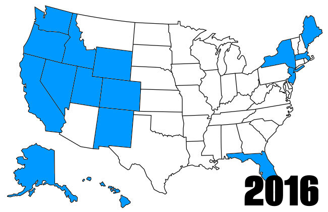

We added Utah and New Mexico in 2016. These were the first trips we did that looked like the way we travel now - packing in a ton of activities every single day, attempting to see everything. At 10, Trevor was a seasoned traveler with the stamina and interest to visit multiple museums, historical sites, attractions, and unique restaurants each day.  


We started 2017 with Trevor's first trip to Arizona. It was during SNAP Conference in April 2017 that I officially became a travel blogger (as opposed to a craft blogger who sometimes mentions travels). It was incredibly exciting to work with travel-related brands for the first time and receive media rates and comped tickets. We took a summertime trip to Iowa and Nebraska, then a fall trip that added Maryland, Delaware, and Pennsylvania to our states-visited list. 


I remember how excited I was to create an unbroken path across the US on our map in 2018! That year, we took an epic trip to Illinois, Michigan, Ohio, West Virginia, Kentucky, and Indiana over the summer, plus a Thanksgiving trip to Texas


In 2019, Trevor took a school trip to Washington DC, which included time in Virginia. All three of us have been there, but it is the only state of the 42 on Trevor's list that the three of us haven't visited together. We took a summertime trip to Missouri and Kansas, plus a winter trip to Louisiana and Mississippi


We spent 2020 at home. Literally. I never would have predicted that when we set our goal in 2014. Fortunately, we were back to traveling by the summer of 2021. We added Montana, then spent Christmas week in Tennessee, Alabama, and Georgia


Which brings us to 2022! We spent the first days of the new year in South Carolina and North Carolina. And just a few weeks ago, we visited Minnesota and Wisconsin for the first time. 


OK, so what did I do with these images? I used EZ GIF to turn them into a GIF! And true to the name, it was incredibly easy. (And free!) I just uploaded the images, set the time I wanted each to run, set the number of runs to one, downloaded the results, and uploaded it to my US Travel page. Go check it out, if you haven't already!

9/19/22

In the Style of El Greco, from "Discovering Great Artists"

I recently got my hands on Discovering Great Artists - Hands-On Art Experiences in the Styles of Great Masters by MaryAnn F. Kohl and Kim Solga (affiliate link) and WOW, is it packed with inspiration! 


The authors have divided the many projects into four categories: Long, Long Ago (Renaissance and Post-Renaissance); Sunny and Free (Impressionists and Postimpressionists); Wild and Wacky (Expressionists, Abstract, Abstract Expressionists, Cubists, Dadaists, and Surrealists); and Art Today, Every Way (Pop, Op, Modern, Photojournalists, and Children's Book Illustrators). There are 15-20 artists and projects they inspire in each category. Each includes handy icons to show the difficulty level, prep time, media used, and artist style. Even if you never made any of the projects, this book provides an outstanding summary of the major artists in each style. 

I decided to start with an artist from the Long, Long Ago category: El Greco. I learned that his real name was Domenikos Theotokopoulos and that he left Crete in Greece at a young age to study in Venice, Italy. He became well-known after painting religious scenes for a cathedral in Toledo, Spain. The tall figures he painted appear stretched out, with their features much longer and thinner than real people are. El Greco is considered one of the first great artists who thought expressing feelings in artwork was more important than showing reality. 

Here is the project I made inspired by El Greco:


The book says to find a person in a magazine for this project, but I thought a self portrait would be more fun. Since I got a free package of photos every year that I taught, I have zillions of large photos of myself that I've kept for no reason other than to use for projects like this. 

Following the instructions, I cut the photo across my forehead, under my eyes, under my nose, and across my chin. I added a bonus cut across my neck. Then I glued the photo strips to a piece of white cardstock with a gap between each. 


Then I used my colored pencils to fill in the gaps. It was much harder than I expected to color match. I obviously need a lot of practice and a better understanding of color theory. As you can see, I tried different blends of pencils for each section of skin and hair. Some are better than others and none are great. Honestly, I wasn't too motivated to put a lot of time into it, which was part of the problem.  


This was a fun, albeit creepy, project. I may have to try something like this again. I still have a whole lot of school photos to use up!


CLICK.BUY. CREATE. Shop Michaels.com today!

9/16/22

Caprese Salad in a Sourdough Bread Bowl

One of my absolute favorite things about summer is eating homegrown tomatoes right off the vine, still warm from the sun, juicy, and full of flavor. We planted four varieties of tomatoes this year and I used some of each to make my take on a caprese salad, served in a mini sourdough bread bowl. It was the perfect summer meal. 


There isn't a recipe, per se. I cut a bunch of tomatoes into chunks (and halved the cherry tomatoes), put them in a bowl, then added a generous amount of high-quality olive oil and balsamic vinegar. I added a dash of salt and some pepper and mixed thoroughly. I cut basil (also fresh from the garden) into a chiffonade and added it. I spooned the mixture into individual bread bowls, adding the liquid as well. Then I topped each with a few spoons of ricotta cheese. Fresh mozzarella is traditional in caprese salad, but ricotta makes a really nice substitute. 

Our garden is still going strong following last week's crazy heat wave and record-breaking temperatures, so I'm hoping to have caprese salads for another few weeks. 

9/15/22

Dimensional Fall Tree (Experimenting with Piping Flour-Thickened Paint)

A large number of the crafts I make could start with the introduction, "So I had this idea and wanted to see what would happen if..." In this case, I wanted to see if I could thicken inexpensive acrylic paint with flour*, then pipe it onto a canvas as if it were frosting. It didn't quite work as I'd hoped, but I'm happy with the end result. And it was a lot of fun to make!


I started out by painting a blue background on a square canvas, then painted a tree onto that. While the paint was drying, I got out the flour, acrylic paints in fall colors, and ziplock bags. 


I put about 1/4 cup of flour into a bag, then added a very generous squirt of yellow paint and a teaspoon or so of water. I added more paint and kneaded the bag until everything was evenly mixed and the consistency of thick frosting. I cut a tiny hole in the end of the bag, then started piping leaves onto my tree. 


It worked well at first and I was enjoying piping little leaves onto the branches. But then my bag clogged. I removed the clog, only to have another clog a few seconds later. I tried to squeeze out that second clog (not wanting to get as messy as I had carefully extracting the first one), but that just made things worse. The more I piped, the globbier the paint got.  


Time for a new technique! I mixed up some orange flour paint and applied it in globs with a plastic knife. It was actually really fun to drop paint globs onto the branches. 


I kept going using that technique, adding two more colors of leaves. When I was happy with my tree, I let the whole thing dry overnight. Success!


*I'm fully aware that there are artist-grade options for thickening paint, like gel medium and modeling paste. And of course, I could have bought thicker (i.e., more expensive) paint to begin with, but the point of my experiment was to make a kid-friendly project using things from around the house. Thus the basic craft paint, flour, ziplocks, and plastic knife. 

Shop Tombow

9/14/22

Drawing Myself as a Duolingo Character

This week, I hit a 600-day streak learning Spanish on Duolingo. To mark the occasion, I decided to draw myself as a Duolingo character. I found an image of the Duolingo characters and identified their distinctive characteristics: rounded geometric shapes, unrealistic proportions, large eyes, teardrop noses, bright colors, minimal details, and disembodied feet on a white background. 

Then I used those traits to draw myself in the Duolingo style. This was my first draft. 


After making it, I found this interesting article about Duolingo's illustration guidelines. I went through each category to make any necessary changes to my drawing to bring it in line with Duolingo standards. First, all shapes are supposed to be rounded. Mine are, but the feet and eyebrows aren't rounded enough. Second, there should be a variation in shape, avoiding predictable shapes with similar visual weight. I think I'm ok there. 

Second draft: 


The next category is simplicity. They state that 6 shapes is too abstract, 30 shapes is too many, and 15 is just right. Mine has 16 shapes in the head alone: circle head, rectangle neck, rectangle hair, oval bangs, rectangle eyebrows (x2), circle eye (x2) with circle pupil (x2), circle ears (x2) with circle earrings (x2), teardrop nose, and semicircle mouth. However, the rest of the body only adds another 8 shapes, bringing me to 23. I took off the earrings to bring it to 21. 

Third draft: 


The next category says that all Duolingo characters must be designed with a flat perspective. I'm fine there. I didn't use shadows, so that's ok too. Then we get to color. There is a recommended color palette that I didn't follow, along with suggestions to be playful and vibrant while avoiding using too many colors. The final guideline is about floating accents. I only floated the feet, so I'm fine there. As I was looking closer at the characters, I realized my eyes were wrong. So I fixed those and made a bunch of changes to the colors, bringing me to.... 

Fourth (and final) draft: 


I really like my character! I think she needs a rabbit sidekick...