
Each year around Thanksgiving, I begin impatiently awaiting the announcement of the Pantone Color of the Year. It's interesting to me to learn what colors are trending and which Pantone is predicting will represent the upcoming year. I enjoying making my own guesses from a craft perspective (rather than a fashion or home decor point of view) and then seeing if the COTY does indeed show up in craft materials, such as scrapbook papers, inks, and specialty paints.
While I am very curious about which color Pantone will name as COTY 2022, I’m going to be really annoyed if they name another pair of colors like they did last year. (Or, god forbid, more than two colors.) Traditionally, the color comes from the Spring/Summer Palette, announced in the fall. This year, they presented two different palettes. Each has ten main colors, plus five 'core classics.'
This is from New York Fashion Week:

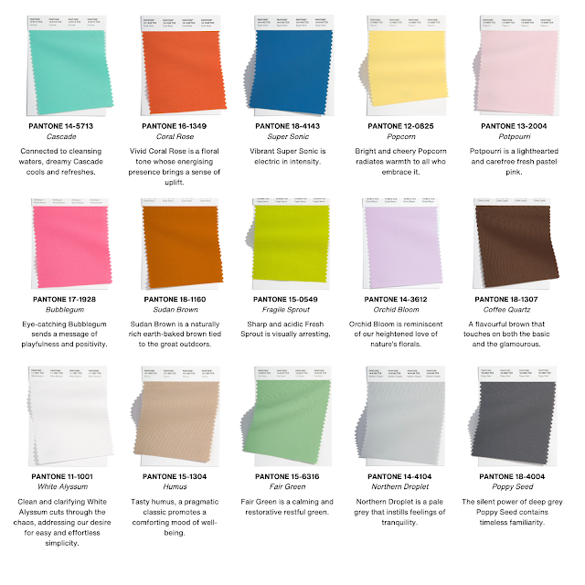
There are a few surprises for me, the main one being Basil / Fair Green appearing as a neutral on their respective palettes. Conversely, the coffee-inspired Coca Mocha / Coffee Quartz are not part of the neutrals but rather a featured color. Interesting. I see a lot of pastels and wouldn't be too surprised for one of them, perhaps Orchid Bloom, to take COTY. Two colors, including Northern Droplet and Poppy Seed, are on both palettes, which makes me think they're contenders. I don't know - Pantone has surprised me many times with their selection.
What are your thoughts? What do you predict for COTY and/or what do you hope is named COTY?

I like this year's spring/summer palettes than i have in previous seasons and I am thrilled about Periwinkle. It is interesting to me that Rit Dye added periwinkle to their line of bottled dyes way back in the spring of 2021. They must have had a sense that this would be a popular color and it has been for the hand dyed, handmade products I sell. Like you, I am curious about why periwinkle and the coordinating colors they've chosen are not in New York's palette. Maybe someone else can answer that. I am also glad to see a slow movement away from grey towards taupe, beige and rich browns. Overall I am pleased with this season's palette and hope my customers are too!
ReplyDelete