9/30/21

Cocktails for a Cause

One of our favorite family traditions is visiting the Vacaville Festival of Trees in late November. We love seeing all the beautifully decorated trees and struggle to pick a favorite among so many clever and creative designs. Trevor always does the scavenger hunt, then we browse through the craft items for sale. We buy treats from the bake shop to enjoy as we agonize over which raffle prize buckets to drop our tickets in. It's such a fun event. And, we love that all the proceeds from the event benefit the Opportunity House homeless shelter. 

In 2020, COVID meant that the Festival of Trees looked a lot different than usual. The decorated trees were displayed individually in storefront windows throughout downtown and bidding was virtual. Baked goods sales moved online as well. The three of us loved spending a beautiful fall day strolling through Vacaville in search of the trees. 2021 will have the same format and we're already looking forward to it. 

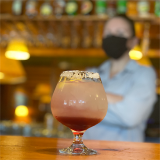
There's one facet of the Festival of Trees that we've never participated in, and that's the Gala. Until now! We're not attending the Gala, but Steve and I did help decide the Signature Drink that will be served there. For $65, we got a "Cocktails for a Cause" ticket, good for 8 cocktails from 7 Vacaville restaurants and one vote for a winner. During the month of September, we visited each restaurant to try the drink and meet the bartenders competing for the honor.

After not eating in restaurants from March 2020 to June 2021, it was really nice to have a reason to revisit our favorite Vacaville restaurants. And not only did we enjoy our favorites, but we discovered two more new-to-us places that we'll definitely return to in the future. 

The competing restaurants and their drinks include: 

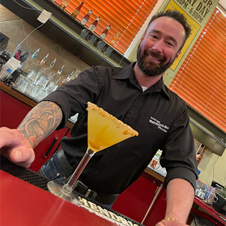
BackDoor Bistro: "It's 5 O'Clock on an Island Somewhere" (Jon)
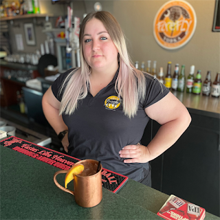
Burger City: "James and the Giant Peach Mule" (Kelly)


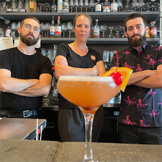
Clay Oven: "Ooh La La Lemon Drop" (Jeet)
Fuso Italian Restaurant: "Cinnamon Dreamsicle" (Rachael)
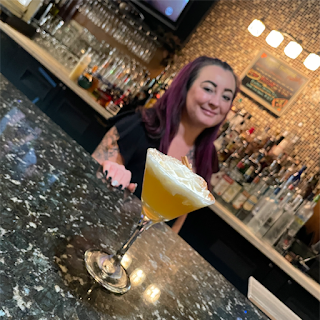
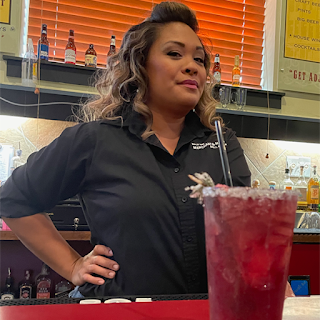
  

Merchant & Main: "Snowy Red" (Ari)
Merchant & Main: "The Grinch that Stole Christmas" (Nick)


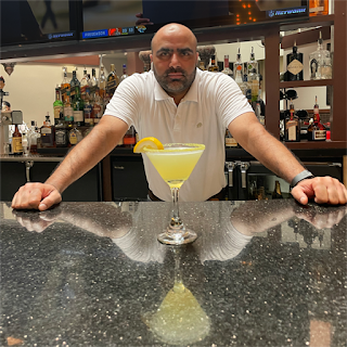
Tahoe Joe's: "Sierra Mountain Spritz" (Allison)
Los Reyes Restaurante Y Cantina: Señorita Blush (Lucy) - the 2020 champ!


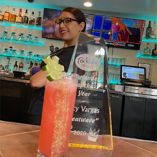
Picking one winner was soooooo difficult for me! Steve gave the nod to Jon at BackDoor Bistro for his spectacular "It's 5 0'Clock On an Island Somewhere." While I liked it too, I didn't think it made sense for an elegant evening Gala surrounded by Christmas trees. And that is the same issue I had with quite a few of the other drinks. Lucy's "Señorita Blush" was my favorite drink, the one I'd order again and again, but it was fruity and tropical and perfectly refreshing for a hot summer afternoon... not for a winter gala. 

My runner up was Allison's "Sierra Mountain Spritz." It was delicious and would go well in a winter setting. But ultimately, I voted for Ari's "Snowy Red." Not only did it taste fantastic and feels like Christmas, but the ruby red color with the rosemary garnish will look so striking at the Gala.

Steve and I have a new annual tradition! Cocktails for a Cause was so much fun and such a clever and creative fundraiser that we're planning to support year after year. 

9/29/21

Color Name Art Acrostric

My colored pencil art class continues and I'm having so much fun with it! I'd started by watching videos and reading articles about specific skills I wanted to improve, but those just made me realize how much I didn't know about the basics. I'm now going back and watching all of Sarah's colored pencil videos. Her first-ever live stream inspired me to make this: 


This challenge was up on her channel right before she went live. Rather than just answer the question, I turned it into a coloring project. You know how much I love name art!


I started by identifying the colors I would use. Crimson and Yellow came to me right away, as did Indigo for I. But I was stumped with N and D. I thought about using Non-Photo Blue, but I consider that to be a B color, not an N color. For the same reason, I didn't want to use Dark Green or something like that for D. Eventually, I came up with Navy and Denim. They're more similar to each other than I would have liked, but I couldn't think of anything better. Then I realized that three of the five letters in my name would be blue (without a single B in my name), so I switched Indigo for Ivory. 

I used PicMonkey to design my acrostic:


I knew I didn't want to color on copy paper again, and I didn't have any drawing paper that would work in the printer. So I used a light box and traced with a black Pigma Micron pen onto Strathmore drawing paper. Affiliate links here and below. A tip: use paperclips to attach the papers so that they don't accidentally shift while you're tracing. 


For each color name, I chose three Prismacolor Premiers. Using light layers, I put the color that best matched the color name in the center (in this case, Crimson Red), then blended that with a lighter color on top and a darker shade on the bottom.  


I struggled coloring Ivory. I don't have very many pale colors, so I used Eggshell as the middle and blended it with White and a Warm Grey. I don't love it, but it's fine. I definitely need more colored pencils in that range.  

When I got to the blues (Navy and Denim), I needed more options beyond my small collection of Prismacolors. My single Caran d'Ache Pablo was just the shade I needed. When I sharpened it, that's when I realized the mistake I'd made with my swatches. I hadn't sharpened the various pencils to see how well they held their points. The difference between the Prismacolors and the Pablos was shocking. I love my Prismacolors for how well they blend and how brilliant the color is, but the Pablos sharpened to a much, much finer point, great for getting into tiny spaces. Now, in addition to needing more shades of Prismacolors, I need Pablos for detail work. Or maybe another brand/model? I need to retest all of my higher-end colored pencils. 


Overall, I'm happy with my finished name art, even though I don't think the colors work well together. Crimson, Ivory, and Navy look pretty good together, and adding Denim is fine. But I don't like Yellow and Ivory together at all. When I cover one or the other, I like the remaining palette so much better. 


One thing I love about this project is that everyone's palette is different. I may have to do a little experimentation to find what name generates my favorite color palette. If you can think of one that works well, tell me in the comments!

9/28/21

Colored Pencil Progress

Last week, I discovered Colored Pencil Magazine exists. Now I've learned that there is a Colored Pencil Society of America. I'm continually amazed by how much I didn't know about colored pencils, despite using them regularly for 47+ years! 

I've also discovered that I own more colored pencils than I thought I did. I keep my open-stock colored pencils on the paint shelf in the craft room and the complete sets in the craft room closet, plus Trevor has a bunch in his bedroom and more at his desk. Before making my colored pencil swatches, I did what I *thought* was a thorough search of the other places more pencils would be hiding. And yet I continue to find colored pencils here and there. It's a good problem to have, I suppose, but it makes me realize there are a few more drawers and bins in the house that need reorganization. 

Here is my latest colored pencil effort. The pages are from Leisure Arts' Love Grows and colored with Prismacolors (affiliate links).   


I'm really happy with the progress I'm making with blending and shading, thanks to Sarah's videos. Speaking of which, Sarah is on a quest to reach 100K subscribers on YouTube by the end of 2021. Considering how valuable her content has been to me, I'm doing my part to help her out. If you have enjoyed any of her videos I've shared, or want to learn more about colored pencils, subscribe to Sarah's YouTube channel. She's giving away a bunch of prizes as her following grows, so there's some extra incentive for you!

I like to do something with my colored images, but these have me stumped. Ordinarily, I'd fussy-cut them and use them on cards or something. But the many tiny leaves, cactus spines, and line-thin stems make these a very poor choice for fussy-cutting. I used the trimmer to separate the images, thinking maybe I could use them that way. Here they are, with a colored pencil for scale:


If you have any thoughts on how I can use these, let me know!

9/27/21

Bean Mosaic Coaster

Today's project combines two classic kids' crafts, bean mosaics and trash-to-treasure. Follow along as I show you how to turn a plastic lid from the recycle bin into a functional coaster. While this takes only a small amount of time to assemble, drying time is very long. Plan accordingly! Affiliate links below. 


Bean Mosaic Coaster


Materials:


Steps:


Spread the beans onto a work surface. Experiment with design options, or jump right in! I found it easiest to start with the largest beans in my design. 

Put a small puddle of Mod Podge into the lid. Separate the largest beans you'll be using in the design, taking care to make them as similar in size as possible. Then arrange the largest beans where you want them. They'll be supporting your glass in the finished coaster, so consider that when you place them. 

 
Add more Mod Podge so that there is a shallow amount across the whole lid. It should be no deeper than the height of the smallest beans you'll be using. Arrange the rest of the beans in your design. 


Let the Mod Podge dry for several days (over a long weekend, if you're doing this in the classroom). When it looks like this, add a bit more Mod Podge over the top to seal everything in. 


Let the Mod Podge dry until it is completely clear and glossy. It took mine about a week from start to finish, but obviously room temperature and humidity play a big role in drying time. 


Test your coaster at this point. When you set a glass on it, it should feel secure and the water should be level. 


Here's the side view of mine. 


If yours isn't quite level enough for a drink coaster, you can use it as a plant coaster, or as a place to set keys. You could add a hook and hang it as an ornament. Or you can simply use it as a decoration. Lots of possibilities!

9/24/21

Paper Plate Halloween Wreath

 Check out my new Halloween wreath! The base is a paper plate.


---------


Paper Plate Halloween Wreath


Materials:


Steps: 


Cut the center out of a paper plate so that you have a ring. Then cut the Halloween papers into 1.5" x 8" strips. I used 25 strips for my completed wreath. 


Cut a V in the end of each strip, if desired. Glue the strips to the paper plate, letting a bit of the strip hang over the edge. Overlap the next piece slightly. 


Continue until all the strips are glued. Flip the wreath over. Use scissors to trim the excess paper so that the opening of the wreath is even. 


Decorate the wreath with papers and stickers. I cut the HAPPY HALLOWEEN strip from one of the patterned papers, then added the five stickers. 


Because it's made from a paper plate and strips of patterned paper, the finished wreath is very light and easy to hang. Mine is resting on a small Command hook.


I'm really happy with my new Halloween wreath!

9/23/21

Colored Pencil Fleur de Lis: Lessons in Shadows and Paper Choice

I am learning so much about color pencils from Sarah Renae Clark! I've now watched 19 of her videos as part of my self-created class about coloring. Just after finishing Sarah's Advanced Shading Techniques video, Steve asked me to make a Scout-themed card for a camp ranger who helped our troop. Eager to try out Sarah's shading tips, I printed out a black and white image of the BSA fleur de lis and started coloring.  

I used my brand-new Prismacolors, but they weren't blending as well as they had on the floral coloring page, which had come from a coloring book. It turns out that ordinary copy paper is not a great surface for colored pencil work. Duh. I never use copy paper when drawing, so why would I have for coloring? I went back to Sarah's YouTube page and found a video specifically about the exact problem I was having

I haven't tested what papers will work in our printer, but it's on my to-do list. In the meantime, I did my best coloring the copy paper image. Matting it on black and gold really helped.


I wanted to share two very quick videos of Sarah's that I love. I hope to color with this level of realism someday. 


Were you able to spot the fakes right away? I wasn't!

9/22/21

Putting My Colored Pencil Lessons to Work

My colored pencil art class continues to go well. I'm dedicating a little bit of time each day to watching videos, reading articles, and/or actually practicing the skills I'm learning. 

First, a few random things I've learned in the past week:
  • There are right and wrong ways to sharpen colored pencils. Many artists like to use a craft knife for precision, but there's nothing wrong with using a handheld sharpener as long as it is sharp. Turn the sharpener and not the pencil. If you use an electric sharpener, sharpen no more than 3 colored pencils at a time before letting the machine cool down. Then sharpen a regular graphite pencil before sharpening another colored pencil. 
  • "Keen" is used to describe a very sharp point on a colored pencil. You can use sandpaper to turn your dull point to a keen one. It's the same word as in keen eyesight. 
  • Colored Pencil Magazine exists. The website is great - I loved looking through the Art Challenges. I signed up for their newsletter in order to receive a free issue of the magazine so I could check it out. I like it and am considering subscribing. 
  • Wax bloom is a thing. 
  • Rather than leaving an area blank or coloring it with a white pencil, you can use an embossing tool on an area you want to remain white. Embossing can also keep colored details (like the veins of a leaf) crisp. It's basically pre-burnishing. 
  • Non-Photo Blue is a specific color used in the pre-digital era because it doesn't show up on graphic arts camera film. I had a Non-Photo Blue colored pencil in my collection and never noticed until I made my swatches. 

Ready to see the most recent coloring page I've done? It is from the Love Grows coloring book and I used Prismacolor Premier color pencils on it. Affiliate links here and below. 


After I colored the image, I used microtip scissors to fussy-cut it. I glued it to a 5x7 white card base. I finished the card by gluing on the happy die-cut and the birthday sticker. 

I'm really enjoying my cobbled-together art class!

9/21/21

Colored Pencil Inventory: Learning about Binders and Finding My Favorite Brands

As part of my coloring art class, I've been learning more about colored pencils. The first and most important lesson I learned is that not every pencil with color inside is a colored pencil. A true colored pencil has a binder that holds the pigment. The binder is either wax-based or oil-based. This article does an excellent job of explaining the pros and cons of each. I also learned that the type of pigment, as well as the binder-to-pigment ratio, affects the pencil's quality. 

I have a lot of colored pencils. Most came to me as samples or gifts. Except for a few sets I've kept intact (like the World Colors set by Faber-Castell), I've just tossed all the pencils into a single container. It hadn't occurred to me that mixing brands (and thus, binder types and pigment ratios) could matter. I didn't know if the colored pencils I had were wax- or oil-based. All I knew is that my favorite colored pencils, the ones I reached for most often, were the Eagle Prismacolors I had as a kid that are now stubs despite my attempts to use them only on the most special projects.

Since I was completely ignorant about what I had, I thought the best thing to do would be to create swatches, see what I liked best, and then find out whether those were oil- or wax-based. Along the way, I made some very interesting discoveries.

Here's my first page of swatches, where I started with what I was guessing were the higher-quality colored pencils. Other than my 8 remaining stubby Eagle Prismacolors, I only have 1-3 of each of the others since they were all samples. 
  

Comparing them like this was very enlightening. My favorites (besides the Prismacolors) were the Derwent Coloursofts, the Caran d'Ache Pablo, and the Faber-Castell Polychromos because of the color intensity, creamy application, and ease of coloring. (I've added affiliate links to these and all the other colored pencils I liked.) It turns out the first is wax-based and the last two oil-based. It also turns out that some of what I thought were colored pencils are actually water-soluble! This includes the Derwent Graphitint, Derwent Inktense, and Faber-Castell Albrecht Durer. Now that I know, I've moved them to my watercolor pencil collection. I also learned that the Inktense pencils dry permanent, so they can also be used on fabric. Very cool!

Here's my next set of swatches. 


Again, this was very enlightening. After coloring with so many great pencils, I hated using the Faber-Castell Col-Erase pencils so much I immediately put them in a donation box. I'm sure someone else will appreciate that they are erasable, but I had to press so hard to fully color in the tiny boxes on the graph paper that they made my hand hurt. No thanks! 

I was happy with both the Prang and the Crayola sets. They are wax-based, kid-quality colored pencils that definitely have a place in my craft room, along with the Faber-Castell World Colors. I've moved them to a separate container from the artist-quality colored pencils. 

My next swatches were of a premium white-label set from Leisure Arts.


The fact that they don't have color names or numbers on the pencils makes me think they're a lower-end brand, but they perform beautifully, with vibrant color that's easy to blend. I searched everywhere to see if I could discover anything about them, particularly the manufacturer and the binder type. Nope. It remains a mystery. All I know is that they're delightful to use and have earned a place with my higher-end colored pencils. 

My final swatch chart was for the newest colored pencils in my collection. I made my first-ever in-person visit to Blick and came home with these 36 Prismacolor Premiers. I love them so much!


I can't find a clearcut answer about how many colors there are in all, but 150 is the largest set. I tried to do some research to learn about the numbering system, but wasn't successful. All the pencils are in the 100's, 900's, or 1000's. Where are the single- and double-digits, as well as everything from 200-899? Another mystery. Regardless, there seem to be at least another 114 colored pencils for me to eventually own. #CraftGoals!

9/20/21

Glow in the Dark Eyes at the Window

The house is decorated for fall, but it's almost time to switch over to Halloween. Soon this will be hanging in the window by the front door. 


The eyes glow in the dark. This is what it looks like at night. Affiliate links below. 


Glow in the Dark Eyes at the Window


Materials:


Steps:


Paint a thin coat of Glow in the Dark paint on the yellow cardstock. When it is dry, add a second coat. You can add a third coat if you wish - the more coverage, the better the glow.  

Use strips of silver washi tape to create the muntins of the window. Wrap the ends around the back for a clean look. 


Use the scissors to cut out eyes from the painted yellow cardstock. Glue them to the window. 

To glow, the paint needs to 'charge' in the sunlight, so make sure to display your craft in a place with direct sun. Then enjoy the spooky glow at night!

9/17/21

Laurel Creek Beavers

Last month, Trevor organized a hike for his Scout troop, led by a local beaver advocate and the founder of Laurel Creek Beavers. Our troop started at the Paradise Dam and walked the length of the creek to the Heretic Lodge before retracing our path. Along the way, the Scouts picked up trash (I'm happy to report there was very little) and saw 14 beaver dams. The highlight was seeing the beavers swimming near their lodge. We also saw river otters and muskrats swimming. It was awesome. 

Laurel Creek Beavers (affiliate link)


We learned that the current beaver management protocol includes trapping or even killing the beavers and/or removing their dams. Our guide had a lot of before and after pictures that clearly show that that this is unnecessary, as the creek was in no danger of overflowing even with so many dams. In places where there is a flood risk (which is unlikely in our drought-stricken area), there are better solutions that simply destroying the beavers and their habitat.

The local newspaper featured our Scout outing on the front page of the Sunday paper, which I'm hoping led to increased awareness among fellow residents and greater pressure on the authorities to leave the beavers in place. If nothing else, our Scout families are now fully informed and eager to see the beavers remain a part of our community. 
For more information about the Fairfield Beavers, visit the website or join the Facebook group. Be sure to look through the Media tab for photos of the adorable beaver kit!

9/16/21

An Atypical Sympathy Card

 The coloring page that I shared with you yesterday? I used it to make a sympathy card. 


It is very different than sympathy cards I've made in the past. The most obvious difference is the color palette - pinks and greens that focus on celebrating life rather than mourning death. Another difference is the amount of time I spent making it. Sympathy cards always take me longer than other cards, but between coloring and burnishing the image (another thing I learned about after watching Sarah's videos), adding the stitching, and embossing the sentiment, this probably holds the record for the card that took me the longest to make. And that is a good thing. 

As I made the card, I thought about a life well-lived. I thought about a dad who was devoted to his family, who loved spending time in nature, and who always had a smile on his face. I met John when I was 8 or 9, when he and Jonna joined the same Father/Daughter program my dad and I were in. Over the years, our families spent a lot of time together. John helped me move into the apartment I shared with Jonna in college, but even more notably, he helped me move out of the apartment long after Jonna had moved out. I remember the huge smile on his face during my wedding, and the even bigger smile when I introduced him to my baby for the first time. John will be missed by many and I'm glad he was a part of my life. 

9/15/21

"Art Class" #1: Improving My Coloring

One of my creative resolutions for 2021 is to take two art classes. I was hoping to do in-person classes, but here we are in September and I haven't found any that I want to take. I looked at some online classes and found some interesting options, but nothing was quite right for one reason or another. I decided to take a different approach: I would pick two art-related skills I'd like to learn/improve and then I'd search for the corresponding content.  

The first skill I'm tackling is improving my coloring. Besides picking out colors that look good and staying within the lines on a coloring page, what else is there to coloring? As it turns out, a LOT. 

To be honest, it wasn't until I colored the hummingbird gift bag that I realized how much skill coloring well requires. The more I've read, the more I realize how much I have to learn. (Isn't that the case with everything?) With the hummingbird image, I attempted to add shading and texture to the flowers. I had some success, but realized this would be the perfect topic for the first class I'd put together for myself. Since then, I have skimmed dozens of blog posts and watched snippets many YouTube videos looking for a great instructor. I am thrilled to have found Sarah Renae Clark

Sarah is a coloring book author and talented artist from Australia. Her blog posts are well-written and illustrated beautifully, but it was her YouTube videos that truly drew (haha!) me in. 

These are three of my favorites. Each contains lessons I was immediately able to put into place to improve my coloring.  


This is the first coloring I've done since starting my 'class.' The image is from the Love Grows Coloring Book (affiliate link). 


It took a lot more time than it used to take me to color a similarly sized project, but the extra time was particularly good for this project. Tomorrow I'll tell you why. 

9/14/21

Splatter Paint Fall Trees

After sharing so many splatter-painting backgrounds, it's time for a splatter-painted foreground. Rather than the thumb-across-toothbrush technique, I used a different method to achieve the dots and drips. It was so much fun!


Splatter Paint Fall Trees


Materials:

  • watercolor paper
  • crayons (brown, black)
  • acrylic paint (blue, orange, yellow, red-brown)
  • two paintbrushes

Steps:

Use crayons to draw bare trees on the watercolor paper. I drew four trees, each with plenty of branches and twigs, then added a bit of shadow with the black crayon. 

Thin the blue paint and use it to create a wash of color on the entire paper. These bits of sky will show through between the leaves of the tree. Let the paint dry. 

Put the painting into a cardboard box. I have a designated box I use to contain the mess when splattering, misting, dripping, and spraying. Hold one paintbrush in each hand. Dip one paintbrush into the red-brown paint, then tap it on the handle of the second paintbrush. This will cause small flicks of paint to splatter down. Experiment with the quantity of paint on the first brush, where you tap on the second brush, and how far from the paper you hold the brushes to get different sizes of splatters. Concentrate the splatters along the base of the trees and in the branches, leaving the space along the middle of the trunks and above the branches relatively unsplattered. You may need to rotate the paper to accomplish this. 


Without cleaning your brush, switch to orange paint and use the same technique to add splatters. Switch to yellow, building up the layers. When you have a good amount of splatters in the two main sections of the painting, use a pouncing motion to fill in any gaps between the leaves on the ground. With the same pouncing motion, do the same to add leaves to bare branches (if desired). 


It's up to you how many leaves you want on your finished artwork. I kept going until I liked how the trees looked. 


This really is a ton of fun to do. There's something very satisfying about seeing drips of paint transform into leaves. 


9/13/21

First Day of 10th Grade

The first day of school is always special, but this year's marked the first time in 516 days that Trevor attended school in person. While he enjoyed distance learning and did very well, he was happy to head back to in-person school for 10th grade. 

First Day of 10th Grade (affiliate link)

Of course, school isn't back to pre-COVID normal. Masks are mandatory indoors and recommended outdoors. Students carry water bottles instead of using drinking fountains, and hand sanitizer is everywhere. Staff and students must do a daily self-check for COVID symptoms. Trevor's high school takes place entirely on the community college campus, which opted to keep most of their class in distance learning this semester; consequently, the high schoolers have the whole campus to themselves. Well, almost. Key facilities like the library and gym aren't open. The cafeteria isn't operating, but the district brings in free lunch for all students every day. School drop-off and pick-up are a dream because the parking lots are completely empty. Permits are not required for upperclassmen who drive themselves. Things will change dramatically when the community college returns to in-person learning, presumably when the new semester starts in January.

9/10/21

Found Poem: September 11, 2001

September 11, 2001 was a Tuesday. I had just woken up and started getting ready for work when my phone rang. A call at 6:00 am is never good news. And this was as bad as news gets. My friend Brenda told me to turn on the TV immediately. What I saw was horrifying.

The drive to work was strange. The roads were empty and I wanted to turn around and go home. But I couldn't. I needed to be there for a class of fifth graders whose parents might or might not have told them what was going on before dropping them off at school. When I got to work, we had strict instructions not to talk about what was going on, to offer brief reassurances only as needed, and to keep the day as normal as possible. It was very difficult for me to stay in the cocoon of my classroom with absolutely no information about what was going on beyond those walls. We had no internet in the classrooms and this was long before smart phones, so we teachers had to wait until recess and lunch to learn anything. 

The drive home was even stranger than the drive to work.  

The following day at school was even more difficult. By then, all the students knew what had happened. Many had seen graphic images over and over on TV. They were scared, they were upset, and they had a thousand questions. There was no hope of having anything approaching a normal school day. To complicate matters, each Wednesday we got a class set of newspapers. The kids and their parents knew that Wednesdays meant newspapers and current events homework. I couldn't just casually send home these papers with their screaming headlines and disturbing photos, expecting them to pick an article and summarize it. 

During my lunch break, I used the paper to make this found poem. 


At the end of the day, I read my poem to them. I announced that homework was canceled, then invited only those students who wanted to take a paper to do so. I gave them an optional homework assignment to create their own found poem, ideally working with parents and older siblings. I received five poems, all beautiful. 

It's hard to believe 20 years have passed. I have not forgotten. 

9/9/21

California Poppies Craft

After cutting off a strip to make my fall leaf bookmark, I still had leftover paper that I'd painted in oranges and yellows. The colors were perfect to use for California poppies. 


Our state flower grows wild all over our golden hills, offering beautiful pops of color most of the year. Fun fact: the petals close at night and open when the sun rises. On cloudy or windy days, they stay closed. Fun fact #2: Today is California Admission Day. Happy 171st birthday to our state!


California Poppies Craft


Materials:

  • watercolor paper, painted with oranges and yellows
  • cardstock (a sky blue background and green for the stems and leaves)
  • microtip scissors
  • brown ink
  • craft glue

Steps:


Cut petal shapes from the orange paper. You need four petals for the flower facing front and three for the one that is facing away. 

From a yellow section of the paper, cut a small piece that looks like grass. These are the stamens. Cut stems, leaves, and a bud from the green paper.  


Add a little bit of brown ink around the edges of the petals. This will give a sense of depth. Then glue everything together, starting with the flowers, then adding the stems and leaves. Finally, glue the poppies to the blue background paper. 


I love California poppies!