1/31/23

Seattle Fun, June 2022

We spent a fantastic three days in Seattle last summer. It was crowded and hot, but neither stopped us from thoroughly enjoying Emerald City, so named because it is the jewel of the Evergreen State. Seattle is a wonderful place to visit, packed with so many things to do and see. 

Seattle Fun (affiliate link)

To make my layout, I chose seven photos that showed the range of things we did. With the exception of the Beneath the Streets underground tour, all of the photos are vibrant and colorful. They served as inspiration for my title work. I needed a pop of color at the bottom of my journaling for balance, so I grabbed an Ohuhu marker that was sitting on my desk. It worked perfectly. 

1/30/23

Conversation Hearts Ninja Valentines

I miss the days when Trevor would make cute homemade valentines for all of his friends. I was thinking back to the Ninjago valentines he made in first grade, which inspired me to make a new version of ninja valentines. They start with a box of conversation hearts, which gave me a great excuse to buy conversation hearts. They're one of my favorite candies. 

Hi-ya!


Ka-pow!


Not only are they cute, but posing them is ridiculously fun. Affiliate links below. 

---------


Conversation Heart Ninja Valentines


Materials: 


Steps: 


Wrap the box in black cardstock or construction paper. You can simply wrap it like you'd wrap a present, or you can measure, cut a rectangle to size, and score it along the fold lines to get crisp edges. I prefer that look, so that's what I did. 


Secure the paper with the black painters tape, or glue it directly to the box with craft glue. I used tape. Cut a rectangle from your desired skin tone cardstock, then draw on eyes and eyebrows. Glue the rectangle to the box. 

Cut a pipe cleaner in half, then bend each half in half. Bend the ends to form the hands and feet, then position the arms and legs how you want them. Use several pieces of tape to secure them to the back of the box. 

You can give your ninjas as is. But if you want to write a message and/or include to/from information, write it on a label sticker, then attach to the back of the box. This has the added benefit of further securing the arms and legs.

1/27/23

The Amazing Art of Gwyn Pevonka

One of my favorite Christmas presents this year came from my Aunt Vickie. It's an original artwork from the contemporary painter Gwyn Pevonka entitled "Washington Skies."  


To best understand it, you need to see the side view. 


Pevonka's process begins with painting one layer a day onto a canvas for 20+ consecutive days. Then she carves into the surface to reveal the layers beneath, kind of like the hand-caved candles I was obsessed with as a kid. For some of her pieces, the process stops here. But for others, including the one I now own, she adds those carved bits to the canvas and uses them to make what she calls Acrylic Assemblages. It's a fascinating process. 

I very much enjoyed looking through Pevonka's portfolio to see her range of work. I particularly love her animals, especially this hummingbird. 


Last year, I started a series where I made my own paintings inspired by contemporary artists, including Julie Fei-Fan Balzer and Deb Weiers. I've been thinking about ways to create something inspired by Gwyn Pevonka and have a few ideas I'll be trying out. Stay tuned!


CLICK.BUY. CREATE. Shop Michaels.com today!

1/26/23

Weekend Getaway to San Francisco and San Jose

In February 2022, Trevor had a Scout training over a 3-day weekend. We had to drop him off near Berkeley early on a Saturday morning and pick him up in the late afternoon on Monday. We decided to use the time for a much-needed couples' getaway. We spent the rest of Saturday in San Francisco, had dinner in San Mateo, then spent two full days in San Jose before it was time to pick up Trevor. Steve and I had a wonderful time together. 
Speaking of Steve, today is his birthday! Happy birthday, Steve. I'm so excited to celebrate with you. 

1/25/23

Library Roulette, Class 700: William Morris Tiles

For the third craft in my Library Roulette Class 700 project, I painted tiles in my sketchbook. They are based on the artwork of William Morris. More about him in a second. 


The book I chose for 738 (Ceramic Arts) is Tile Style: Painting and Decorating Your Own Designs (affiliate link). The book starts with a detailed history of tiles that is quite interesting. The next part talks about designing with tiles. The second half of the book is about decorating your own tiles and using tiles creatively. There are a lot of neat project ideas, each with detailed step-out photos. I picked William Morris Tiles because painting them would be challenging, yet doable. 


William Morris was a British textile designer (as well as a writer, printer, translator, and conservator, among other things) whose training started in architectural drawing. He moved on to painting, creating images for tapestries and fabrics, wallpaper, furniture, stained glass windows, and more. 

The design featured in Tile Style was created by Morris in 1870. The originals are on display at the Victoria & Albert Museum in London. We actually visited the V&A during our 2019 trip, so it's possible I saw them in person. It's also possible I didn't - the museum is enormous and despite our best efforts, we couldn't see everything. 

I didn't have any blank tiles laying around, but I did have lots of blank pages in my new sketchbook. So that's what I used. Tile Style has patterns in the back of the book, so I scanned the design, printed it, scribbled on the back in pencil, aligned it in my sketchbook, and then traced the lines. That gave me the guidelines for painting. 


I started with the flowers, then added the leaves. Then I did something stupid - I outlined the tiles in baby blue. 


I have no idea why I did this. I should have just gone in with the dark blue I was using to paint the background. Instead, I had to cover all of the baby blue, which led to a few lines having to be thicker than I'd intended and more wiggly/slanted than I'd wanted. Oops. 


No matter. The fun was in the actual painting, not the finished results. Since they're in my sketchbook and not painted directly on tiles, it's not like I have to look at the mistakes on a daily basis. In fact, if you'll be painting on tiles, I highly recommend practicing in a sketchbook first!

1/24/23

Washi Tape Valentine Heart Suncatcher

I made another project this week to add to my huge collection of Valentine's Day decorations. This is what it looks like on the wall...


... but it's intended as a suncatcher. Look how pretty it is in our bedroom window, against the bright blue sky. 


The whole project takes about 10 minutes and the end product is so pretty. Note that I used a 20+ year old scrap of patterned vellum, which is really hard to find. It's also hard to find the same washi tapes I used. Below, you'll find affiliate links to non-patterned vellum, different Valentine's Day washi tapes, and other products you'll need to make this.

---------


Washi Tape Valentine Heart Suncatcher


Materials: 


Steps: 


Make a heart pattern, then trace it onto the vellum with the Sharpie. 


Arrange the washi tape in an order you like. Apply the first tape horizontally across the center of the heart (I started with the eye-catching "i ♡ you" tape), allowing the ends of the tape to hang over the edge of the outlined heart slightly. Add each tape above that one until you have filled the top portion of the heart. The size of your heart and the width of your washi will determine how many rows that is. 


Keeping the tapes in the same order, fill in the bottom of the heart. You'll end up with the tapes mirrored across the 'equator' of the heart. Press all the tapes down firmly. 


The black Sharpie line will show through the washi. Cut just inside this line. Then tape your suncatcher to a window and enjoy!


Obviously, you can use this technique for any holiday or occasion. Just change the washi tape and the shape of the vellum. It's such a quick and easy project, one I'll definitely be doing again. 

1/23/23

Product Review: Ohuhu Honolulu Dual Tip Alcohol Markers

As promised, today I'm reviewing the Honolulu Dual-Trip Alcohol Markers by Ohuhu. I was given the markers from the manufacturer, but this is not a sponsored post. As always, everything I say is my own honest opinion. There are affiliate links throughout this post. 

I'm going to start by jumping right in and saying that I love these markers. I'll go into the pros and cons below, but do know that I highly recommend them. This set of 320 markers is a thing of beauty. Every time I see my Ohuhu Honolulu markers in their carrying case, I am instantly happy. Having so many shades at my fingertips is a dream. 


---------

Ohuhu Honolulu Dual-Tip Alcohol Markers, Set of 320


The Carrying Case


The case, which is included with the markers, is soft-sided with six dividers and a pocket for swatch cards and a colorless blender (also included) inside. It has both an adjustable shoulder strap and a handle. It measures approximately 14" x 11" x 7" and weighs around 14 pounds when fully loaded with the markers. It zips securely for transport and is comfortable to hold. A word to the wise: Do not move your case without zipping it, even if you're 'just' moving it upstairs. You might be successful, or you might wish you'd been. Let's just say it takes awhile to pick up that many pens if you drop them. I'm thankful I dropped them before swatching and organizing them.  


The Barrels, Caps, and Tips


The markers have round barrels that are very comfortable in my hand. Little grips on the caps make them easy to open and prevent the markers from rolling away on the table. The color number and name are printed on both caps. The caps could be a better color match to the ink. About 80% of the markers are a decent match, leaving 20% of the caps that range from close-ish to just not true to the ink color. 

Each marker has two tips: a brush tip and a chisel tip. Both are exactly as expected and perform well. I am able to get great coverage and get into tiny spots by using both tips. The tips themselves are double-sided, so if you ever get any fraying, just grab tweezers, pull out the tip, and pop it back in the other direction. You can buy replacement nibs if the second side wears down. I haven't experienced this; my tips are holding up perfectly.  

Something I love about these markers is that, with the caps on, you can easily tell at glance which end has which tip. The grey shows on the brush tip side, even with the caps on. 


The Ink


I am really happy with the ink flow of the Honolulus. It goes on beautifully, dries instantly, blends well, and doesn't smear. A small number of markers bled over the lines a little bit when I was making my swatch cards but that was rare. I haven't had the markers long enough to know if the ink fades over time, but the manufacturer claims it doesn't. 


The Colors


I've never had a set of coloring implements with anywhere close to 320 colors, so I love my Honolulus for that reason alone. The largest crayon set Crayola makes has 152 different colors (and I don't own it); I don't even have a complete set of Prismacolor colored pencils (I have 77/150). So having so many colors is amazing. I can't think of a color that I need that isn't in the set. 

While I love the color palette, I do not like the organization. The color families don't make sense, and the numbering system makes even less sense. Take a look at Color Swatch 2, for example. There are four color families on it, which I have outlined with the appropriate color. They include: R (Red), P (Purple), V (Violet), and B (Blue). The colors are shown in numerical order. 


If you showed me just the colors in the Red color family, I'd be lucky to guess the color family at all. Look at R24 (3rd row, 2nd column). It's called Dark Violet Light. I'm not sure how a color can be both dark and light, but ignoring that... it's Violet. Literally. Why isn't it in the Violet family? There are so many examples of colors that are in one color family that literally have the name of another color family.  

On top of that, the colors within a family aren't numbered in an order that makes sense. I want to be able to pick up any three pens in a row and make a good gradient. But instead, they skip around. The Blue family is decent in its organization, but that's about it. Scroll back and look at the Swatches. The colors could be organized so much better. 

Back to the names. I pulled out 8 markers with names that do not (in my opinion) match their colors whatsoever. Look at the caps and think about what you would call each one. Off the top of my head, I'd call them Pink Blush, Peach, Pale Peach, Pale Pumpkin, Pastel Orange, Pale Mustard, Lime Sherbet, and Mellow Blue. 


Want to know their actual names? I'll mix up the order so that you can guess which is which. They are: Brown Grey, Vivid Blue, Pink Flamingo, Deep Orange, Horseradish, Chocolate Pink, Carmine Red, and Black Brown. 

Don't see any color that could possibly be Black Brown? Yeah, me neither. 

Here are the answers:


Fortunately, the names of the colors don't really matter and I'm free to organize them however I'd like. It just seems like such a missed opportunity. 


The Price


I saved the best for last. The Ohuhu Honolulu set is incredibly affordable, priced around 75¢ per marker. Considering that the quality rivals that of one of the most expensive brands of alcohol markers, which can cost more than $5 a piece, the Ohuhus are such a bargain. To be fair, the Ohuhus aren't refillable and the others are (not to mention their numbering system makes more sense), so it's not quite apples to apples. But still. Get the Ohuhu Honolulu 320-marker set. You won't regret it. 

1/20/23

The O'Reilly Animals Coloring Book

 Steve bought me a coloring book for Christmas and I loooove it. 


The O'Reilly Animals Coloring Book features twelve beautiful, highly-detailed animal images, each adapted from engravings that, in turn, were inspired by illustrations in natural history books from the 18th and 19th centuries. Affiliate link here and below. 


If you don't know the story of the O'Reilly animals, it's well-worth a read. I hadn't heard of them until I married my computer-scientist husband, who has a substantial collection of O'Reilly books. The covers are so distinctive and completely unlike any of his other professional materials. 

As I mentioned, the O'Reilly coloring book has only 12 pages, which is unusually few for a coloring book. I like every single design, which is pretty much NEVER the case. I am super picky about coloring books. Not only is the paper in this book high-quality, but they're printed single-sided, so you don't have to choose between designs. The images are realistic and detailed, but not overly so. 

I colored the first page, Toucans, using the 320-set Honolulu series alcohol markers by Ohuhu


The folks at Ohuhu sent me this complete set to try out and I'm happy to report that they color like a dream! The range of colors is incredible and the ink flow is just right. I used both the brush and chisel ends for coloring and love the options for both precision and coverage.

I will share a complete review of the Ohuhu 320-marker Honolulu markers on Monday, so be looking for that. In the meantime, buy yourself a new coloring book. You deserve it. 

1/19/23

Library Roulette, Class 700: Adventures in Improv Quilts

For the second craft in my Library Roulette Class 700 project, I made this paper quilt using patterned papers from a Valentine's Day collection (affiliate link here and below). 


The book I chose for 746 (Textile Arts) is Adventures in Improv Quilts. As you know, I'm not a quilter and almost never do fabric crafts, but it didn't matter. I LOVE this book. I learned so much about improv quilts and how they are made through the well-written text and plentiful photos. 


Pretty much all of the exercises, tips, and tricks that are intended for designing with fabric are applicable for designing with paper. The guided exercise I tried was called Retro Circles. 

I chose four coordinating papers and cut them each into 4" squares. 


I stacked the papers and cut three gentle curves. 


Then I shuffled the cut pieces and created four blocks, each with one of the four papers. When working with fabric, you chain piece them together. Paper is so much easier - just glue the pieces to a 4" background.


I repeated that process three more times to give me a total of 16 squares. Then it was time to arrange them. I played with a lot of different possibilities....


..... before settling on this one. Then it was just a matter of gluing the squares to a 16" background. 

Obviously, with fabric you would go on to quilt it. With paper, that isn't necessary. But it could be a lot of fun. I'm strongly considering making another paper quilt and experimenting with both real and faux stitching. 

This was such a fun project! There are so many other fun ideas in Adventures in Improv Quilts that I would like to try in paper. 

1/18/23

Library Roulette, Class 700: Dotted Leopard Frog Craft

Today's craft is a dotted frog. Specifically, it's a whimsical version of a northern leopard frog, the state amphibian of Vermont and the proposed state amphibian of Minnesota.  


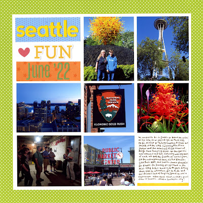
Before I explain how I made it, let me start with why I made it. One of my creative resolutions for 2023 is to play Library Roulette with books from the 700 section, then using them to inspire a craft project. To understand what I mean by Library Roulette, go way back to 2012 when I played it for the first time. To understand what I mean by the 700 section, look at this chart of the Dewey Decimal categories within the 700's. 


I used five randomly generated numbers from 700-799 to select five library books. My numbers were 770, 738, 740, 746, and 751. As you can see, 770 is Photography. 738 is Sculptures and Plastics. 740 and 746 are Drawing and Decorative Arts. 751 is Painting. 


 I chose to work with Lots of Dots by Ana Enshina (affiliate link here and throughout the post) first. 


This unique book shows how easy it is to create beautiful works of art using nothing but dots. The first few pages explain the technique, then the rest of the 135-page book is filled with dotted artwork and the templates to make them yourself. I love everything about this book, but it seems like a risky choice for a library. The perforated templates are designed to be torn out; fortunately, no one has done so. (Thank you, fellow library patrons!)

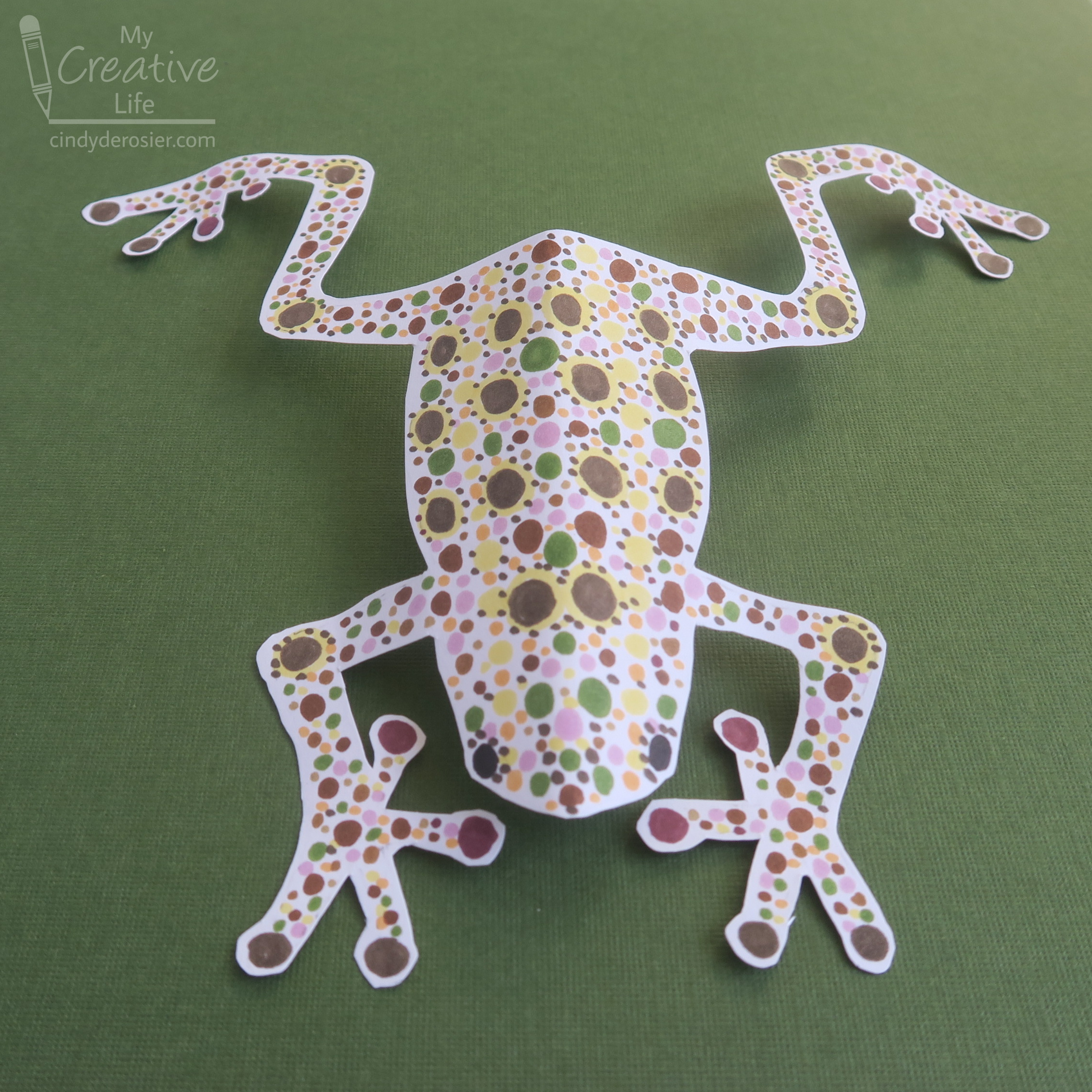
Since I obviously wasn't going to tear out a page from a library book (I can't even tear out pages from books I own), I used the frog from the "Easy" section of the book as a guideline for drawing my own on a piece of scratch paper. I folded the paper in half and cut it out to make a symmetric pattern, which I traced lightly onto Bristol Vellum

I selected colors from the gorgeous Ohuhu Kaala 60-Marker Landscape Set and made some swatches on my paper. Because I was inspired by the leopard frog, I used the yellow and orange to add dots down the frog's back to mimic its actual coloration. 


I used my darkest brown to make the leopard frog's namesake spots. I used the same brown on the frog's joints, then used it and another brown on the fingers and toes.  


I outlined each brown spot with tiny yellow dots, then started filling in the rest of the frog. I kept it sort of symmetric, without being too precise about it. 


Finally, I erased the pencil guidelines and cut out the frog using microtip scissors. It looked striking against a piece of green paper...


... but a bit too much like a 'specimen' in my opinion. By giving it a gentle bend along the midline, then adding bends to the joints, I had a much more lifelike leopard frog.  


This was a really fun project and Lots of Dots was a great way to start off this edition of Library Roulette. I can't wait for the next book and craft!