5/31/21

Art Materials from A to Z

I've been working on a project for awhile. One letter at a time, bit by bit, until eventually I had all 26. Each letter from A to Z is made with an art material that starts with that letter. Once I had all my letters, I backed each one with a contrasting color. I put them together into a collage and I am in love with the results:


Take a close look and see if you can identify each letter. Some are easy. Some are almost impossible. (If anyone gets U, I am seriously impressed.) Some would be far easier to identify if you could see them in person instead of the scanned version. 

Have you made your list yet? 

Below are the answers, some info about how I made each letter, and affiliate links to the materials. Tell me in the comments how many you got right!

---------

A is for acrylic. I swirled globs of acrylic paint onto my Frisbee, let it dry, then peeled it off and used scissors to cut it into the letter A.

B is for beads. I covered a chipboard B with tacky glue, then dumped yellow seed beads on top. I used my craft pick to turn the ones that landed on their sides. 

C is for crayon. I colored on white cardstock, then cut out a C. 

D is for denim. That link goes to denim patches, but I actually cut up an old pair of jeans to make the letter D. 

E is for enamel. I cut out an E from cardstock, then covered it with Enamel Accents. I love that stuff. It dries to a hard, shiny, dimensional surface.

F is for felt. Not much to say here. I cut the letter from felt. 

G is for glitter. No more loose glitter for me. I'm all about Stickles for maximum sparkle. 

H is for hemp. Technically, I'm not sure that the rope stuff I used for this is actually hemp, but I think it is so I went for it. There aren't that many options for H.

I is for ink. I used a blending tool to put different shades of ink onto cardstock, then cut out the letter I. 

J is for jewels. Acrylic, but still jewels. In another application, I might call them rhinestones but then they wouldn't start with the letter J. 

K is for kraft. I recently learned that kraft paper is named for the German word Kraft, meaning strength. Fortunately, it's easy to cut with scissors. 

L is for lace. Two snips of lace ribbon glued together = Letter L. 


M is for marker. Really basic here - I colored on paper, then cut it out. 

N is for newspaper. Turns out you can buy all sorts of newspaper-printed stuff... deli paper, tissue paper, even wallpaper! I used the local paper.

O is for origami. I found a tutorial for turning a dollar bill into the letter O, but I used white paper instead. 

P is for pipe cleaner. Another very quick and easy letter. 

Q is for q-tip. This one was tricky. I ended up soaking two Q-tips and then gently easing them into a small medicine cup which held the curve while they dried over the course of a few days. Then I snipped them and glued the parts back together to make the Q. 

R is for ribbon. Three snips, two twists, some glue, and a heavy book while it dried.

S is for sequins. I put tacky glue on another chipboard letter and layered the sequins on top. 

T is for tissue paper. It took about 2 seconds to cut this out. 

U is for unryu. I know it by a different name (starts with M!) but you have no idea how happy I was to learn its U name. Doubly cool because I had some on hand to cut!
 
V is for vellum. I keep a decent-sized stash of vellum around. I don't use it often, but when I need it there's no real substitute.

W is for wire. Twisteez wire, in this case! Another material I always keep on hand. 

X is for xerox. OK, so xerox is not an art material itself, but it's the best I could do for X. I cut the letter from a handout I didn't need anymore. 

Y is for yarn. I could have done a few quick snips to make the letter Y, but I opted instead to crochet my letter. It's just a chain stitch, so it was still quick and easy. 

Z is for zipper. Remember the denim from letter D? Same pair of old jeans. 

5/28/21

Sparkly Graduation Card

The tangram graduation card I made for my cousin Tim was much too stark for the other graduate in the family, Lilly. She is the daughter of Tim's older brother, Matthew. Lilly has a sparkly personality and needs a card that reflects that. I had so much fun making this glittery, shiny card for her. Turns out that her high school colors are the same as mine! Affiliate links below. 


Sparkly Graduation Card


Materials:


Steps:


Use the letter stickers to spell out CONGRATS on the white card blank. With a black pen, add a smily face. Cut the black cardstock to make a cap. It's easiest to make a square, then put a parallelogram over it. Add star and heart stickers randomly to fill the white space. 

Fold a piece of embroidery floss in half, then tie a small overhand knot. Glue the knot to the center of the mortarboard using tacky glue. 

Dot black and gold Stickles (or whatever the school colors are) randomly in the white space until you have adequate sparkle. When everything has dried completely, the card is ready to send. 

5/27/21

Tangram Graduation Card

Twenty years ago, I earned a Master of Education in Educational Leadership. I was teaching full-time and attending classes in the evening. It was challenging and didn't leave much time for anything else. Exactly twenty years later, my youngest cousin earned exactly the same degree. Tim also taught full-time during his masters program. However, while I was single and childless during the entire time I was working on my degree, Tim was married with three school-age boys... all of whom were doing remote school at home during a pandemic while Tim was teaching and taking classes remotely. Though we emerged with the same piece of paper (in similar red diploma holders), there's no question to me who had the more difficult route to the same end. Much respect to you, Tim!  


I've been going through files from my teaching days, and I used one of my student's samples as the inspiration for the card I made for Tim. First, an explanation. Each year, I shared one of my favorite picture books, Grandfather Tang's Story (affiliate link) with my students. In this beautiful book, a man tells his granddaughter a magical story featuring clever animals and true friends. As he tells the story, he arranges the pieces of a tangram to illustrate it. As I read, I arranged the pieces of a tangram on my overhead project (20 years ago, remember?) with a piece of paper blocking the lightbulb. At just the right moment, I would lift the paper to reveal Grandfather Tang's next creation, then the students would rush to make the same creature using their own tangram. After the story was over, the kids had time to create their own tangram design. It was so much fun and I loved seeing their creativity. 

I kept some of my favorite tangram designs to show future classes as examples, including this adorable "Dog in a Box for a Gift!" by Lauren.... 


... and this "Graduate Person" by Nicole.


Nicole included the following "explanation" at the bottom of her artwork:


"I made this because I might graduate this year from elementary school (Glen Cove). I'm excited to graduate and move on also to learn more. Even though I wanted to stay at this age, I'm curious about the world. I also want to graduate from every school I go to so I want to graduate. I want to do these things because I want to be smart."

All these years later, it still tickles me that Nicole thought she "might" graduate from elementary school. She was a top-notch student who took school seriously and tried her best with everything she did. Her classroom behavior was perfect. The idea that she would somehow fail 5th grade and not graduate from elementary school was absurd. (Spoiler: Nicole successfully completed 5th grade and has graduated several more times since then.)

I took the basic idea from Nicole's "Graduate Person" and used it to make this card, currently in the mail headed north to my cousin, Tim. 


Graduation Tangram Card


Materials:


Steps:


With the card base oriented vertically, arrange the tangram pieces to form the graduate. The parallelogram is the cap, the square is the head, the two large triangles make the body, the medium triangle is the feet, and the two small triangles make the diploma. 

When you are happy with the placement, glue all the pieces down EXCEPT the diploma triangles. Separate a single strand of embroidery floss in the appropriate school color, lay it horizontally where the diploma will go, then glue the diploma pieces on top of it. Let the glue dry. 

Tie a bow around the diploma, then trim off the excess. 

Use the remaining 5 strands of embroidery floss to make a tassel. Fold the floss in half (so that the tassel will have 10 strands), then tie an overhand knot near the folded end to make a tiny loop. Glue that loop to the top of the mortarboard, then trim off the extra length. 

5/26/21

Escape Team: A Super Fun, Interactive, Pencil-and-Paper Escape Game

A few weeks ago I discovered Escape Team. I absolutely love it and am so excited to share it with you! 

If you've been to an escape room, Escape Team is sort of like that, except you don't have to go anywhere. Plus, you can do all of the Escape Team missions for a tenth of the cost of one in-person escape room. To play, you access the game on your mobile device, print out the puzzles, and solve them on paper. Meanwhile, an audio narrative on your device sets the scene, the countdown clock runs on your screen, and you can see clues if you need them. You enter your solutions to each puzzle (always a 5-digit code) on the device. It's really, really fun.


It can also be frustrating, but in a good way. Because the puzzles don't have instructions, you really have to think and work together to solve them. Our team consisted of me (49), Steve (45), and Trevor (14), and the different puzzles required our different brains and varied ways of looking at things. Particularly for the later (and more challenging) missions, if any one of the three of us hadn't been there, the other two would either still be working on the puzzles or would have had to use all of the hints. By working together, we bounced ideas off each other and used our own strengths to take the lead on particular puzzles. I'd say the ideal team size is 3 or 4 people. 


Each mission consists of five different puzzles. They are solved on paper, with some requiring colored pens, scissors, or tape.   


You can play the introductory Training Mission and Central Station Mission for free to see if you like it (which you will). The remaining missions cost $0.99 each. 


After you've solved all of the current missions, you can either wait patiently for more to be released or you can try out user-generated missions. We haven't done that yet, but I'm eager to give it a go. There's even an option to create your own mission! We haven't done that yet either, but it would be really fun to work on together. I'm thinking something with a rabbit theme.... 

If you end up trying Escape Team, let me know in the comments. And if you make your own mission, let me know that too and I'll be sure to give it a try! Enjoy! 

5/25/21

Trevor and Stu

When Trevor began confirmation classes, our pastor asked him to talk with me about selecting a mentor. In my mind, there was one obvious choice. Stu has been an important part of our congregation since before Trevor was born. In fact, he was the assisting minister at Trevor's baptism! Stu is strong in his faith and always willing to serve. Like Trevor, he is quiet and reserved. Trevor and I thought Stu would be an outstanding mentor. Spoiler: we were right.  

As fate would have it, COVID-19 meant that our family, Trevor's godparents, and most members of the congregation watched the ceremony live on You Tube rather than in person. Stu was with us in the sanctuary, making him the only person besides Steve and me to be at both Trevor's baptism and confirmation ceremonies. 
   
Trevor and Stu (affiliate link)

This is the last layout I made this layout for the National Scrapbook Day event at Victoria Marie Designs. Specifically, it is for Frames, Tags, and Labels Challenge. While I do use labels occasionally, I almost never use frames or tags on my layouts. For this page, I thought the tags worked really well to label the two photos showing Trevor and Stu together in 2006 and 2021. I'll be making two more pages with photos from Trevor's confirmation- one about the actual ceremony, and a second about what attending church in person for the first time in a year was like.

5/24/21

New Affiliate Page: How to Support this Site

Most of the money I make from blogging comes from affiliate marketing. Put simply, affiliate income is a commission a blogger earns from a manufacturer or retailer after recommending a product or service that a reader buys using a specific link from the blog post. It doesn't cost the buyer anything extra. 

I was slow to get started with affiliate marketing. I blogged for quite a few years without monetizing My Creative Life at all. I'd seen blogs monetize with multiple pop-up ads, awkward product placements, and off-topic sponsored posts that made me cringe and I swore I'd never do that. And I haven't, 2600+ posts later. There are no pop-up ads, no promoted products that I don't actually use and love, and no sponsored posts. While I could make a lot more money if I plastered ads all over the blog, promoted anything people would pay me to, and accepted sponsored posts, that's not what I like to read and therefore not what I want my blog to be. The only ads you see are ones that I've chosen specifically to complement a certain post. For example, at the end of the instructions to make this panda craft, you'll find an ad for four kid-friendly books about pandas. 

You will see a lot of affiliate links on my blog, particularly in the supply lists for craft tutorials. You'll also see this image on the sidebar, directly beneath my photo:


If you click that image, it will take you to a dedicated page with links to each of my affiliate partners. They're all companies I've worked with for a long time and I feel 100% confident in recommending them to you. 

When you follow a link, either from a graphic or text, and then make a purchase, the company uses the unique tracking code on the link to credit my account for your purchase. They then give me a percentage of the sale price (typically ranging from 2% to 10%). After a few months (during which the company makes sure the products aren't returned or weren't purchased fraudulently), my commission locks. When those locked sales add up to a specified minimum, I get paid. Since most of what I promote is inexpensive, like candy eyeballs or a pack of pipe cleaners, 2% of the sales price is usually just pennies. But enough pennies add up to dollars. 

There's one more thing to explain about affiliate marketing that some people don't know. If you click on my link and immediately buy something from that store (even if it isn't the item I'd advertised), I get the commission for it (after it locks). However, if you click on my link, put an item in your shopping cart, leave the site, and then buy it later, I may or may not get credit for the purchase, even if it's exactly the item I'd promoted. With Amazon, if you don't buy it right then, I don't get the commission. Other stores may have a 7-day cookie, or even a 30-day cookie, meaning that the website remembers that you originally arrived there from my website that many days ago, and will still credit me with your purchase. 

If you would like to support this (or any other) blog, the best way is to use the affiliate links when you shop. If you don't make the purchase right away, return here first to re-click the link, and then make the purchase. Again, it doesn't have to be for the specific item I'm promoting. For example, if you follow my link to Diamond Dotz Freestyle, and instead end up buying books about crochet, I still get the commission. 

If you have any questions about affiliate marketing or monetizing a website, ask in the comments or send me a message at cindy.mycreativelife@gmail.com. 

5/21/21

World Peace in Clay

The World Colors line by Faber-Castell includes more than the fabulous color pencils with blendable skin tones I shared at the beginning of the week. They also sent me their World Colors Modeling Clay. (Affiliate link here and throughout the post.) This fun set has fifteen colors of clay, including six skin tones, seven rainbow colors, and black and white. The package also includes three double-ended tools. 

I played with the clay during a two-hour long meeting (one of the best things about meeting via Zoom is the opportunity for crafty multitasking) and eventually made this:

 
I say 'eventually' because I did a lot of experimental blending and mixing first. The actual project took around 15 minutes. The first thing I did was to create a bunch of different skin tones, which you can see on the bottom right of my work tray. (Which, in a previous life, held something edible from Costco.) Then I did some marbling with the other colors and started what resembles a patchwork quilt. It was so much fun to just play with the colors. It's been a long time since I've used modeling clay.


I put some thought into how to make use of the skin tones I'd created and came up with the idea of the connected hearts encircling the globe, which I'm calling World Peace in Clay. Note that modeling clay does not harden and is intended to be used again and again, which is perfect for kids. If you want to make something permanent, use an oven-bake clay like Sculpey


---------


World Peace in Clay


Materials:


Steps:


Mix white and blue clay to make the perfect shade for your globe. Roll it out, then find something round that's the size you want the globe to be, and press it into the clay to mark the circle (I used a tupperware bowl). Use the provided tool to cut away the excess clay. 
 
Roll out green clay, then use the tools to shape pieces to look like the continents. No need to be precise - just the approximate shapes. Layer them on the blue circle. 


Roll out each of the skin tones and press the heart cutter into them, one at a time. Then place the hearts onto the globe where the Equator is. 


I love how this turned out. Thank you to Faber-Castell, both for letting me play with this clay and for making the product in the first place. What a wonderful thing that we can now so easily depict all skin tones in our crafts. 

5/20/21

SPL

One of the primary differences between Cub Scouts and Scouts BSA (previously known as Boy Scouts) is that Cub packs are adult-led while troops are Scout-led. A team of adults (including the Scoutmaster, who is the most visible) work to support the Scouts, but much of how a troop is run depends on the youth leadership. 

Scout troops are divided into patrols, groups of 6-8 boys who elect a Patrol Leader. One Scout is elected as Senior Patrol Leader. He, with help from an Assistant Senior Patrol Leader, is in charge of the troop as a whole. Having a good SPL makes a huge difference in how a troop operates. 

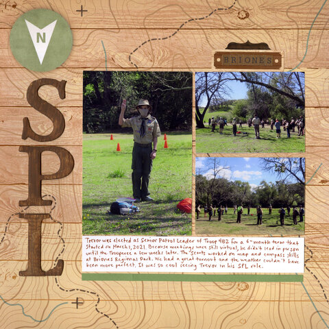
Trevor was elected SPL for a 6-month term starting March 1. Most of the leadership he's provided has been via Zoom (although we returned to in-person meetings this week!), but he's done two in-person outings. The photos below are from a map skills and orienteering event held at Briones Regional Park.  

SPL (affiliate link)

This topo map paper from Scrapbook Customs couldn't be more perfect! It's designed so that the North arrow points up, but I opted to turn the paper 180° so that the arrow would point to the title. Fortunately, a capital N has vertical symmetry and so it works perfectly.

I'm entering this layout in the Big Ol' Title challenge by Victoria Marie Designs. I had to do a bit of surgery to make the L. It's actually an I with the tail of a Z. It's not the only place I had to 'make it work.' The green paper I wanted to put below the journaling wasn't long enough, so I pieced two strips together. You can see the seam almost directly down from Trevor's feet. In addition to helping set the theme, the busy background paper does a great job of distracting from both of these flaws. 

5/19/21

Hot Air Balloon Lunch

TREVOR (14) is working at his computer.  CINDY (49) is at the kitchen island. She uses a knife to cut slices of havarti into clouds and places them on a blue plate. She arranges a slice of bologna on top, separates string cheese into four thin strings and places them below the bologna, and adds a Triscuit at the bottom. She shows it to TREVOR, who is trying to complete his homework. 


C: Does this look like a hot air balloon?
T: Yes, but the strings are too long. 

CINDY returns to the island and cuts the strings shorter. 


C: Better?
T: Yes, but it needs color. 

CINDY takes cheddar cheese from the refrigerator and uses a biscuit cutter to make bright orange polka dots that she adds to the bologna.  


C: How's this?
T: It looks like a soccer ball. It would look better with vertical stripes. 

CINDY removes the cheddar and searches the fridge for something to make vertical stripes. She uses mustard to draw stripes onto the bologna.  


C: Now? 
T: More color.
C: How about ketchup?
T: Are you sure that wouldn't be gross?
C: Why would that be gross? Bologna is just a flat hot dog and you like mustard and ketchup on hot dogs.
T: Maybe.

CINDY draws in stripes of ketchup. 


C: Well? What do you think?
T: Yes. 
END SCENE. 

5/18/21

Christmas 2020

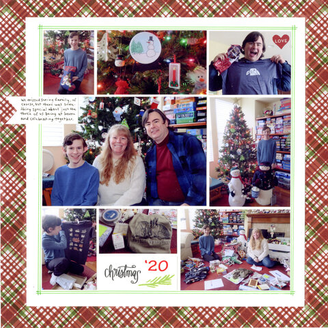
Christmas 2020 was a quiet affair at the deRosier house. Trevor slept in, we had a luxurious breakfast, and then we slowly opened presents, enjoying each one instead of racing on to the next. We had calls with both sides of the family. It was nice. Oh, and all three of us received bunny t-shirts, which was awesome. 

Christmas 2020 (affiliate link)

I made this layout for the Acrostic Challenge at Victoria Marie Designs. First, we had to create an acrostic for the word SCRAPBOOK, then we had to use some or all of those words to create a layout. I came up with stickers, cardstock, red, adhesive, plaid, banner, orange, oval, kit. Of those nine, I used the first six. 
The plaid background paper, which I love, is part of the Christmas set from Scrapbook Customs. All the papers are so pretty. You'll be seeing more of it from me in the near future. 

5/17/21

All Colors are Beautiful

The folks at Faber-Castell sent me their World Colors EcoPencil Colored Pencil Set to try (affiliate link here and throughout the post) and I'm happy to report that this set is fabulous! I love how rich and vibrant the colors are. There are 24 single-color pencils in a rainbow of gorgeous shades, but what makes this set particularly great are the 3 double-ended pencils. Each has 2 different skin tones, which can be used as is or blended to make even more shades. There's a handy graphic on the back of the box to show you some of the skin tones you can make by blending. 

I used the World Colors Pencils to make this: 


I love the "class picture" look of this project. It reminds me of the many students that I had the pleasure to teach back in the day. My inspiration for making it came from the packaging itself:


Read on to find out how I made my project.  


---------


"All Colors are Beautiful"


Materials:


Steps:


Cut nine squares of white cardstock. Mine are small (1.5") but you can make them larger if you want. Use the World Colors EcoPencils to draw faces on eight of the squares. Vary the skin tone, eye color, and hair color and style. You can model them on real people or use your imagination. 

When you've completed the eight faces, arrange them in a grid. Use the color pencils to add different background colors to each. 

On the ninth square, use the Sharpie to write "All Colors are Beautiful." Make a rainbow of colors over the title. Place it in the center of the grid of faces. 

Transfer the faces to a piece of black cardstock, leaving a small (1/8-1/4") border between each and around the outside edge. Glue each square to the black cardstock, then trim away any extra cardstock. 

5/14/21

Christmas Eve 2020

Because of the pandemic, we spent Christmas Eve with just the three of us, for the first time ever. We missed seeing family, of course, but the relaxed pace and quality time together was nice. We made a big meal (leftovers for days!), played board games, and watched the Christmas Eve candlelight service live on YouTube. We had a good time. 

Christmas Eve 2020 (affilate link)

My design for this layout was inspired by the Old or Discontinued Product Challenge at Victoria Marie Designs. Everything on this page is old and/or discontinued, with the exception of the red cardstock that you can still buy. Even the two border punches I used have been discontinued.

My favorite thing about this page is the screenshot from the Christmas Eve service. The photos I took of us watching it didn't turn out well, but I was able to go to my church's YouTube page, bring up the Christmas Eve service, play the video, and then do a screenshot, which I then printed as a photo. It's the first time I've documented how I've been 'attending' church for the last 14 months, so I'm especially glad to have it on the page.

5/13/21

UCD All to Ourselves

Back in November, we took advantage of Trevor's mid-week day off school for Veterans Day and spent the afternoon at our alma mater. We'd intended to walk the full length of the Arboretum and back, but it was blocked off midway due to maintenance. That turned out to be a good thing, as we decided instead to walk through campus. There are always new things to see when we visit - a building that's popped up somewhere, creative bike parking options, a food truck court - but the different things we saw this time greatly outnumbered all previous visits. A pandemic will do that.

Most notable was that the campus was almost empty. Most classes were online only and many students opted to remain at home or in off-campus apartments. We saw a few students here and there, as well as several dozen open dorm windows, but the campus was empty in a way we'd never seen before. Most buildings were closed and there were signs all over the place outlining COVID-19 safety protocols. Huge tents were erected near many of the classrooms. We were amused that these open-air metal structures each had at least four fire extinguishers.
    
UCD All to Ourselves (affiliate link)

If this layout seems familiar, it's because I used the same sketch as for my I Love Bunnies page. The challenge actually required us to make two different layouts from the same sketch. I've never done that before. It's fun to see how changing the color scheme makes two layouts with all the same elements feel different from each other.

A few things to point out about this layout: First, there are 7 photos on this page, grouped to make the two 4" x 6" photos on the sketch. I use photo collages all the time, but I don't think I've ever placed two separate collages on the same page. Next, my favorite white pen to the rescue! There were only 2 lowercase L's on the sticker sheet, so I used my pen to change an exclamation point into another L for the title. And finally, the leaves. I punched them from a different plaid paper from the same collection, so they match the background paper perfectly. 

5/12/21

Clay Watermelon Necklace

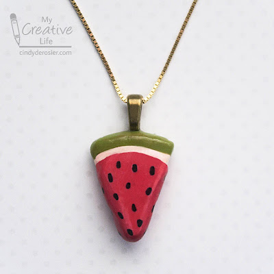
Check out my new necklace! It's easy enough for a child to do, which I know because that is about where my jewelry-making skills are. 


Watermelon Necklace


Materials:


Steps:


Condition the clay by working it until it is soft. Form the red clay into a wedge the size and shape of a slice of watermelon. Add a thin band of white clay across the top. 


Add a thicker band of green clay above the white. Smooth everything until you are satisfied, then bake the clay according to the package instructions. 

When the clay has cooled, use the Sharpie to draw seeds onto the red portion. Baked Sculpey does not need to be sealed, but I chose to add a coat of Mod Podge so that my watermelon would be glossy. Your choice. 

Adhere the bail to the back of the pendant. When the glue is dry, hang the pendant on the cord or chain of your choice.

5/11/21

Pandemic Organizing

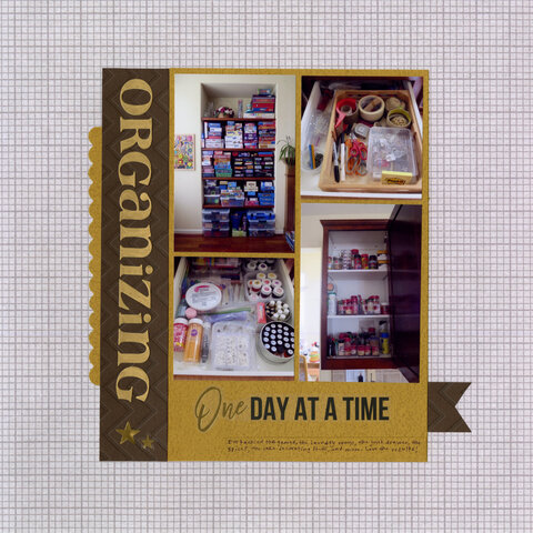
Since we haven't gone anywhere in 14 months (and counting), you'd think that our house would be cleaner than ever. Nope! But I'm happy to report that it is more organized. At least, certain parts of it are. I've been tackling small areas like shelves, drawers, and cabinets, one at a time. It's been very satisfying. In the layout, you can see our newly organized board games (we love games - go here and scroll down to see our favorites), the kitchen junk drawer, the spice cabinet (now organized by savory, sweet, and spicy to make things easier to find), and the sprinkles drawer (which has my LorAnn flavorings, candy eyeballs, and a bunch of other stuff for edible crafting).   

Organizing, One Day at a Time (affiliate link)

I made this layout for the Collage Challenge at Victoria Marie Designs. I create photo collages on 90% of the layouts I make, so it wasn't much of a challenge for me. Instead, I challenged myself to build the layout around the "One Day at a Time" sticker. I'm really happy with how it came out. So much so, that I turned it into a sketch. 


I used PicMonkey, of course. Playing on PicMonkey is literally one of my favorite things to do. I like it almost as much as actually scrapbooking. 

5/10/21

Nut Butter Bear Edible Craft

These edible bears are fun and easy to do. And they are adorable, if I do say so myself. Which I do. Affiliate links below. 


Nut Butter Bear


Materials:


Steps:


Spread peanut butter onto one rice cake and three popcorn mini cakes. 


Put a dollop of Nutella off center on two popcorn mini cakes to make the ears. Stick them in place (the peanut butter will hold them nicely). 

Put a smaller dollop of Nutella directly in the center of the third popcorn mini cake. Position it on the face to make the bear's snout.


Drag a toothpick through the Nutella on the snout to make the bear's smile. Add two candy eyeballs. 


Since I suspect someone will point this out, this project is not appropriate for people with nut allergies or for groups where you don't know for certain that no one has nut allergies. You can make an equally adorable bear using other types of spreads. For example, try Monkey Butter in place of the peanut butter and Apple Butter for the Nutella. There are lots of other possibilities. Don't be afraid to be creative!

5/7/21

Solar

Steve has spent the better part of a year designing, building, and installing solar for our house. It's been a labor of love, but one with lots of unforeseen obstacles. I'm proud of him for working so hard and not being defeated by the challenges along the way. 

Solar (affiliate link)

I made this layout for the Color Inspiration Challenge at Victoria Marie Designs. This is the color palette we had to use. Again, it was ok to substitute or interpret as desired:


It took me awhile to figure out what to do for this challenge. But once I thought about that packet of die-cuts, the page came together quickly. I proud of myself for (temporarily) letting go of how literal I usually am when scrapbooking, as evidenced by the popsicle on its side! I wanted that color there and decided to just go for it. Very out of character for me! But that's the whole point of a challenge. Mission accomplished. 

5/6/21

Patriotic Crafting: Edible US Flag

Tis the season for patriotic crafting! Memorial Day is in a few weeks, Flag Day two weeks after that, and then July 4th will be here before you know it. Here's a tray of candy-coated treats (13, to be exact) that make a festive addition to any patriotic celebration. 


One fun option for this edible craft is to flavor each candy color differently. I used my LorAnn flavors to make my flag taste like raspberry, cherry, and vanilla. There are so many possibilities - the next time I make this, I may opt for something completely different! 


Have you guessed what's underneath the candy coating? Read on to find out! Affiliate links below. 


---------


Edible US Flag


Materials:


Steps:


Arrange 13 grissini on the serving tray you plan to use. Try to choose the straightest ones. 


Cut two sheets of parchment paper, large enough to hold the grissini spaced 1" apart. Place a rack over one of the sheets. Transfer six grissini to the rack, then melt the white candy according to the package directions. Use the pipette to add the desired flavor. Thin if necessary, using EZ Thin or other method as recommended in the direction. Drizzle the candy over 100% of three grissini and 60% of the other three. Before the candy hardens, transfer them off the rack and onto the clean sheet of parchment. 


Follow the same steps with the remaining 7 grissini. Move them to a rack positioned over parchment paper, prep the red candy, and then drizzle it over the grissini. This time, you'll cover three grissini completely and 60% of the remaining four. 

While the candy is setting, prepare your sprinkles. I didn't have the star sprinkles I linked above on hand, so I picked out white hearts from a valentine mix I did have on hand. 


Prepare the blue candy, then drizzle it over the four red and three white grissini that are only partially covered. Immediately place the stars (or in my case, hearts) onto the blue area and then sprinkle generously with sanding sugar. Carefully transfer them to the parchment. 


When the candy has hardened, arrange all 13 grissini back on the tray and they're ready to serve. The fruit-flavored candy goes so well with the grissini, much like dipped pretzels do. In fact, I'd originally planned to make this with pretzel rods, but they are shorter, thicker, and more irregular than the grissini, which yield a more appealing flag shape. 


Looking for other patriotic crafts? You're in luck! A bunch of my fellow craft bloggers are sharing their ideas for fun and festive patriotic crafts. Check it out!

5/5/21

Faber-Castell Watercolor Paint-by-Number Kits

One of the many new products I saw at Creativation that piqued my interest: watercolor paint-by-number kits from Faber-Castell. (Affiliate link here and throughout the post.) Their kit is completely different (read: better) than any other paint-by-number kit I've seen. Before I explain how, let me show you my completed painting:


The painting is 12" x 12" and that is a stretched canvas that is ready to hang.  

I've never seen paint-by-numbers with anything other than the conjoined strip of low-quality opaque paint, applied to a canvas with the numbers painted directly on each spot. This is completely different. Because it is watercolor, the paints are in a palette. Also because it is watercolor, the paint is translucent. Therefore, the numbers are not printed directly on the canvas where they would show through. Instead, the numbers are printed on a separate, full-size page (folded in the photo below). The kit also includes a brush. The handle is triangular, which means it doesn't roll when you set it down. Nice!


There is one weird flaw about this kit that I want to point out. The paints are not arranged in numerical order. As it turns out, it wouldn't have been an issue with this design because it's obvious that the sky (#5 on the chart) wouldn't be purple (in position 5 on the palette), for example. But on other designs it might be an issue. I used Sharpies to properly number my paints so I wouldn't mess up. 


A handy feature of the kit is that the palette lid functions as a place to mix colors. You can see that I've mixed up a pale orange and a pale pink on the lid. 


Overall, I found the kit easy and enjoyable to use, and I'm happy with the finished painting. It comes with everything you need and is beginner-friendly. While it is marketed to adults, preteens and teens will love it too. 

There are six different designs to choose from. 


These watercolor paint-by-number kits have a good price point for what you get, making them an excellent choice to give as gifts or to buy for a group paint night. Overall, two thumbs up!