
For someone who knows a lot about the types of papers used for scrapbooking and other paper crafts, I know very little about the paper used in fine art. I've dabbled in watercolors, so I know a little bit about cold-press watercolor paper (affiliate link here and throughout the post), but learning more about colored pencils has opened my eyes to many other types of paper. Early in my colored pencil journey, I watched a video about the best paper for colored pencils and bought Neenah Vellum Bristol specifically because it would work well in the printer. Overall, I've been very happy with it.
While the Bristol is my go-to for printing, I wanted to see if it was the best option for coloring stamped images with colored pencils. I went through my stash of art paper and pulled out Strathmore 200 Series Drawing Paper (their "Good" paper) and Strathmore 400 Series Drawing Paper (their "Best" paper).

(Source)
Obviously, I was expecting the 400 to perform better than the 200, but I wasn't sure how either would match up with my printer-friendly paper.
I decided to rank the three papers based on five criteria. I labeled each paper, mixed them up, then felt them with my eyes closed. Based solely on touch, I preferred the weight and feel of the Bristol. Next was the 400, and the 200 was a distant third.
Next, I compared their color. The Bristol packaging indicates that it has a Brightness of 94. I thought Brightness = Whiteness, but it turns out I'm wrong. Neither Strathmore pad mention Brightness (or Whiteness). I like a white paper that is truly white and the Bristol looked the whitest to me. Interestingly, the 200 was more white than the 400.
Next, I tried stamping on each paper. I used the darling Peek-a-Boo Pets stamp set for the first time. As a side note, I love these stamps but I have to question why several of these animals are in a pet set when a rabbit is not. Fun fact: Rabbits are the third most common pet, after dogs and cats. Anyway, the images I chose (the dog, the cat, and some sentiments) stamped well on each paper. The Bristol and 400 were ever so slightly crisper than the 200.
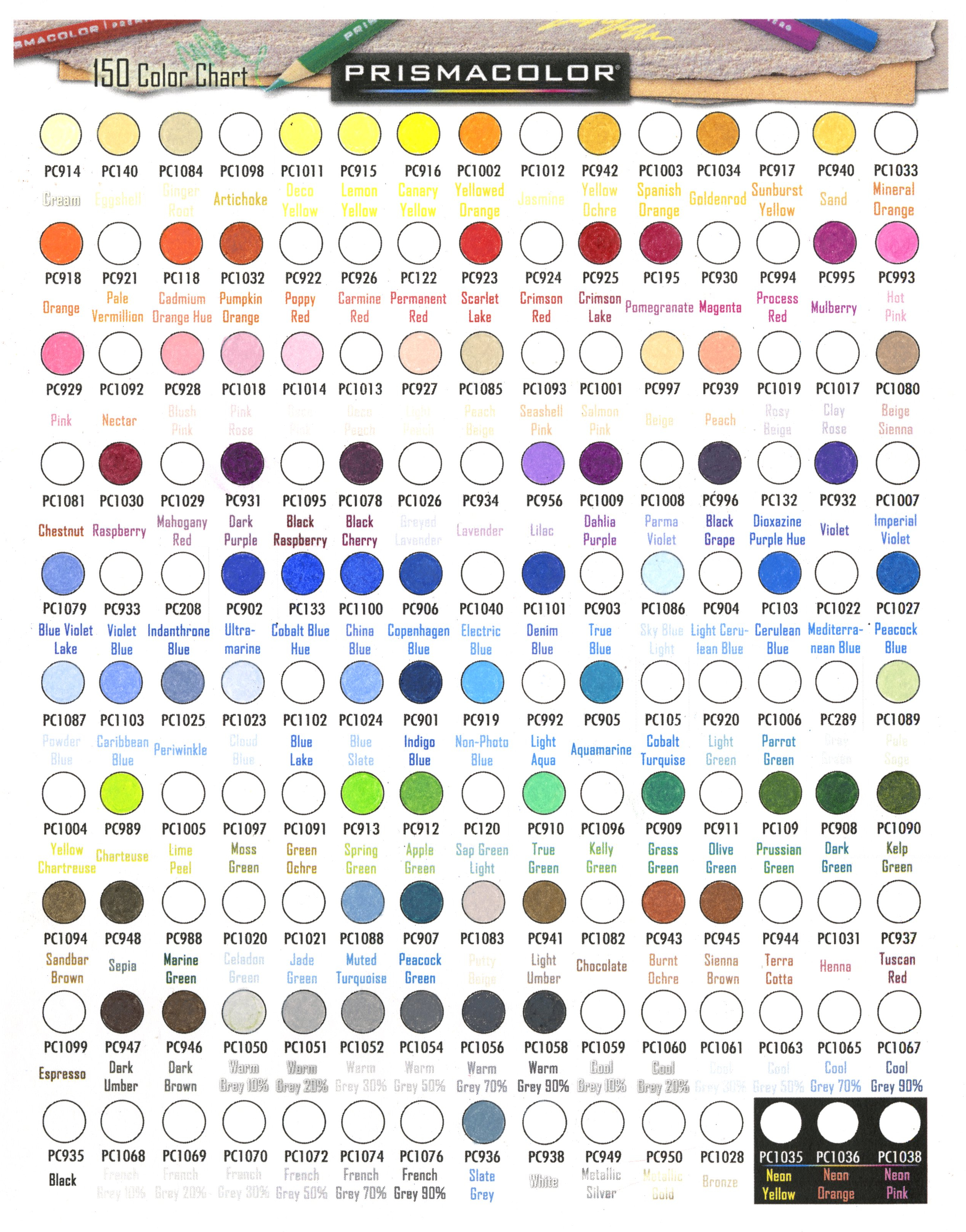
I pulled out my Prismacolor Premiers and started coloring. The first thing I learned is that I need more brown Prismas. Yes, "need." Look how many empty spaces there are on my chart.
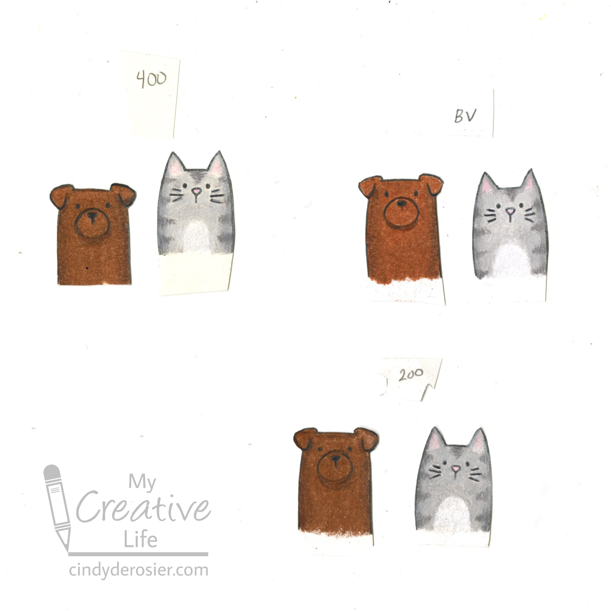
Overall, the Bristol Vellum is my favorite of the three for coloring stamped images. I'm interested in trying out other papers to see how they perform with colored pencils. I'd definitely like to give Strathmore's Bristol a try.
Do you have a favorite paper for colored pencils? Tell me about it in the comments!

When it comes to paper for coloured pencils, grain texture is the enemy. It really "eats" your coloured pencils. I like Strathmore's tone papers -they take coloured pencils well and I can add other dry media as well. Bristol paper is not great for mixed media....at least for my style of drawing/colouring.
ReplyDelete