
It's time for the next project in my "Inspired By" series, where I make a piece of art in the style of another artist. This time, I was inspired by Romero Britto. Britto is a Brazilian artist who has spent his adult life painting, sculpting, and printing in Miami. He is the founder of the Happy Art Movement and aims to spread happiness, fun, love, and optimism through his colorful artwork. He is one of the most famous living artists and is thought to be the most licensed artist in history.
My painting is called Fruit Bowl.
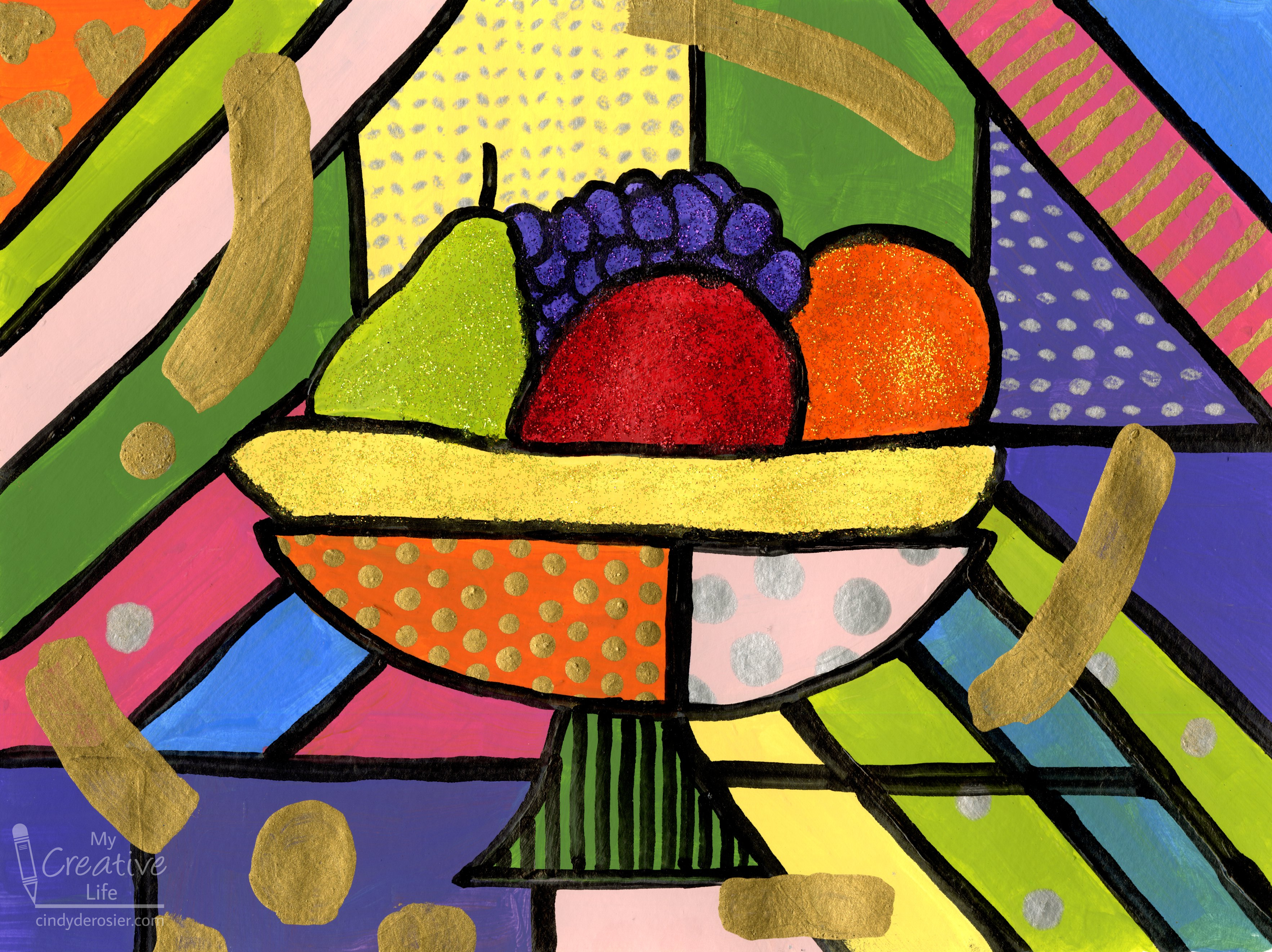
Before I started painting, I made a list of the characteristics of Britto's paintings that, to me, best define his style.
- bold, bright colors separated by heavy black lines
- happy subject matter
- pops of glitter and gold
- doodles, especially circles and hearts
- swoops of color over the black lines
Britto's subject matter is broad, so I selected one piece, called Banana Split, as my inspiration:
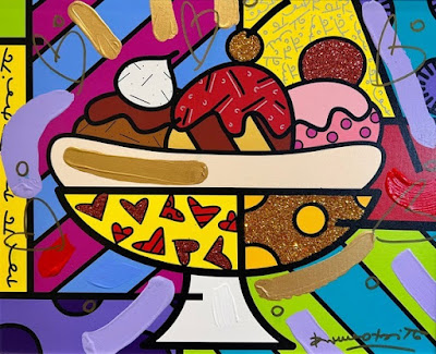
Rather than make my version of his Banana Split, I used the banana as inspiration for a fruit bowl. If I were teaching this lesson to a group of kids, I'd challenge them to think of other items that could be sitting in a dish like that besides a banana split or fruit. It could be other foods, but there are countless other options. It's always so much fun to see what creative things kids dream up!
I did a light pencil sketch of the bowl and the fruit, then painted blocks of color.

When that was dry, I painted some gold and silver dots and hearts in a few of the color blocks (affiliate link here and below).

Then I rubbed Stickles onto just the fruit and let that dry. Then I used Testors' Black Gloss Marker to draw my lines.
In retrospect, I should have done the black lines first and the glitter afterward. The paint marker went over the glitter just fine, but it bled a little. It's particularly evident on the banana. I totally should have known better.

Finally, I added some big swaths of gold to the painting. I wish I'd given their placement a bit more thought. I'm particularly unhappy with the one in the upper left, as it leads the eye out of the painting instead of into it.

The whole painting could have benefitted from more thought, to be frank. I made some choices I would definitely change if I made a second attempt. But that's a good thing because it means I learned a lot in the process.

No comments:
Post a Comment
I moderate comments, so you will not see yours appear right away. Please check back if you had a question; I promise to answer it as soon as I see it. Thank you for taking the time to comment!