
I made this sketch recently, my tenth:


I was happy with the layout... until I scanned it. As soon as I saw it on the screen, I didn't like the way some of the letters in the title seemed to disappear. It looked fine in real life, but I decided to change it so that it would look ok digitally too.
I didn't want to spend too much time making the change, nor did I want to use new supplies. So I carefully peeled up the a and the e and added some turquoise ink to them. The title is much easier to read now.
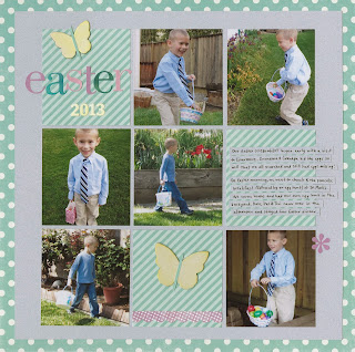
One simple change and now I'm satisfied with how it looks both in real life and digitally.

what a great sketch
ReplyDeleteWonderful page and great design!
ReplyDeleteLove this! What software did you use to make the sketch? I've been thinking about giving that a try. And it is so true about seeing a project differently once you scan or photograph it... sometimes if I am struggling with a design I'll snap a quick photo and look at it that way - usually that helps me decide what to change. It's amazing how a little thing like changing the color of a letter sticker can make such a big impact. Love your blog, Cindy!
ReplyDeleteThank you! To answer your question, I use Open Office Draw. I blogged about the process of making my first sketch and why I came to use Draw here:
Deletehttp://www.cindyderosier.com/2012/01/my-very-first-sketch.html
thanks Cindy! off to read your post...
DeleteTrevor looks adorable, all dressed up with his tie! :) And of course I LOVE the layout - I have a thing about grids!! :) Great job! I need to check out your post about making the sketch too ... I have never known how people do it. I have a huge binder that I've hand drawn on grid paper that I'd love to transfer to digital this way!
ReplyDeleteOH that happens to me sometimes too! Sometimes I hate scanning my layouts for that reason! Love the grid design and the green/gray combo! Trevor looks handsome!
ReplyDeleteWow wow wow! This is gorgeous!!! I loveeeeeeeeeeee the colors, the photos and the grid design!!!!!!
ReplyDeleteNeat way to improve on it...looks good!
ReplyDeleteLove the sketch too!
I love your sketch, Cindy! I want to use it!!!! The layout that you made is absolutely adorable! I love how you changed the letters to see them better digitally. That has happened to me, too!
ReplyDeleteI love a grid. It's one of my favorite LO designs! Super cute page. I agree: the letter switch was all you needed! Perfect.
ReplyDeleteI love this sketch!!! I will have to use it :)
ReplyDelete