
For the third craft in my Library Roulette Class 700 project, I painted tiles in my sketchbook. They are based on the artwork of William Morris. More about him in a second.

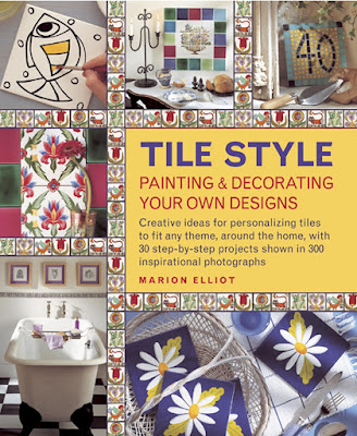
The book I chose for 738 (Ceramic Arts) is Tile Style: Painting and Decorating Your Own Designs (affiliate link). The book starts with a detailed history of tiles that is quite interesting. The next part talks about designing with tiles. The second half of the book is about decorating your own tiles and using tiles creatively. There are a lot of neat project ideas, each with detailed step-out photos. I picked William Morris Tiles because painting them would be challenging, yet doable.
William Morris was a British textile designer (as well as a writer, printer, translator, and conservator, among other things) whose training started in architectural drawing. He moved on to painting, creating images for tapestries and fabrics, wallpaper, furniture, stained glass windows, and more.
The design featured in Tile Style was created by Morris in 1870. The originals are on display at the Victoria & Albert Museum in London. We actually visited the V&A during our 2019 trip, so it's possible I saw them in person. It's also possible I didn't - the museum is enormous and despite our best efforts, we couldn't see everything.
I didn't have any blank tiles laying around, but I did have lots of blank pages in my new sketchbook. So that's what I used. Tile Style has patterns in the back of the book, so I scanned the design, printed it, scribbled on the back in pencil, aligned it in my sketchbook, and then traced the lines. That gave me the guidelines for painting.

I started with the flowers, then added the leaves. Then I did something stupid - I outlined the tiles in baby blue.

I have no idea why I did this. I should have just gone in with the dark blue I was using to paint the background. Instead, I had to cover all of the baby blue, which led to a few lines having to be thicker than I'd intended and more wiggly/slanted than I'd wanted. Oops.
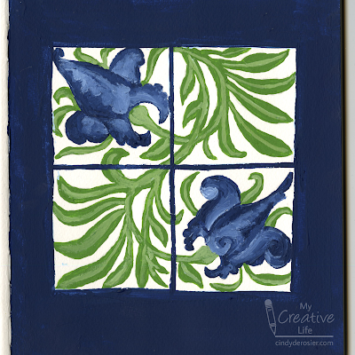
No matter. The fun was in the actual painting, not the finished results. Since they're in my sketchbook and not painted directly on tiles, it's not like I have to look at the mistakes on a daily basis. In fact, if you'll be painting on tiles, I highly recommend practicing in a sketchbook first!

Very vibrant pretty and artistic. Love the blue and green you used
ReplyDeleteCheers, Dr Sonia
I always do my "corrections" with colored pencils. :)
ReplyDelete